Presenting Terry Pratchett's Nation:
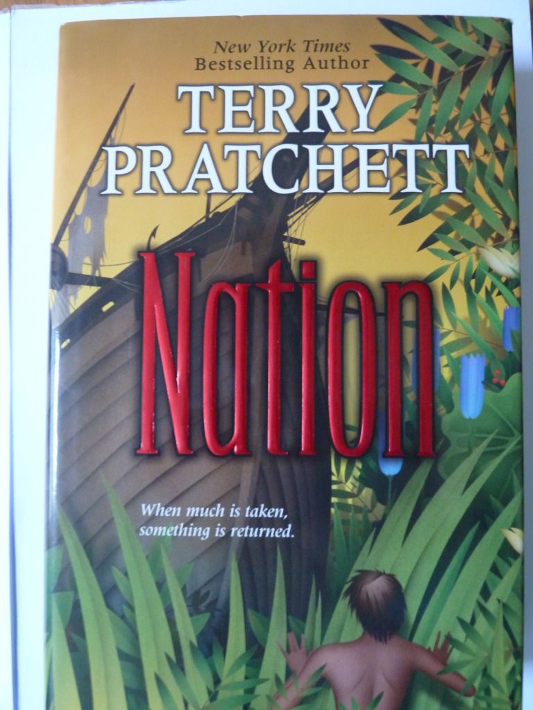 The author's name and title are clearly displayed in the order of importance, and are very easy to read despite the busy background. The title is eye-catching because it is foil-stamped, with a drop shadow for added emphasis.
The dust-cover shows one continuous scene - which I think is always a nice design touch. The transparent text box used for the blurb is a good way to put text on top of a busy background, whilst still allowing the sense of the image to be conveyed.
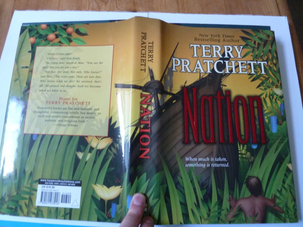
As this is the US hardback, it also has a ragged 'rough cut' edge (something more common in the US). I find it makes it harder to flick through pages, and it makes the book feel less 'perfect', but it also adds an element of interest.

No comments:
Post a Comment