Monday, 30 April 2012

Cookbooks part one - covers

We New Zealanders sure do love our cookbooks. A brief glance in any cookbook section of the store reveals a book for every possible occasion or taste. I’m planning to do a couple of posts on cookbooks: this one will be about covers, and the next one will focus on what’s inside.
The standard cover for a cookbook features, unsurprisingly, (a) food, or (b) a famous cook holding food.

There seem to be niche markets within the broader 'cook books' genre. Below I've selected three cook books primarily targeted at women, versus three primarily targeted at men.


The fonts for the more 'feminine' cookbooks are decorative and scriptlike; the fonts for the 'masculine' cookbooks are less adorned and in all caps. We have darker colours and men in staunch poses in Stoked and Jaimie's 30 Minute Meals and pink and frills in Saved by Cake and Gorgeous Cakes. Apparently the cake-baking marketing is almost exclusively aimed at women.
Looking at Marian Keye's Saved by Cake in more detail, I've decided I really like this cover. This cover just captures the essence of Marian Keyes: quirky, girly, and good fun. The target market for this book is readers of her novels, as well as women that like baking.

The layout of this cover is very good: the text is well organised so you first read the author's name, then the name of the recipe book, then the sub-title. The script typeface used for the title is reminiscent of icing and fits with the slightly quirky overall feel of the book.  The curved layout of the title echos the curve of the author's head, which then draws your eye down to the photo of the author, then to all the cakes she's making. The colours are also eye-catching and work well with each other.

One thing I don't like is how the 'y' of 'Keyes' is hooked around the 'C' from 'Cake' on the line below. I think this makes the title overly-fussy, particularly given the existing fussyness of the script typeface for 'Cake'.

This cover has a strong layout, and is clearly targeting men as well as women, but it doesn't look like a cook book at first glance - you have to assume it's a cookbook because of where it's shelved. If you saw this book out of context, you would have to either read the title, or recognise Jamie Oliver from the photo to identify that this book is a cookbook. Jaime Oliver is a very famous cook, but it's questionable whether people would recognise him at a distance in a photo that isn't a close-up of his face.

There are lots of things I like about this cover, and some things I don't. Firstly, the central image of the tart is striking, and immediately tells you that this is a cookbook. The text layout works well and the combination of the slab serif typeface for 'Treats From' and script typeface for 'little and Friday' evokes an old-fashioned, quirky feel. Teal seems to be an in-colour with cookbooks at the moment so this book is on-trend.  This cover also feels lovely to hold, with a quarter cloth binding.

What don't I like about this cover? The script typeface is a little hard to read, and I'm not sure why there's a full-stop after friday. Also, the 'treats from' and 'little and friday' seem somewhat removed from each other, even though that is the full title of the book.

Friday, 27 April 2012

Design of a design book


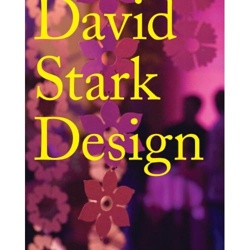
I was at the library today in the cookbooks section when a mis-shelved title metaphorically leapt off the shelf and demanded to be taken home. This visually striking book is a design book published in 2010 called David Stark Design.


The cover is compelling; I couldn’t help picking it up. Why, though? Partly I think it’s the simplicity of the design: only three words on the entire front page and only two basic colours. The serif typeface chosen for the title is also simple, as is the strong left-alignment. The contrast of the cover also hit me forcefully. Yellow and purple are opposites on the colour wheel, and the contrast is further emphasised by the spot glossy surface of the text compared to the matt cover. 

The design elements of the cover (simplicity, bright colours, contrast) are echoed in the design and layout of text elements inside the book. 

For example, in the table of contents the section titles are highlighted with yellow, and the background of the page is pink. The contrast is also echoed in the font choices: the section titles are in a standard sans serif typeface, whilst the sub-headings are in a serif typeface reminiscent of type-writers. The highlighted section titles are very easy to find.

The text pertaining to the artwork on each double-paged spread is also contained in a yellow text-box, repeating the colour theme from the cover. This is also a clever way to put text on top of a photograph.

The section headings overlay the narrative text. I'm uncertain about this design choice - it is striking, but the heading makes reading the underlying text difficult.

Tuesday, 24 April 2012

Comic book typefaces

Today I got distracted by the glorious array of typefaces used in comics. I’m new to the world of comics, so I’m only just learning some of the conventions.

The three comics all the examples are from are A Sickness in the Family by Denise Muso (published 2010), Book 10 of Y the Last Man by Brian K. Vaughan, Pia Guerra and Jose Marzan, Jr. (published 2008), Volume 6 of Buffy the Vampire Slayer by Joss Whedon, Jane Espenson and Georges Jeanty (published 2010).

For starters, the first convention I noticed is that all text is in CAPITALS IN A SANS SERIF FONT THAT LOOKS SUSPICIOUSLY LIKE COMIC SANS (well, that’s presumably the reason it’s called comic sans). I imagine this is because text is presented in small snippets usually less than two sentences long. Serif fonts are easier to read for long pieces of running text, but sans serif is great for a less cluttered look.

The next thing I noticed is that words that the characters are speaking aloud go in round speech bubbles, whereas thoughts go in square text boxes:
pictures on the left from A Sickness in the Family, pictures on the right from Buffy the Vampire Slayer
Square text boxes also seem to be used to show a change of scene, or give information to the reader about a new place or character.

Bolding combined with italics seems to be used for emphasis, the same as in non comics. Even so, I find it hard to tell when emphasis is being used:

By far my favourite font aspect of the comics is the fonts used to depict sounds. 
Top row from A Sickness in the Family, middle row from Buffy the Vampire Slayer, bottom row from Y the Last Man
I particularly like this bit of ‘sound type’ in the picture below from A Sickness in the Family. The letters are distorted like a rising tendril of smoke, evoking a high pitched hissing noise.

Sunday, 22 April 2012

I may be imagining things...

but is it just me who thinks these two covers bear some resemblance to each other? A shout-out to the fact that Fifty Shades of Grey started as Twilight fanfiction?


The shape of the tie almost exactly echoes that of the ribbon on Eclipse's cover. The location of the title is also very similar, plus the fact that both have dark backgrounds.

On a tangential note, the Fifty Shades of Grey cover also has a not-so-very-subtle visual pun going on with grey text on a grey-scale background. 

Saturday, 21 April 2012

Interesting cover examples

I've included The Red House because of the debossed cracks in the cover that make it feel like broken crockery. 


This book, Quiet, has a lovely visual pun going on with a 'quiet' cover design - no colours, small size of font, no illustrations.

Friday, 20 April 2012

Books in the same series

Obviously, if a reader likes a book they’re likely to want to read the next book in the series. Cover design within a series is all about making life easy for the reader – book 2 in the series should look as much like book 1 as possible. Another consideration is that series are usually stacked together on bookshelves, forming a large block ‘billboard’ of spines that can also be used to attract new readers.

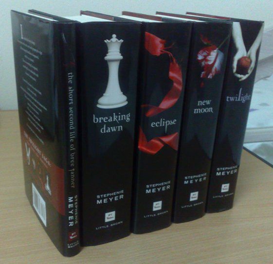
With the Twilight series below, the covers all share the same design and together form an impressive large black colour block of spines.
 
A series with clever spine designs is the Mistborn Trilogy by Brandon Sanderson. On the spine, the ribbon connects to the next book in the series and the cover figure gets progressively closer.
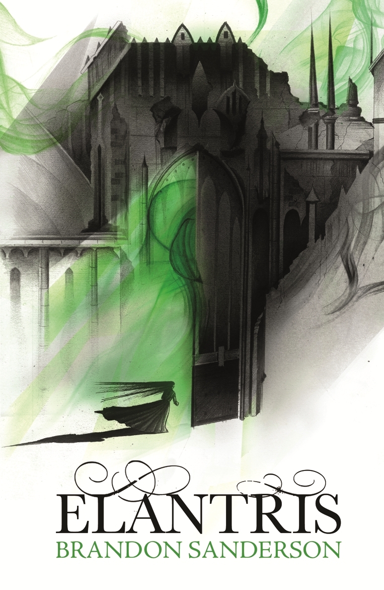
I also have to mention a clever bit of cover design I've noticed for Brandon Sanderson's books. Since he became a bestseller, all his books have taken on similar design elements. They're all white with a single accent colour. Books within the same series (like the Mistborn Trilogy above) have the same accent colour. Books from different series have a different accent colour. See Elantris and The Way of Kings below. Both of these books are different series, but the standard design elements make it easy to find books by this author.

Update 22 June 2012:
I've also noticed another bit of cover trending here, with the Night Angel trilogy by Brent Weeks using similar design elements to Brandon Sanderson's for its covers. Brent Weeks and Brandon Sanderson target exactly the same demographic, so it makes sense for the covers to share design elements. If readers pick up a book by Brent Weeks when they wanted a book by Brandon Sanderson, it's a win from a marketing perspective because they have picked up a book they will probably be interested in anyway. I also wonder if it has anything to do with the fact that S and W are usually shelved fairly close together in the fantasy/sci-fi section of most bookstores.

Update 27 June 2012:
And yet more fantasy books to add to the trend pile! What is it with the ribbon love?

International editions - case study 'Angel's Blood' by Nalini Singh

I find it interesting to compare different editions of the same book, especially foreign language editions. To that end I've collected various editions of Angels' Blood by Nalini Singh. The original version of Angels' Blood was published in the US in 2009. Angels' Blood reached our shores in the form of the UK/Australian edition in 2010.

US Edition
UK/Australian Edition

The title's typeface in the US edition draws heavily on romance genre conventions: decorative, foil stamped, drop shadow. The UK/Australian edition is edgier, and hints at horror/thriller elements with the dripping blood in the title.

Other editions are as follows. 

The Spanish and Portuguese editions are effectively the same as the UK edition, except the typeface for the title has been altered in the Portuguese version. The European versions seem to be more monochromatic than the various Asian editions as a general rule. The UK, Hungarian and French covers seem to be following the trend for predominantly black and white covers, with a single highlighting colour, very reminiscent of the iconic Twilight cover.

I think the Indonesian and Polish versions are the least successful, mainly because of the bad photo-shopping. On the Polish  cover the woman’s breasts have been photo-shopped out, leaving the model with an unnatural appearance. I've made some more detailed comments on the Indonesian cover below.
The Indonesian version also doesn't clearly express that this is a book with strong fantasy elements – this cover could belong to any romance novel. The other editions lacking a strong fantasy element on the cover (such as the US and Japanese editions) still have a fantastical feel because of mystical background lighting.

Another thing I find interesting with the different editions is whether the author’s name or the book’s title is deemed more important. The most important element is the biggest, boldest, and is usually located at the top. The editions seem to rank the importance of the title versus the author’s name as follows:

Title more important
Author more important
UK/Australian
French
German
Hungarian
Italian
Japanese
Polish
Portuguese
Spanish
US
Indonesian
Thai

The logic behind this is probably because Nalini Singh is most well-known in the US market, so her name has strong brand appeal there. Outside that market, the name of the book is more likely to entice potential readers. I’m not sure why the Indonesian and Thai editions deem the author’s name more important.

Twilight and young adult cover trends

Twilight. Love it or hate it, it’s hard to deny its influence on Young Adult Fiction. Twilight, by Stephanie Meyer, was released in 2005 and I have a personal theory that Twilight’s initial success was largely due to its striking cover art. 


Break-down of Twilight’s cover art
The cover art of Twilight is deceptively simple, and therein lies its strength. Covers are billboards; they shouldn’t be complicated.
  • The colour palette is entirely black and white with the exception of a single bright red apple. This simple yet powerful design would have made the novel stand out from its more colourful neighbours when it was first published. 
  • The simple image of hands clasping an apple packs a hell of a symbolic punch. The image taps into well-known stories of temptation and turmoil: the forbidden fruit from the Garden of Eden, the apple of chaos thrown by Aphrodite that led to the Trojan War, and the poison apple given to Snow White by the evil queen. The colour scheme echoes this symbolism; red and black are colours associated with strong emotions: passion, love, and death. 
  • Added to the symbolism is the atmospheric name of the first instalment. 
  • The layout is very clear and draws the eye downward (elongated middle letter in the centre-aligned title plus the hands acting as an arrow pointing down to the author's name) 
All the elements of the cover reinforce each other, leading to a hugely powerful combination.

Does the cover match the contents?
So is the cover a fair representation of the book’s content? The dramatic symbolism and colour scheme might seem overly melodramatic for what is perhaps the commonest romance story in existence: girl meets mysterious, beautiful stranger and falls in love. However, Twilight’s content could also be described as overly melodramatic – part of its appeal to a teen audience is in its exaggerated emotional atmosphere. The cover encapsulates this mood perfectly.

Covers within the Twilight Series
There are four books in the Twilight series and they all have very similar designs. The colour scheme remains the same for all the covers, with only the central image changing. The images chosen for the rest of the series carry less symbolism than the original Twilight cover and appear to have been chosen more for aesthetic appeal than for any deeper reason.


Twilight and Cover Trends
Twilight has generated a trend of young adult novels that mix melodramatic love triangles and teen protagonists with supernatural elements. These books make themselves easy for Twilight-fans to find by echoing design elements from Twilight’s iconic cover. Below I’ve analysed some examples.

Vampire Diaries by L. J. Smith is particularly interesting because it was published over a decade before Twilight, but the Twilight - fuelled paranormal craze was clearly seen as an opportunity to re-issue this series. The new cover is clearly intended to echo Twilight, but the additional elements suggest that this novel is darker or more gruesome than Twilight.
pre- Twilight
Re-issued post-Twilight
Here are some other YA covers clearly influenced by Twilight, using one or more of the following elements:

  • black background
  • simple black-and-white image
  • single colour adding emphasis
  • atmospheric title
And I also present the following, in the ultimate attempt to draw Twilight fans to the classics:
I'm all for encouraging people to read classics, but marketing these as 'just like Twilight' is very misleading. I think the melodramatic cover is particularly inappropriate for Jane Austen's Pride and Prejudice. Also, Romeo and Juliet is a PLAY, not a NOVEL! 

Updated 12 May
I took this photo yesterday, and it shows the influence Twilight is continuing to have on YA covers. Just look at all that black!

I also realised that black covers are problematic from a purely practical point of view; they collect dust and fingerprints very easily.

My first example: Hit List by Laurell K Hamilton

I've chosen Hit List, an paranormal romance novel for my first foray into cover analysis because it's unappealing by anyone's standards, but why?

The Positives
One of the strongest aspects of this cover is that the hierarchy of information is clear, from the author's name at the top, down to the title and then the name of the series. Additionally, the metallic gold of the cover is eye-catching (although tacky).

The quote from Charlaine Harris (a bestselling author in the same genre) and the '#1 New Yorks Time Bestselling Author' shoutline are both clearly displayed and may help to convince potential buyers that this book is worth buying.

The Negatives
I think the main issue with this cover is that there is just too much going on. It also unsuccessfully mixes the conventions of several different genres, and it's not clear just what target audience this cover would appeal to. The metallic gold suggests romance, the naked lady suggests erotica and the bold, all-caps typefaces for the author and title and man in the trenchcoat suggest a gritty thriller. All the different elements of the cover seem to have been combined at random, rather than deliberately placed.

Additionally:
  • The text has a mixture of alignments, with most text being centre-aligned and the title being right-aligned. This adds to the feeling of 'busyness'.
  • The scale of the pictures seems to be off, with the man the same size as the gunshot pattern, but tiny compared to the naked lady.