
Besides the obvious size difference, the covers are virtually identical. One minor difference is the formatting of the "A tale of the Five Hundred Kingdoms" tagline. Also, "five" is not capitalised for the paperback version.
Other general cover comments:
- The author is clearly the most important piece of information on the cover.
- The decorative typeface chosen for the author's name and the book title conveys the whimsical, romantic tone of this book.
- To make it clear that this book is targeted at woman, there's a very feminine woman in the foreground with pink flowers in her hair (this does not happen at any point in the actual book).
- Just to make it extra clear that this book is targeted at women, there's also some random pink sparkles. These also serve the dual purpose of conveying that this is a fantasy novel.
- Just in case you still hadn't realised that this book is targeted at women, the author's name is foil stamped in metallic gold - a convention often used for romance books.

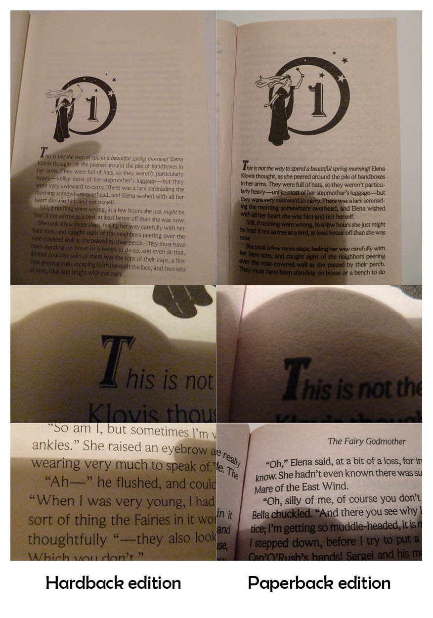
One major difference between the two editions is the paper quality. The paperback edition uses lower quality paper, which means the ink has bled slightly, giving the pages darker 'colour'. This is particularly obvious in the photos below.
 As you can see, the detail on the dropcap is not visible in the paperback edition. The main text also looks much cleaner and is easier to read in the hardback edition, even though the same typeface is used. This typeface is midway between a serif and sans serif typeface, with very small serifs.
One interesting layout choice for the chapter pages is that the image is proportionately larger in the paperback edition. Possibly this is to balance out the smaller page margins of the paperback.
Both editions have quite a lot of show-through; this is particularly evident on the page before the illustrated chapter heading:

Another interesting layout feature of the hardback edition is that the largest margin is the top margin. The hardback has very large margins in general, but normally the bottom margin would be the largest.

No comments:
Post a Comment