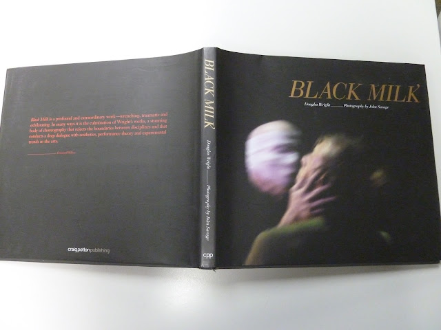
First is the cover colour palette, particularly the colour chosen for the blurb text. Red-on-black is very hard to read, and the colour seems odd given that the rest of the text is either in gold or white.
The text is ragged-right, but some of the alignments are strange, with line-breaks in odd places and variations in measure between pull-quotes and the main text.
There's also a strange variation in the page numbers on page 27. The other page numbers are all aligned to sit closer to the inside margin than the outside one, but on this page, the page number is shifted downwards, centre-aligned, and enlarged. It just seems to be this one page that does this, so I have to assume it's a typo rather than a design choice. If it is a design choice, I have no idea what was behind it.
Another interesting aspect of this book is that it changes from matt to glossy paper half-way through. The photo below shows the mid-point where it changes. On the left is the matt paper, and on the right is the glossy.
The latter half of the book seems to include less text and more full-page spreads of photos, so it makes sense from a cost perspective to make this half glossy if it wasn't affordable for the whole book.


No comments:
Post a Comment