Showing posts with label covers. Show all posts

Saturday, 20 October 2012

I see what you did there


Really? I have to admire the sheer audacity of this cover design. What I find particularly amusing about it is that it's clearly a cash-in on the mega success of Fifty Shades of Grey, but it's invoking Twilight with it's cover art/layout. It seems like both an acknowledgement of Fifty Shades of Grey's fanfiction origins and a dig at the abusive undertones of Twilight.

Monday, 20 August 2012

Fifty Shades of Grey Cover Trends

So, design scrapbook is officially over, but I couldn't resist making a post about about this. It's insane. Actually insane. Look at this:
We have books clearly cashing in on the Fifty Shades of Grey craze advertising this through echoing the design of Fifty Shades of Grey, which in turn cashed in on the Twilight craze, blatantly mimicking cover elements from that series. It's like the book cover version of Matryoshka dolls!

Wednesday, 4 July 2012

Another oddly sized book

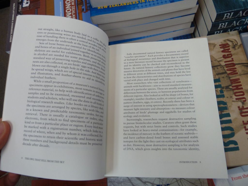
Here's Awa Press' The Owl that Fell from the Sky. The very first thing I noticed about it was its odd size - it's approximately the height of an A-format paperback, but much wider ( 170 x145mm), giving it an almost square appearance.

Aside from the format, the cover design is lovely with a simple black/white/teal colour palette. The only part I question is what appears to be a strange ligature between 's' and 't' - it distracts from the otherwise clean-cut nature of the cover design.


Looking at a page-spread, the margins have been chosen to create a text panel with relatively traditional proportions, rather than the square-ish proportions of the book. This measure works well, without needing too many hyphens (I can't actually see any on this page-spread). I also note the use of the em rather than en dash - this seems appropriate, as the em dash is slightly more old-fashioned, and this book is about museum specimens.

Tuesday, 26 June 2012

Pretty cover and ragged edges

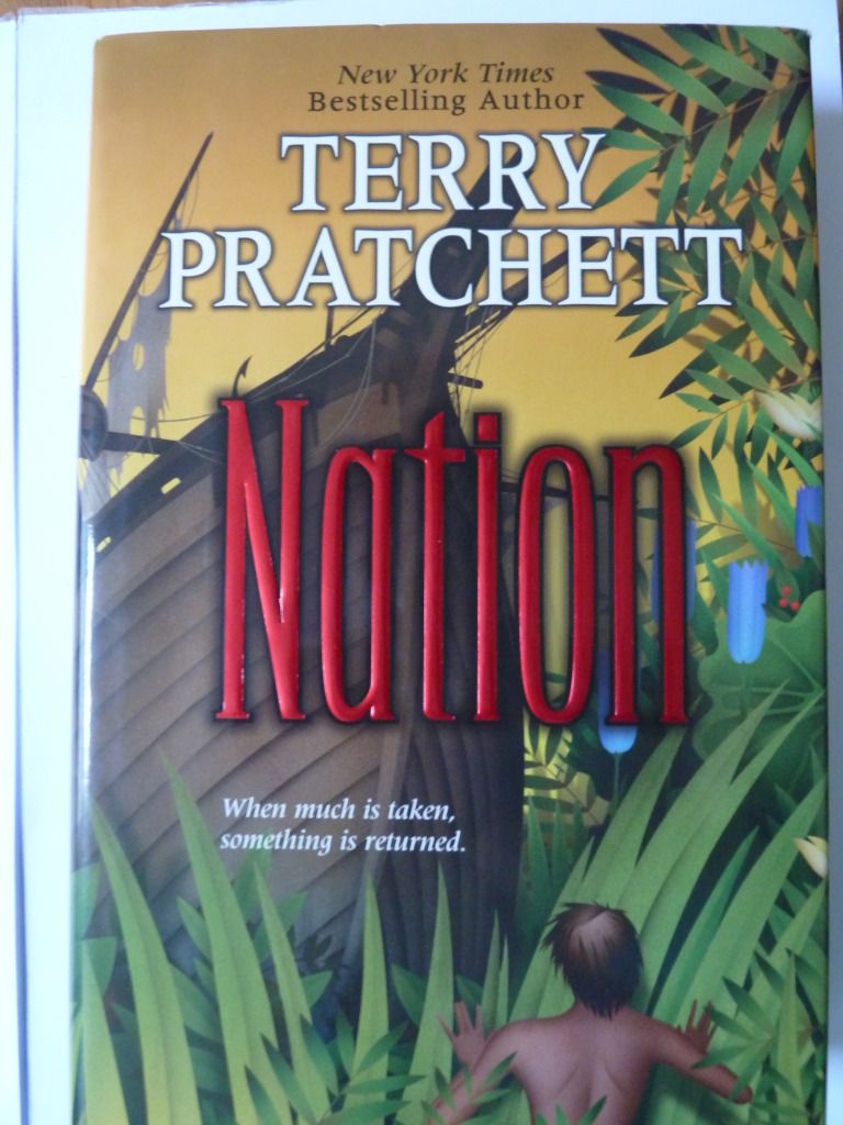
Presenting Terry Pratchett's Nation:

The author's name and title are clearly displayed in the order of importance, and are very easy to read despite the busy background. The title is eye-catching because it is foil-stamped, with a drop shadow for added emphasis.

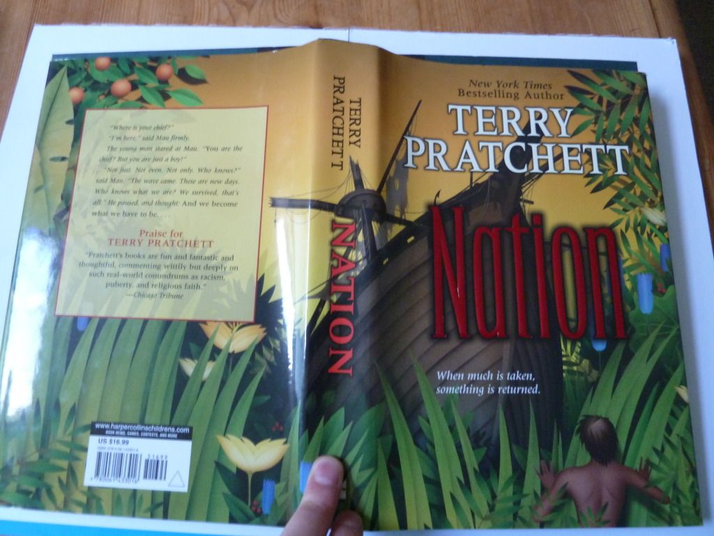
The dust-cover shows one continuous scene - which I think is always a nice design touch. The transparent text box used for the blurb is a good way to put text on top of a busy background, whilst still allowing the sense of the image to be conveyed. 

As this is the US hardback, it also has a ragged 'rough cut' edge (something more common in the US). I find it makes it harder to flick through pages, and it makes the book feel less 'perfect', but it also adds an element of interest.

Monday, 25 June 2012

A book that looks low-budget and homemade, but isn't

I wanted to include this very strange book about jewellery, published by a German publisher. Firstly, here's what you assume is the cover:

However, here's the book's actual cover:
click to see dots that make up the image.
The image is made out of lots of little dots and seems to be a knife handle wrapped with wire. The grainy image quality is continued throughout the book. Here's a shot of that shows the general low-resolution quality of the images (this is quite hard to capture in an image displayed on a computer screen):
This low-res image quality is clearly a deliberate design choice, possibly to give the feel of a 'home-made' documentary. The low quality images also tie in with the 'raw' coverboards and 'naked' spine. It's a wee bit pretentious, as I imagine it was much more expensive to have all these 'naked' details than it would have been to produce a more conventional-format book.

Another interesting design choice is the layout of the text panels:
There is a huge top margin, and equally-sized bottom and side margins. The measure is also very wide - 102 characters by my count. The normal 'comfortable' range for reading running text is 45-75 characters per line. This is well outside that - possible the huge top margin is to help balance this out, but it is still hard to read all the way to the end of each line.

Update 27 July
I forgot to add that, although pretentious, I think the unconventional format works for this book. It's targeted at a very niche market - contemporary jewellery designers - and the deliberate pushing of boundaries is likely to appeal to this audience.

Sunday, 24 June 2012

Cool cover - Gold by Chris Cleave

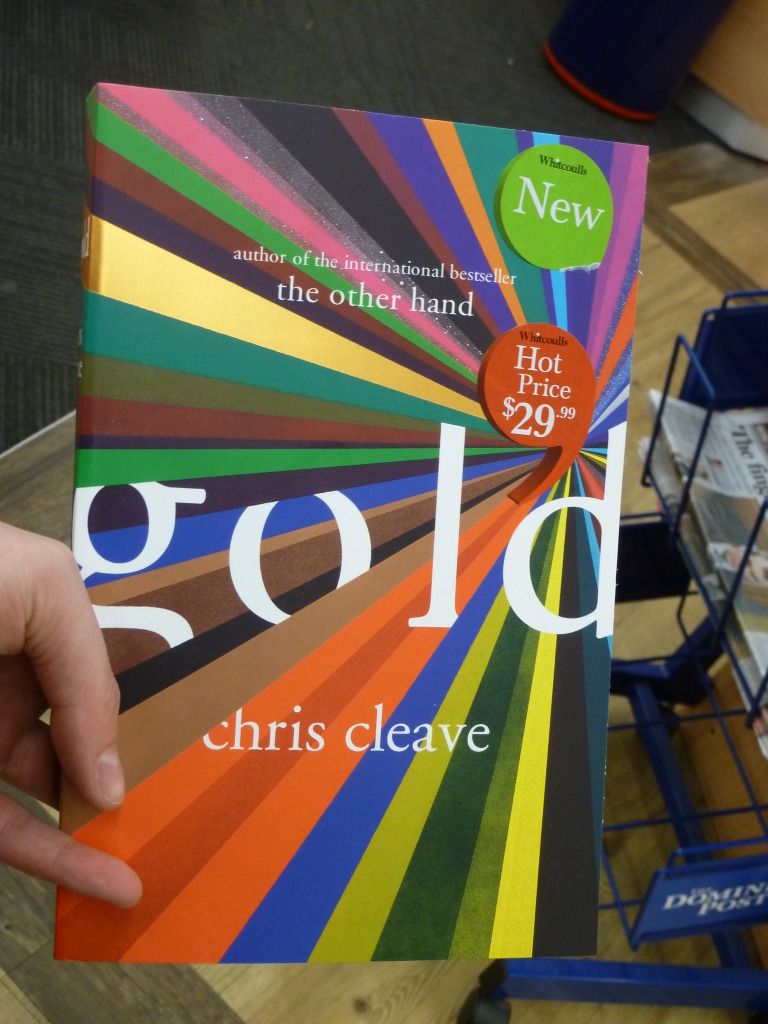
This caught my attention the other day:
With all those colours and the stripe of gold foil, it's very eye-catching. This is a novel about Olympic cyclists, and I see the multiple colours receding into the distance as representing the blur of cyclists wearing different colours and moving at speed.
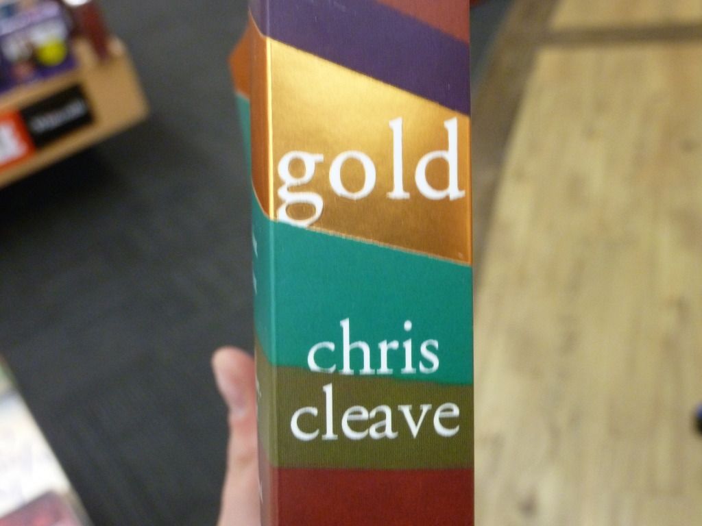
The stripe theme is carried over the whole cover. Here's the spine, with the title located on the stripe of gold foil.
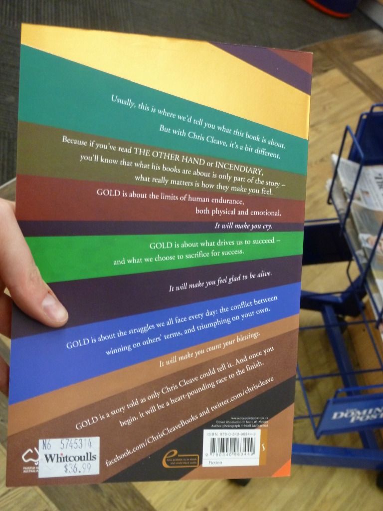
Then there's the back, with the blurb text aligned so each paragraph sits aligned on a stripe. Overall the text is roughly right-aligned, following the curve of the stripes receding into the distance. This makes the blurb more exciting, but it's still pretty easy to read.

Friday, 22 June 2012

Cool children's book typeface

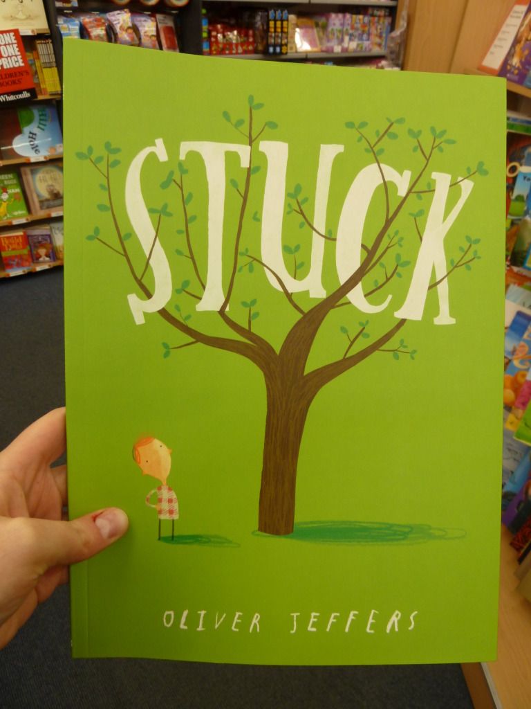
I found this rather charming children's book Stuck.
I think this is a really successful cover.

  • The title is easy to read because of its size and contrast, even though it is in an uneven typeface with a hand-lettered feel to it. 
  • The title's typeface also suits the illustration style, and the positioning of the letters between the tree branches anchors the title to the cover image. 
  • The typeface for the author's name matches the typeface used for the inside lettering (more on this below).
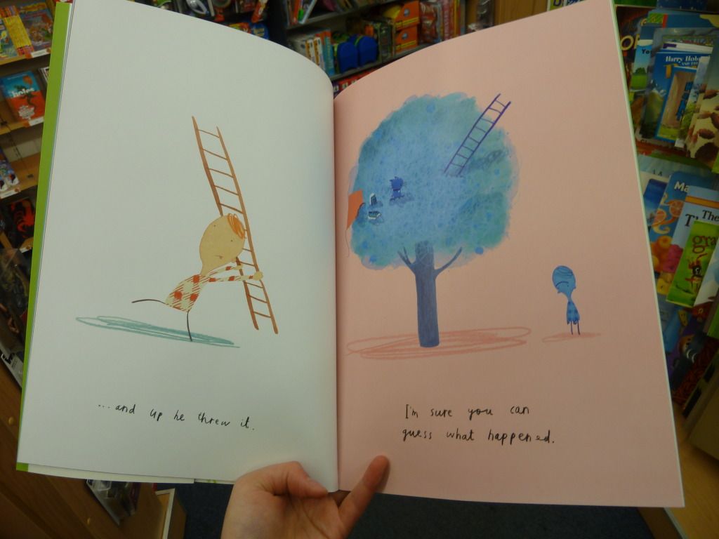
Here is a page spread from the book:

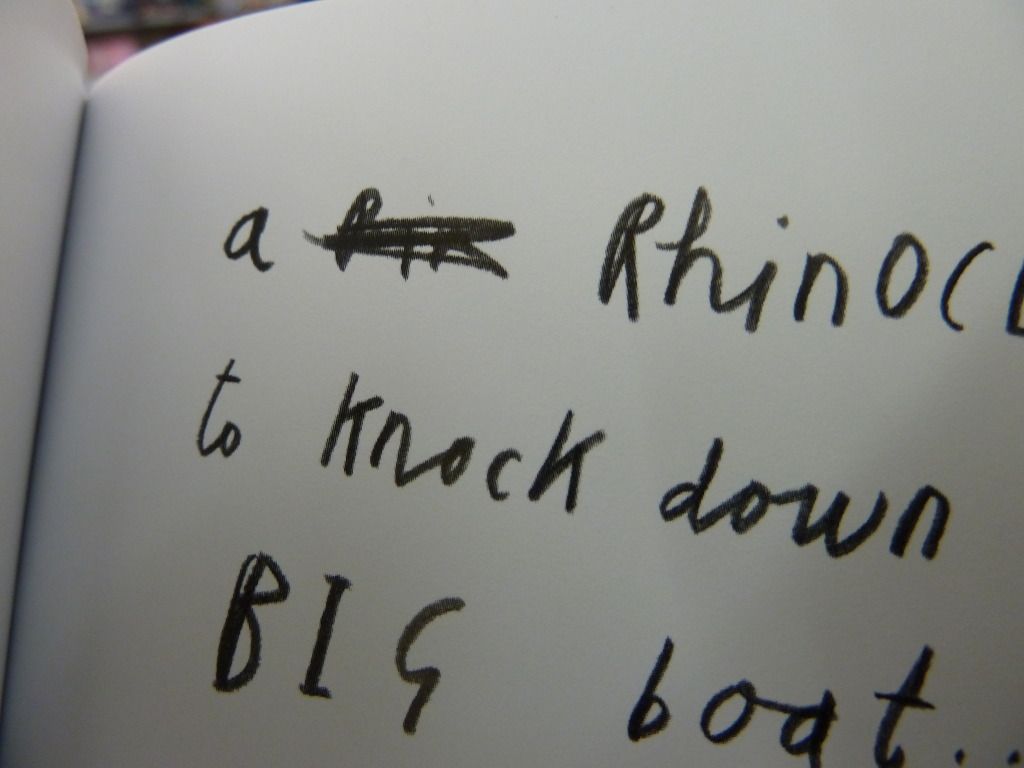
The typeface used for the text is a child's scribbly pencil handwriting (is it still a typeface if it's hand-written?). This suits the scribbly nature of the illustrations, and makes the narrator seem more authentic. I particularly like how in the photo below, the narrator has had two tries at spelling a difficult word (rhinoceros) and crossed out the first attempt.

This book also has cover flaps, and designs on the inside of the cover, a nice additional touch.

Unconventional cover and binding

I found this book the other day with an unconventional cover.
 It takes you a moment, but eventually you notice that you can lift the paper up directly under the title. And then you keep unfolding, and eventually you unwrap the book entirely and discover this: a poster dust jacket made of luxuriously thick paper.

This is a lovely book, but one thing I noticed about the binding was the distance between stitches. I've circled them in the photo below and you can see that the bottom stitch is significantly farther from the edge of the paper than the top stitch.
What this means is that when you turn the pages, if you're at the beginning of a new signature of pages the bottom right corner catches as you turn. Like so:

An interesting design feature of this book is the location of the barcode. This would usually be located on the outside of the back cover, but in this book it is located inside the back cover, presumably to avoid taking up space on the dust jacket poster.

And yet another interesting design choice is the mixture of paper stocks used in the book. You can see the marked colour variation between the two different paper stocks in the photo below.

Different Harry Potter covers

In a fit of nostalgia, I thought I'd do a comparison of different covers for the UK editions of one of the bestselling novels of all time: Harry Potter and the Philosopher's Stone.

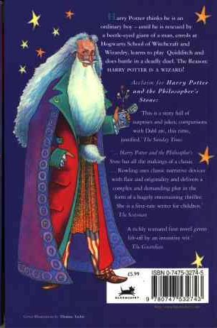
First, the edition I own, published in 1997 (though sadly not a first edition). This edition is notable for the strange man on the back cover, who in later editions is replaced with Albus Dumbledore (see the cover on the right).


I have mixed feelings about this cover. Looking at it now, it has a sort of quirky, nostalgic charm to it. However, I remember being given this book when I was 11 or 12 and thinking that it was one of the lamest and most childish covers I'd seen. I've read that this book was initially targeted at ages 9-11, so speaking from my memory of being the target market, I can't say I found it appealing.

Comments:

  • It's interesting that the character's name is presented as the most important piece of information on the cover. Since the character's name is the same for the entire series it provides a simple way for readers to quickly identify all of books in the series.
  • The typeface used for "Harry Potter" is a slightly old-fashioned serif, in keeping with the tone of the book. The script-like typeface for "and the Philosopher's Stone" is clearly an attempt to convey the fantastical nature of the book's contents.
  • The bright block colours have clearly been chosen to appeal to children.

Bloomsbury clearly cottoned on to the fact that not just kids liked the books by bringing out the first UK adult edition, published in 1998:

This cover is horribly unappealing on several levels:

  • It looks incredibly dated.
  • Nothing on this cover suggests its a fantasy novel.
  • The dark black and white cover photo implies that this is a serious book with dark themes.
  • The author's name seems to be floating randomly in space, un-anchored to anything around it.

The later adult edition in 2004 is a huge improvement:
  • Interestingly, the "Philosopher's Stone" part of the title has been deemed more important than the main character's name for this edition.
  • Again, this isn't a cover that says "fantasy", although it's better than the earlier adult edition.

Finally, the most recent children's edition the "signature edition" in 2010.


  • This is a very clean look compared to the earlier children's edition.
  • The simple centre alignment of all the text, and the focus of the image, makes a clear path from top to bottom for your eyes to follow.

Wednesday, 20 June 2012

Papyrus Alert!

Spotted this children's book the house that went to sea. The title is in our friend Papyrus, with the first letter of each word in smallcaps. Even though this is a very recognisable font, I think it suits this cover as the curved lettering is reminiscent of gentle waves.

Tuesday, 19 June 2012

Cool cover texture

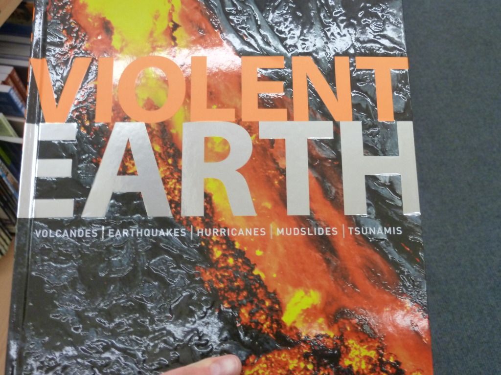
Check out the cover of Violent Earth. It's hard to capture its full awesomeness in photos, but I'll try.

Firstly, there's the crumpled plastic texture of the lava background. This is a very tactile cover that begs to be handled - a good selling point for a coffee table book.


The lettering on the cover hasn't been neglected either, with spot gloss for "Violent" and a metallic gloss for "Earth". This typeface is also well-chosen, as the bold, capitalised sans serif stands out against the busy, textured background.

Monday, 11 June 2012

Bitterblue - interior design oomph

Look at this lovely book, Bitterblue by Kristin Cashore:
The title is in gold ink (imitation) that really stands out against the blue background. The cover image is very dark, but this makes the white text easy to read.

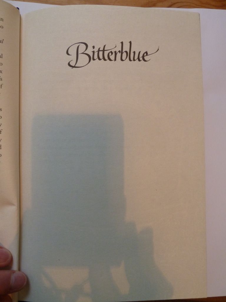
And as well as the extremely attractive cover, this book also has lovely design elements on the inside. First, the half-title page:

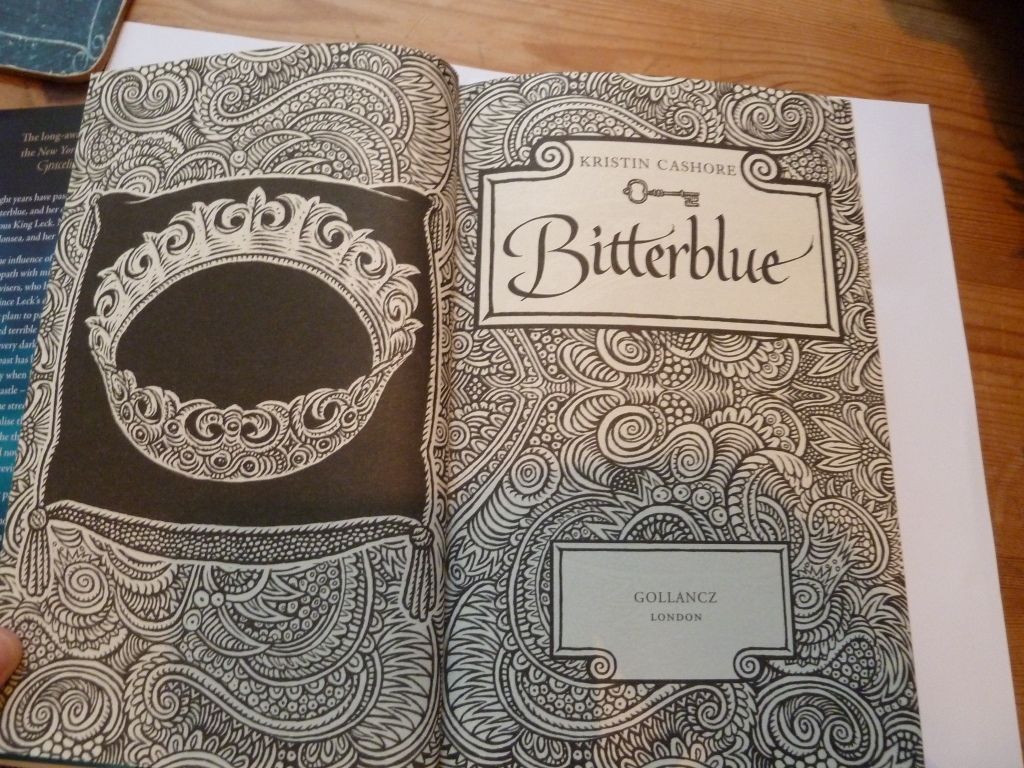
Simple yet effective, it repeats the typeface used on the cover. Then we have the title page:

The title page is given extra emphasis by being given a double-page spread with lovely illustrations with a 'wood-cut' feel to them. This style of illustration is continued throughout the book.

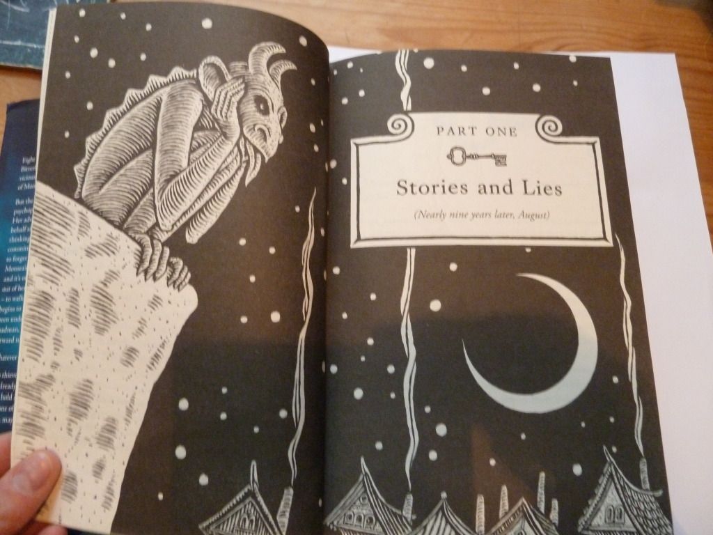
Each part of the book has its own part-title page:

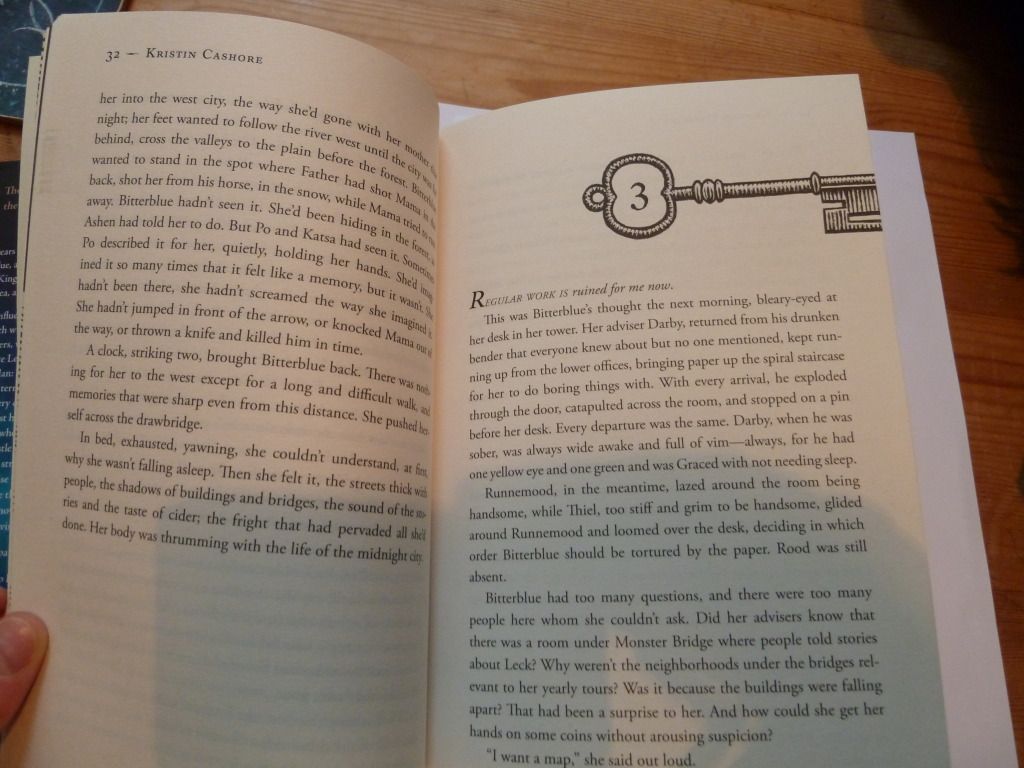
Then each chapter heading has a key motif. This refers to the fact that the book is about unlocking secrets (the US edition features keys as the central image on the cover).

The end result of all this interior designy goodness is that when closed, there is a rather nice pattern formed:

Friday, 8 June 2012

Cover trends in NZ fiction, or 50% Shades of Brown

I haven't included many NZ titles on this blog, so I have taken it upon myself to produce an infographic of NZ fiction covers, inspired by this post. The titles I've included were all published in 2011, and are all classified as "general or literary fiction" according to their metadata. There are 23 in total.

As you can see, the covers are heavily weighted towards brown/grey, with red coming in as a popular second choice. I can literally count the number of titles that are not brown or red on one hand. Looking at this, it doesn't seem that surprising that NZ fiction has a reputation for being dreary and depressing.

Close-ups of people's faces also seem to be a popular choice.

Saturday, 2 June 2012

The Hunger Games: e-book version

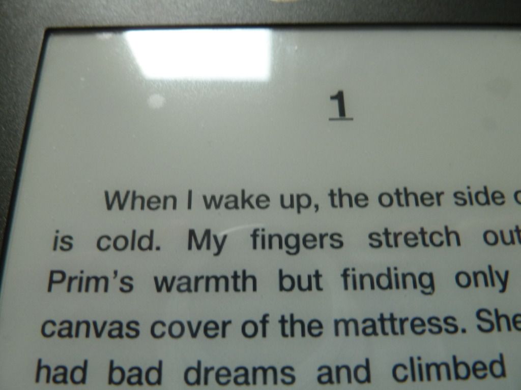
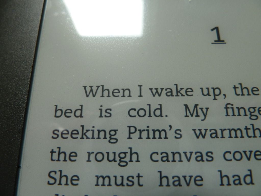
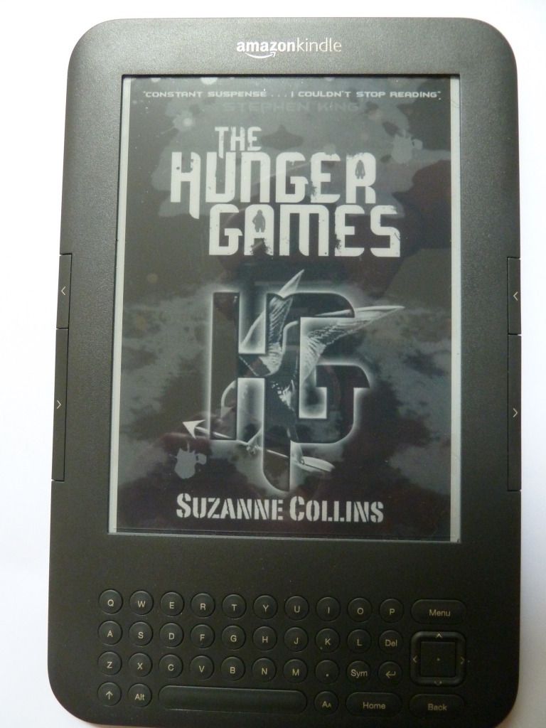
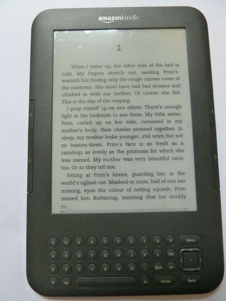
Today I'm going to consider the kindle version of The Hunger Games. Here's the cover:

And here's the title page:

The value of a cover page for an ebook is debatable. On a kindle, when you click on the book's name in the home page, you get taken straight to the first page of chapter 1 and skip the cover page entirely. And if including a cover page is debatable, including a title page is even more so. In a physical book, the title page establishes the proper title and author of the book for cataloguing purposes. On its verso you would usually find further publication information and the book's copyright statement. But you don't need this in an ebook - you can have the page with all the publication information without needing a title page to go on the other side. In this particular ebook, the publication data and copyright is at the end of the ebook.

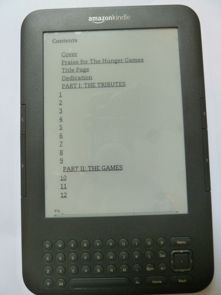
And here's the table of contents, where if you click on a chapter heading you'll be taken straight to that page:

This table of contents is ugly, with no regard for pleasing layout. It's also somewhat difficult to navigate, as you can't see the whole table of contents on one 'page'.

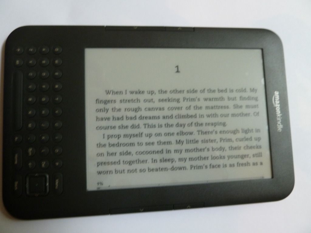
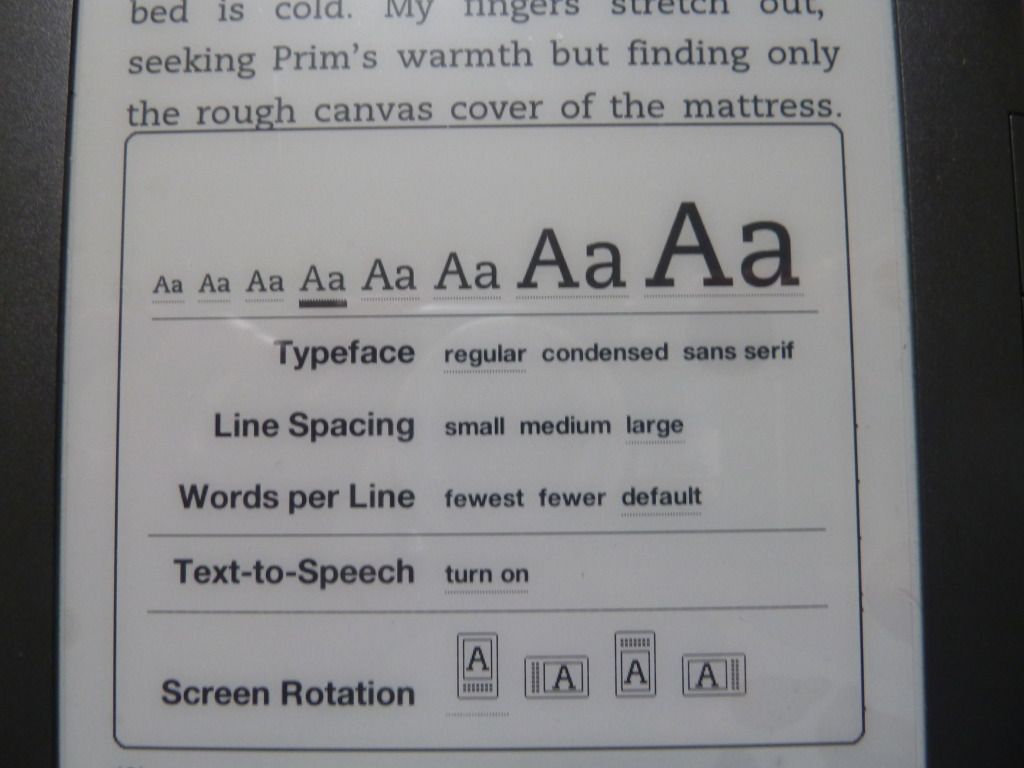
In terms of the page layout, this is pretty much up to the user. I can make the text bigger or smaller, change the typeface from regular to condensed or sans serif, change the line spacing, and even change the page orientation:
smaller text
larger text


sans serif typeface
regular typeface


landscape orientation
When the reader can change how the page looks at will, this defeats the purpose of designing a perfectly balanced page-spread. The downside is that the layout is not as nice as that of a print book. The upside is that it puts power in the reader's hands: they can read it in the format they find easiest. I think the ability to change the size of the text is probably the most useful, as many people suffer from eye problems that make reading smaller text difficult.

Thursday, 31 May 2012

Thumbnails for buying online

More and more people are buying books either online or as ebooks, which means what people see when they're browsing are tiny thumbnails. So what makes a thumbnail cover, as opposed to a print cover, stand out?
Of the above, the ones that stand out are the ones where the design is:
  • bold with lots of contrast
  • uncluttered
  • where text is an important part of the design, it is large and in an easy-to-read typeface
The Steve Jobs biography stands out the most for me, even though the type is impossible to read at this small size. This doesn't matter though, because the title is displayed immediately below the cover image. The black and white also translates well onto e-readers that use only e-ink and don't display colour.