
The successful example above is from Trees of New Zealand: Stories of Beauty and Character. A beautiful photograph of leaves has been used for the background of the page-spread, but the overlying text is still perfectly readable. This is a simple left-aligned short contents which uses a serif typeface. The hierarchy of information is clear, with the less important sections at the beginning and end of the book shown in italics. I'm not sure why the heading is in a different typeface - it's already larger than the other text and centre-aligned, so changing the typeface as well seems somewhat redundant.
I also like the placement of the imprint information - it's there if you want to read it, but it's in a smaller font and located lower down the page than the contents, so it doesn't distract from the either the photography or the table of contents.
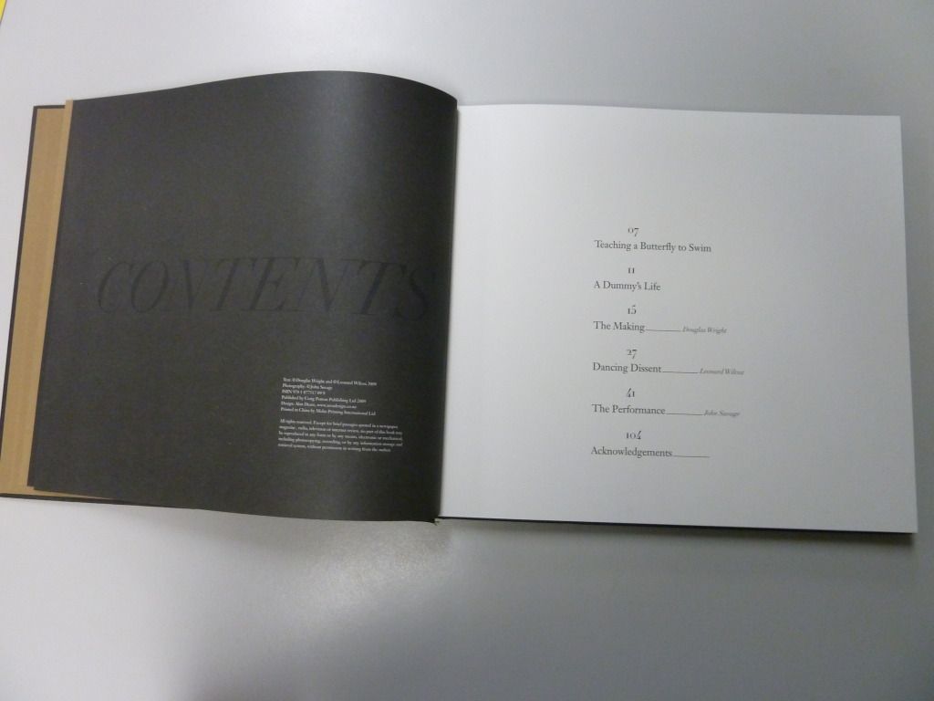
This is an unsuccessful example taken from the book Black Milk. Whilst the black-on-black title is a cool design feature, your eye is drawn to the verso page first, which features the less important imprint information, rather than the recto page featuring the contents. Additionally, the layout of the table of contents is unnecessarily hard to read with page numbers centre-aligned above the chapter titles.
No comments:
Post a Comment