Showing posts with label genre: fantasy. Show all posts

Friday, 22 June 2012

Different Harry Potter covers

In a fit of nostalgia, I thought I'd do a comparison of different covers for the UK editions of one of the bestselling novels of all time: Harry Potter and the Philosopher's Stone.

First, the edition I own, published in 1997 (though sadly not a first edition). This edition is notable for the strange man on the back cover, who in later editions is replaced with Albus Dumbledore (see the cover on the right).
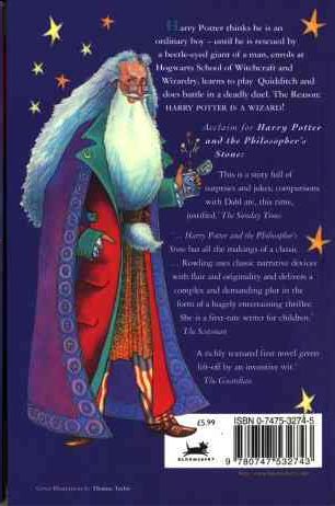


I have mixed feelings about this cover. Looking at it now, it has a sort of quirky, nostalgic charm to it. However, I remember being given this book when I was 11 or 12 and thinking that it was one of the lamest and most childish covers I'd seen. I've read that this book was initially targeted at ages 9-11, so speaking from my memory of being the target market, I can't say I found it appealing.

Comments:

  • It's interesting that the character's name is presented as the most important piece of information on the cover. Since the character's name is the same for the entire series it provides a simple way for readers to quickly identify all of books in the series.
  • The typeface used for "Harry Potter" is a slightly old-fashioned serif, in keeping with the tone of the book. The script-like typeface for "and the Philosopher's Stone" is clearly an attempt to convey the fantastical nature of the book's contents.
  • The bright block colours have clearly been chosen to appeal to children.

Bloomsbury clearly cottoned on to the fact that not just kids liked the books by bringing out the first UK adult edition, published in 1998:

This cover is horribly unappealing on several levels:

  • It looks incredibly dated.
  • Nothing on this cover suggests its a fantasy novel.
  • The dark black and white cover photo implies that this is a serious book with dark themes.
  • The author's name seems to be floating randomly in space, un-anchored to anything around it.

The later adult edition in 2004 is a huge improvement:
  • Interestingly, the "Philosopher's Stone" part of the title has been deemed more important than the main character's name for this edition.
  • Again, this isn't a cover that says "fantasy", although it's better than the earlier adult edition.

Finally, the most recent children's edition the "signature edition" in 2010.


  • This is a very clean look compared to the earlier children's edition.
  • The simple centre alignment of all the text, and the focus of the image, makes a clear path from top to bottom for your eyes to follow.

Tuesday, 19 June 2012

Comparing a paperback and hardback

I'm going to compare the paperback and hardback editions of The Fairy Godmother by Mercedes Lackey.

Besides the obvious size difference, the covers are virtually identical. One minor difference is the formatting of the "A tale of the Five Hundred Kingdoms" tagline. Also, "five" is not capitalised for the paperback version.

Other general cover comments:

  • The author is clearly the most important piece of information on the cover.
  • The decorative typeface chosen for the author's name and the book title conveys the whimsical, romantic tone of this book.
  • To make it clear that this book is targeted at woman, there's a very feminine woman in the foreground with pink flowers in her hair (this does not happen at any point in the actual book).
  • Just to make it extra clear that this book is targeted at women, there's also some random pink sparkles. These also serve the dual purpose of conveying that this is a fantasy novel.
  • Just in case you still hadn't realised that this book is targeted at women, the author's name is foil stamped in metallic gold - a convention often used for romance books.
The paperback version lacks a half-title page, but the title pages for both editions are the same.

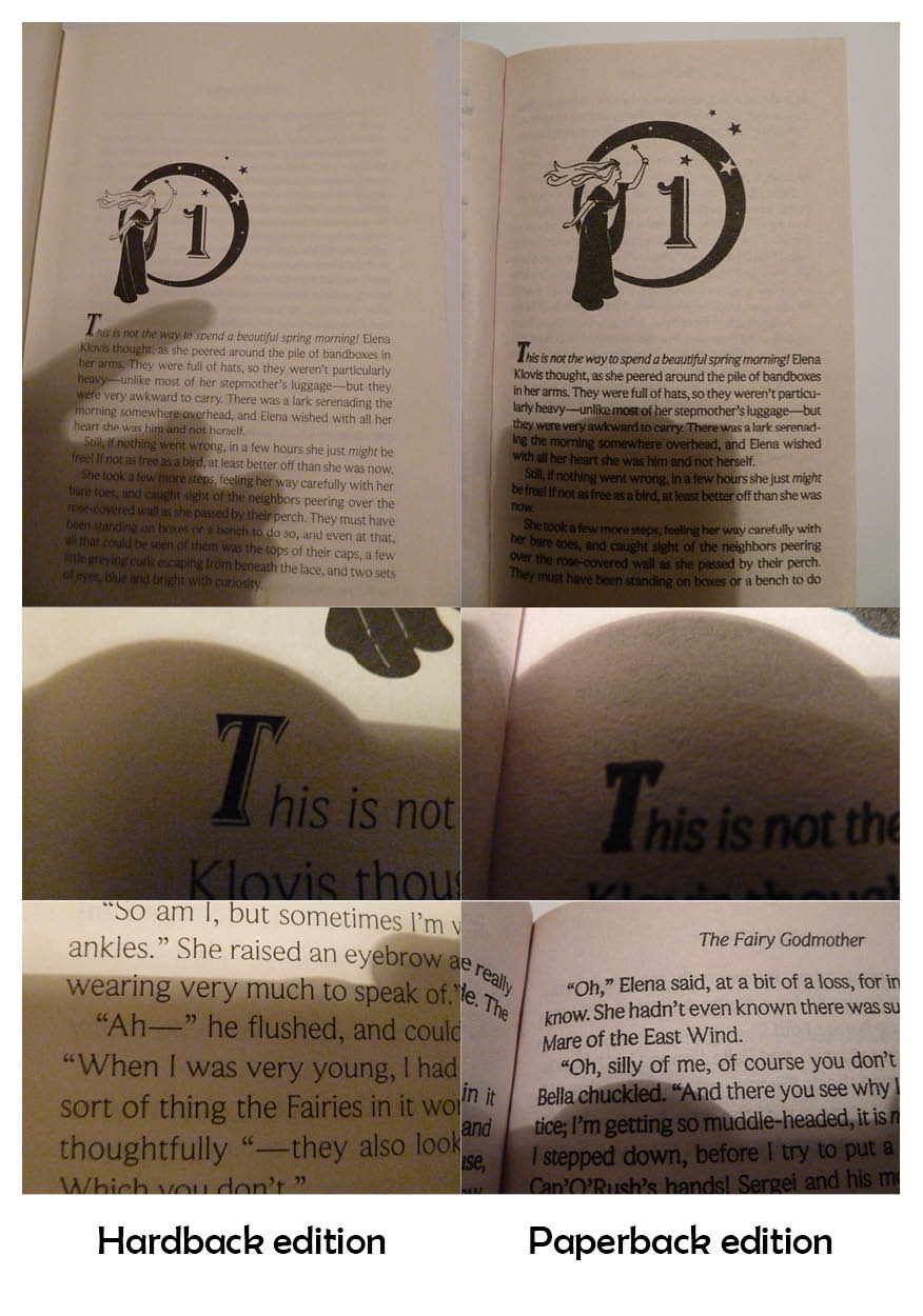
One major difference between the two editions is the paper quality. The paperback edition uses lower quality paper, which means the ink has bled slightly, giving the pages darker 'colour'. This is particularly obvious in the photos below.

As you can see, the detail on the dropcap is not visible in the paperback edition. The main text also looks much cleaner and is easier to read in the hardback edition, even though the same typeface is used. This typeface is midway between a serif and sans serif typeface, with very small serifs.

One interesting layout choice for the chapter pages is that the image is proportionately larger in the paperback edition. Possibly this is to balance out the smaller page margins of the paperback.
Both editions have quite a lot of show-through; this is particularly evident on the page before the illustrated chapter heading:

Another interesting layout feature of the hardback edition is that the largest margin is the top margin. The hardback has very large margins in general, but normally the bottom margin would be the largest.

Sunday, 10 June 2012

Frontmatter and Internals

I thought I'd delve more deeply into Brandon Sanderson's The Way of Kings (for a break-down of the cover art, see this post).

Here's the frontmatter (apologies for the shadow of my camera). I think the page-borders (reminiscent of parchment) are a great way to add interest to what can be a relatively boring part of a book. However, I'm not sure that the mixture of typefaces was the best choice for the title-page.

Moving on to the chapter pages, each new chapter has a page of illustrations (from one of the character's journals) and a very decorative chapter title. The text associated with the illustrations is somewhat difficult to read, but feels hand-lettered, like you really are seeing a real page from the character's journal.

The decorative chapter title seems a little too much, particularly for a small paperback. We have an archway with the name of the chapter, an image, then a quote from one of the character's research notes, then a dropcap. Altogether, this page-spread feels very squashed.

Speaking as the target market, however, I have to say I loved these extra design details when I was actually reading the book. I imagine the layout was less squashed in the hardback edition.

Friday, 20 April 2012

Books in the same series

Obviously, if a reader likes a book they’re likely to want to read the next book in the series. Cover design within a series is all about making life easy for the reader – book 2 in the series should look as much like book 1 as possible. Another consideration is that series are usually stacked together on bookshelves, forming a large block ‘billboard’ of spines that can also be used to attract new readers.

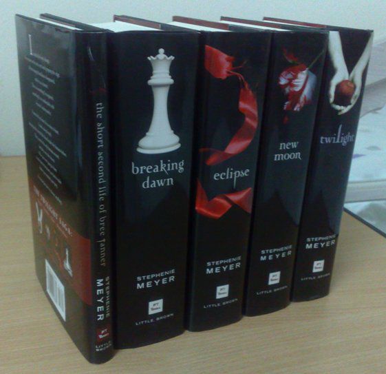
With the Twilight series below, the covers all share the same design and together form an impressive large black colour block of spines.
 
A series with clever spine designs is the Mistborn Trilogy by Brandon Sanderson. On the spine, the ribbon connects to the next book in the series and the cover figure gets progressively closer.
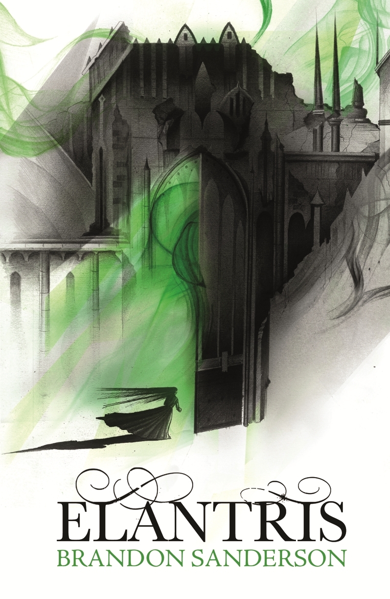
I also have to mention a clever bit of cover design I've noticed for Brandon Sanderson's books. Since he became a bestseller, all his books have taken on similar design elements. They're all white with a single accent colour. Books within the same series (like the Mistborn Trilogy above) have the same accent colour. Books from different series have a different accent colour. See Elantris and The Way of Kings below. Both of these books are different series, but the standard design elements make it easy to find books by this author.

Update 22 June 2012:
I've also noticed another bit of cover trending here, with the Night Angel trilogy by Brent Weeks using similar design elements to Brandon Sanderson's for its covers. Brent Weeks and Brandon Sanderson target exactly the same demographic, so it makes sense for the covers to share design elements. If readers pick up a book by Brent Weeks when they wanted a book by Brandon Sanderson, it's a win from a marketing perspective because they have picked up a book they will probably be interested in anyway. I also wonder if it has anything to do with the fact that S and W are usually shelved fairly close together in the fantasy/sci-fi section of most bookstores.

Update 27 June 2012:
And yet more fantasy books to add to the trend pile! What is it with the ribbon love?