Showing posts with label trends. Show all posts

Saturday, 20 October 2012

I see what you did there


Really? I have to admire the sheer audacity of this cover design. What I find particularly amusing about it is that it's clearly a cash-in on the mega success of Fifty Shades of Grey, but it's invoking Twilight with it's cover art/layout. It seems like both an acknowledgement of Fifty Shades of Grey's fanfiction origins and a dig at the abusive undertones of Twilight.

Monday, 20 August 2012

Fifty Shades of Grey Cover Trends

So, design scrapbook is officially over, but I couldn't resist making a post about about this. It's insane. Actually insane. Look at this:
We have books clearly cashing in on the Fifty Shades of Grey craze advertising this through echoing the design of Fifty Shades of Grey, which in turn cashed in on the Twilight craze, blatantly mimicking cover elements from that series. It's like the book cover version of Matryoshka dolls!

Friday, 8 June 2012

Cover trends in NZ fiction, or 50% Shades of Brown

I haven't included many NZ titles on this blog, so I have taken it upon myself to produce an infographic of NZ fiction covers, inspired by this post. The titles I've included were all published in 2011, and are all classified as "general or literary fiction" according to their metadata. There are 23 in total.

As you can see, the covers are heavily weighted towards brown/grey, with red coming in as a popular second choice. I can literally count the number of titles that are not brown or red on one hand. Looking at this, it doesn't seem that surprising that NZ fiction has a reputation for being dreary and depressing.

Close-ups of people's faces also seem to be a popular choice.

Friday, 25 May 2012

Girls in pretty pretty dresses

So, another post on YA cover trends. This time, it's the girls in pretty dresses. There seem to be rather a lot of them out there:

I can see why it's a popular design; they're very striking and strongly designed to appeal to teenage girls for the following reasons:
  • the use of teenage models
  • the luxurious dresses invoking a romantic feel
  • the melodramatic atmosphere
  • the element of mystery when we have a girl wearing a ball dress in an unlikely location (often in the woods). It makes the viewer want to know why she's wearing that dress and where she's going, which makes it more likely they'll buy the book!
I also found a far more detailed breakdown on YA cover trends than I've done here: http://www.katehart.net/2012/05/uncovering-ya-covers-2011.html

Sunday, 13 May 2012

White covers

I've been seeing a few white covers with low contrast around lately, like the ones below:


Given the current trend towards dark covers for young adult books, this could be a smart way for books like the ones above to stand out on the shelf. However, this kind of cover only works if the vast majority of the other books are not white, so as soon as it becomes a trend it loses a lot of its stand-out value.

The fact that the title of Julianna Baggott's Pure is not easy to read at a distance might actually work in its favour, if people are compelled to look more closely. This title is also notable for being published with two different covers: low-contrast white and low-contrast black.

Sunday, 22 April 2012

I may be imagining things...

but is it just me who thinks these two covers bear some resemblance to each other? A shout-out to the fact that Fifty Shades of Grey started as Twilight fanfiction?


The shape of the tie almost exactly echoes that of the ribbon on Eclipse's cover. The location of the title is also very similar, plus the fact that both have dark backgrounds.

On a tangential note, the Fifty Shades of Grey cover also has a not-so-very-subtle visual pun going on with grey text on a grey-scale background. 

Friday, 20 April 2012

Books in the same series

Obviously, if a reader likes a book they’re likely to want to read the next book in the series. Cover design within a series is all about making life easy for the reader – book 2 in the series should look as much like book 1 as possible. Another consideration is that series are usually stacked together on bookshelves, forming a large block ‘billboard’ of spines that can also be used to attract new readers.

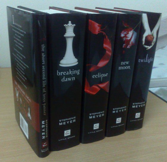
With the Twilight series below, the covers all share the same design and together form an impressive large black colour block of spines.
 
A series with clever spine designs is the Mistborn Trilogy by Brandon Sanderson. On the spine, the ribbon connects to the next book in the series and the cover figure gets progressively closer.
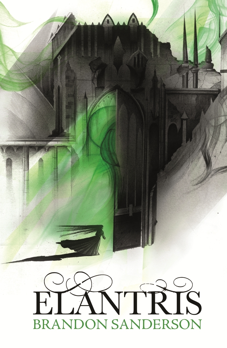
I also have to mention a clever bit of cover design I've noticed for Brandon Sanderson's books. Since he became a bestseller, all his books have taken on similar design elements. They're all white with a single accent colour. Books within the same series (like the Mistborn Trilogy above) have the same accent colour. Books from different series have a different accent colour. See Elantris and The Way of Kings below. Both of these books are different series, but the standard design elements make it easy to find books by this author.

Update 22 June 2012:
I've also noticed another bit of cover trending here, with the Night Angel trilogy by Brent Weeks using similar design elements to Brandon Sanderson's for its covers. Brent Weeks and Brandon Sanderson target exactly the same demographic, so it makes sense for the covers to share design elements. If readers pick up a book by Brent Weeks when they wanted a book by Brandon Sanderson, it's a win from a marketing perspective because they have picked up a book they will probably be interested in anyway. I also wonder if it has anything to do with the fact that S and W are usually shelved fairly close together in the fantasy/sci-fi section of most bookstores.

Update 27 June 2012:
And yet more fantasy books to add to the trend pile! What is it with the ribbon love?

International editions - case study 'Angel's Blood' by Nalini Singh

I find it interesting to compare different editions of the same book, especially foreign language editions. To that end I've collected various editions of Angels' Blood by Nalini Singh. The original version of Angels' Blood was published in the US in 2009. Angels' Blood reached our shores in the form of the UK/Australian edition in 2010.

US Edition
UK/Australian Edition

The title's typeface in the US edition draws heavily on romance genre conventions: decorative, foil stamped, drop shadow. The UK/Australian edition is edgier, and hints at horror/thriller elements with the dripping blood in the title.

Other editions are as follows. 

The Spanish and Portuguese editions are effectively the same as the UK edition, except the typeface for the title has been altered in the Portuguese version. The European versions seem to be more monochromatic than the various Asian editions as a general rule. The UK, Hungarian and French covers seem to be following the trend for predominantly black and white covers, with a single highlighting colour, very reminiscent of the iconic Twilight cover.

I think the Indonesian and Polish versions are the least successful, mainly because of the bad photo-shopping. On the Polish  cover the woman’s breasts have been photo-shopped out, leaving the model with an unnatural appearance. I've made some more detailed comments on the Indonesian cover below.
The Indonesian version also doesn't clearly express that this is a book with strong fantasy elements – this cover could belong to any romance novel. The other editions lacking a strong fantasy element on the cover (such as the US and Japanese editions) still have a fantastical feel because of mystical background lighting.

Another thing I find interesting with the different editions is whether the author’s name or the book’s title is deemed more important. The most important element is the biggest, boldest, and is usually located at the top. The editions seem to rank the importance of the title versus the author’s name as follows:

Title more important
Author more important
UK/Australian
French
German
Hungarian
Italian
Japanese
Polish
Portuguese
Spanish
US
Indonesian
Thai

The logic behind this is probably because Nalini Singh is most well-known in the US market, so her name has strong brand appeal there. Outside that market, the name of the book is more likely to entice potential readers. I’m not sure why the Indonesian and Thai editions deem the author’s name more important.

Twilight and young adult cover trends

Twilight. Love it or hate it, it’s hard to deny its influence on Young Adult Fiction. Twilight, by Stephanie Meyer, was released in 2005 and I have a personal theory that Twilight’s initial success was largely due to its striking cover art. 


Break-down of Twilight’s cover art
The cover art of Twilight is deceptively simple, and therein lies its strength. Covers are billboards; they shouldn’t be complicated.
  • The colour palette is entirely black and white with the exception of a single bright red apple. This simple yet powerful design would have made the novel stand out from its more colourful neighbours when it was first published. 
  • The simple image of hands clasping an apple packs a hell of a symbolic punch. The image taps into well-known stories of temptation and turmoil: the forbidden fruit from the Garden of Eden, the apple of chaos thrown by Aphrodite that led to the Trojan War, and the poison apple given to Snow White by the evil queen. The colour scheme echoes this symbolism; red and black are colours associated with strong emotions: passion, love, and death. 
  • Added to the symbolism is the atmospheric name of the first instalment. 
  • The layout is very clear and draws the eye downward (elongated middle letter in the centre-aligned title plus the hands acting as an arrow pointing down to the author's name) 
All the elements of the cover reinforce each other, leading to a hugely powerful combination.

Does the cover match the contents?
So is the cover a fair representation of the book’s content? The dramatic symbolism and colour scheme might seem overly melodramatic for what is perhaps the commonest romance story in existence: girl meets mysterious, beautiful stranger and falls in love. However, Twilight’s content could also be described as overly melodramatic – part of its appeal to a teen audience is in its exaggerated emotional atmosphere. The cover encapsulates this mood perfectly.

Covers within the Twilight Series
There are four books in the Twilight series and they all have very similar designs. The colour scheme remains the same for all the covers, with only the central image changing. The images chosen for the rest of the series carry less symbolism than the original Twilight cover and appear to have been chosen more for aesthetic appeal than for any deeper reason.


Twilight and Cover Trends
Twilight has generated a trend of young adult novels that mix melodramatic love triangles and teen protagonists with supernatural elements. These books make themselves easy for Twilight-fans to find by echoing design elements from Twilight’s iconic cover. Below I’ve analysed some examples.

Vampire Diaries by L. J. Smith is particularly interesting because it was published over a decade before Twilight, but the Twilight - fuelled paranormal craze was clearly seen as an opportunity to re-issue this series. The new cover is clearly intended to echo Twilight, but the additional elements suggest that this novel is darker or more gruesome than Twilight.
pre- Twilight
Re-issued post-Twilight
Here are some other YA covers clearly influenced by Twilight, using one or more of the following elements:

  • black background
  • simple black-and-white image
  • single colour adding emphasis
  • atmospheric title
And I also present the following, in the ultimate attempt to draw Twilight fans to the classics:
I'm all for encouraging people to read classics, but marketing these as 'just like Twilight' is very misleading. I think the melodramatic cover is particularly inappropriate for Jane Austen's Pride and Prejudice. Also, Romeo and Juliet is a PLAY, not a NOVEL! 

Updated 12 May
I took this photo yesterday, and it shows the influence Twilight is continuing to have on YA covers. Just look at all that black!

I also realised that black covers are problematic from a purely practical point of view; they collect dust and fingerprints very easily.