Showing posts with label title page. Show all posts

Saturday, 30 June 2012

Some conventions are there for a reason...

I stumbled across this architecture book Forty-Six Square Metres of Land Doesn't Normally Become a House.
The cover is textured, and the narrow lettering of the title gets somewhat lost because of this. Despite this, I can see what this typeface was trying to achieve - it looks squashed, playing with the book's focus on restricted spaces.

The most shocking thing about this book is that when you open it, here's what the end-paper/first page looks like:
That's right - gasp - the book starts on the endpaper. There's no title page, no imprint page, and no table of contents - it's not at the back of the book either - and the book continues right up onto the last bit of end-paper. Maybe it's to reinforce the impression of 'squashed-ness'? Each page-spread certainly feels very squashed, with extremely narrow margins. The designer also seems to be very keen on showing off their grid, which does allow a great deal of flexibility in layout, but the narrow margins mean every single page feels uncomfortably constrained.
Eventually, I closed the book and spotted this:
Turning to the orange centre of the book, I found the missing imprint page, half-title page, title page, and table of contents. I guess the designer made them orange so they'd be easier to find. But you know what would have made them even easier to find? Yup, putting them at the beginning where everyone expects them to be. I see no reason for breaking this convention in this instance.
Updated 7 July:
The table of contents, although pretty, gives too much weight to the page numbers and not enough to the section headings (the actual information the reader is looking for).
Also, why on earth have a half-title page if it's going to be in the middle of the book and after the title page?

Monday, 11 June 2012

Bitterblue - interior design oomph

Look at this lovely book, Bitterblue by Kristin Cashore:
The title is in gold ink (imitation) that really stands out against the blue background. The cover image is very dark, but this makes the white text easy to read.

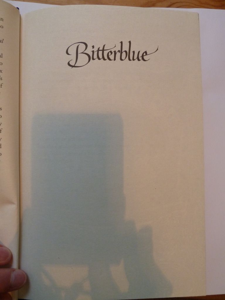
And as well as the extremely attractive cover, this book also has lovely design elements on the inside. First, the half-title page:

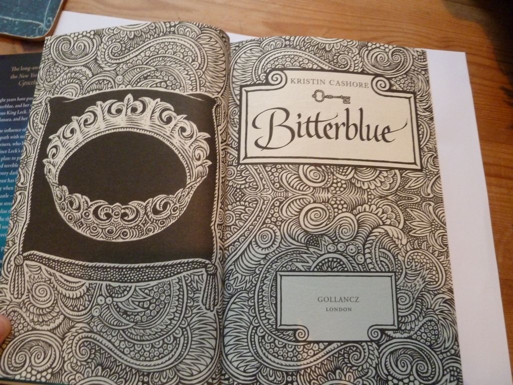
Simple yet effective, it repeats the typeface used on the cover. Then we have the title page:

The title page is given extra emphasis by being given a double-page spread with lovely illustrations with a 'wood-cut' feel to them. This style of illustration is continued throughout the book.

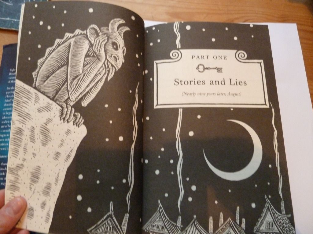
Each part of the book has its own part-title page:

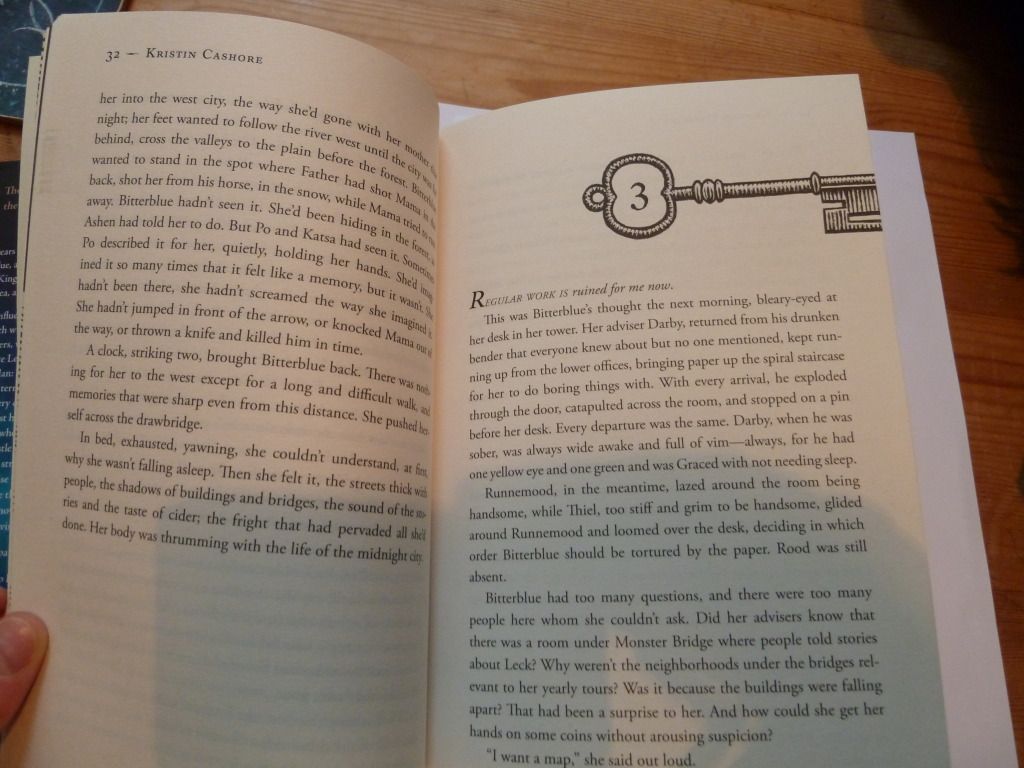
Then each chapter heading has a key motif. This refers to the fact that the book is about unlocking secrets (the US edition features keys as the central image on the cover).

The end result of all this interior designy goodness is that when closed, there is a rather nice pattern formed:

Sunday, 10 June 2012

Frontmatter and Internals

I thought I'd delve more deeply into Brandon Sanderson's The Way of Kings (for a break-down of the cover art, see this post).

Here's the frontmatter (apologies for the shadow of my camera). I think the page-borders (reminiscent of parchment) are a great way to add interest to what can be a relatively boring part of a book. However, I'm not sure that the mixture of typefaces was the best choice for the title-page.

Moving on to the chapter pages, each new chapter has a page of illustrations (from one of the character's journals) and a very decorative chapter title. The text associated with the illustrations is somewhat difficult to read, but feels hand-lettered, like you really are seeing a real page from the character's journal.

The decorative chapter title seems a little too much, particularly for a small paperback. We have an archway with the name of the chapter, an image, then a quote from one of the character's research notes, then a dropcap. Altogether, this page-spread feels very squashed.

Speaking as the target market, however, I have to say I loved these extra design details when I was actually reading the book. I imagine the layout was less squashed in the hardback edition.

Wednesday, 6 June 2012

Leading madness

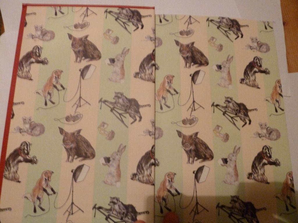
The book I'm examining today is Let's Pretend This Never Happened by Jenny Lawson. On opening the cover, the first thing you notice is the lovely end-paper. The end-paper has been carefully chosen to reflect the book's content (the author's father is a taxidermist, and this is an important part of her childhood).

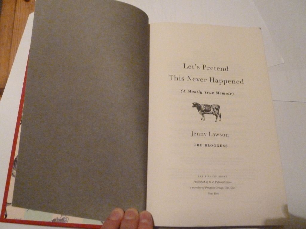
Then comes the front matter, starting with the title page:

I think the dark grey verso page gives more weight to the title page. The cow on the title page also continues the animal theme from the end-paper and cover (the cover features a mouse), without being too repetitive.

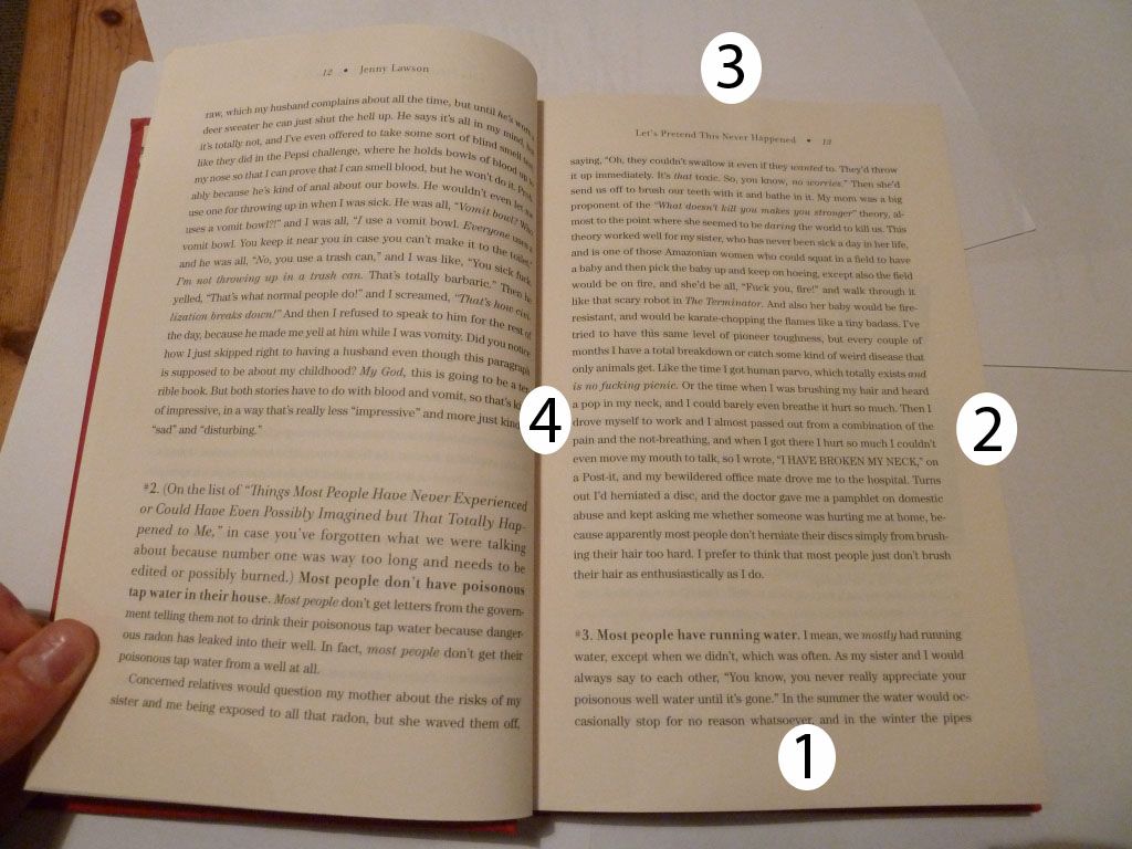
Here's a page spread from the book, with a pretty traditional layout. I've labelled the margins in order from largest to smallest (1 being the largest margin). If you don't include the running head, the top margin is larger than the outside margin.

What's most striking about this page spread is the leading - the space between each line is large enough to be noticeable. It's still readable, but I think it's pushing the maximum leading narrative text can have before each line becomes too separated.

The running heads are also notable for being centre-aligned and not closely anchored to the text panel.

Saturday, 2 June 2012

The Hunger Games: e-book version

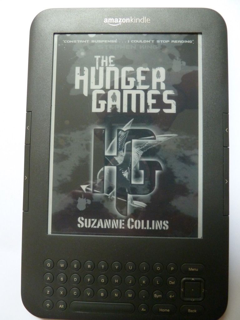
Today I'm going to consider the kindle version of The Hunger Games. Here's the cover:

And here's the title page:

The value of a cover page for an ebook is debatable. On a kindle, when you click on the book's name in the home page, you get taken straight to the first page of chapter 1 and skip the cover page entirely. And if including a cover page is debatable, including a title page is even more so. In a physical book, the title page establishes the proper title and author of the book for cataloguing purposes. On its verso you would usually find further publication information and the book's copyright statement. But you don't need this in an ebook - you can have the page with all the publication information without needing a title page to go on the other side. In this particular ebook, the publication data and copyright is at the end of the ebook.

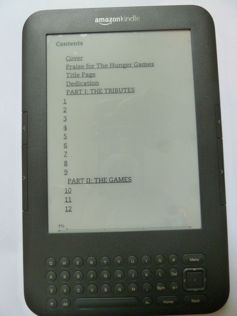
And here's the table of contents, where if you click on a chapter heading you'll be taken straight to that page:

This table of contents is ugly, with no regard for pleasing layout. It's also somewhat difficult to navigate, as you can't see the whole table of contents on one 'page'.

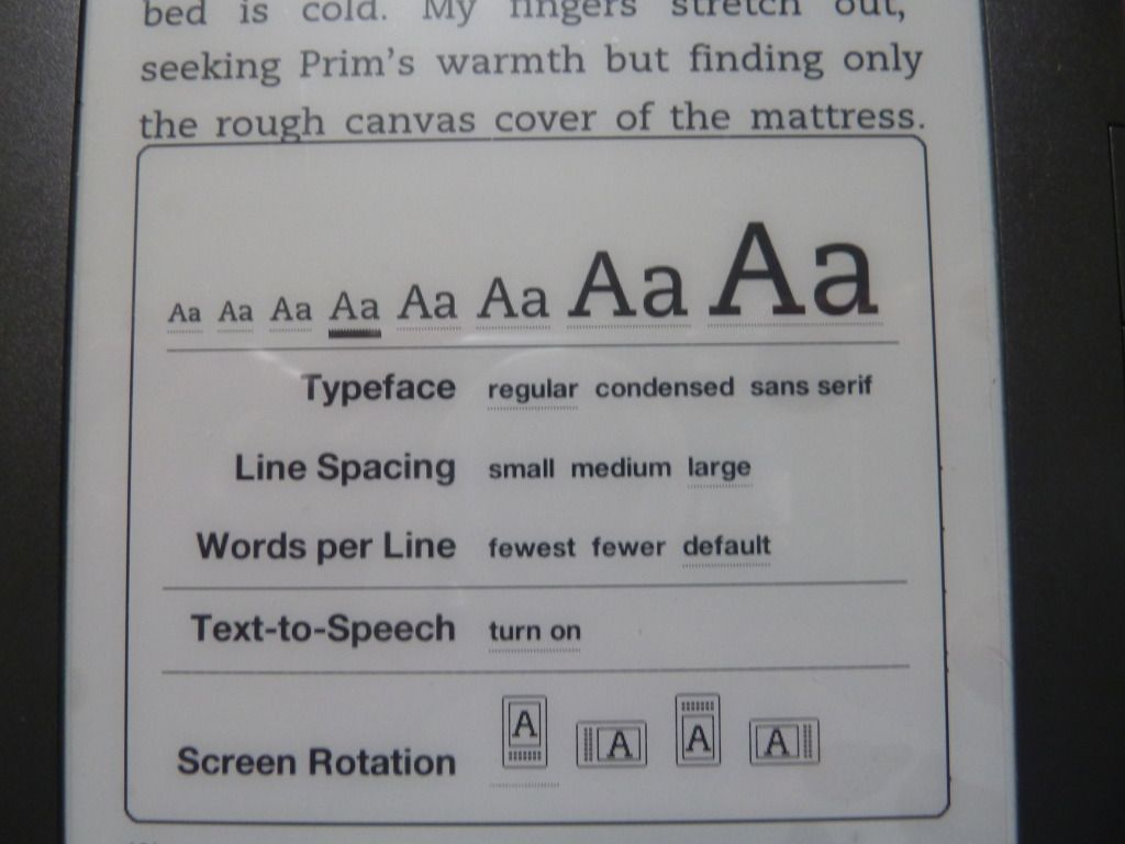
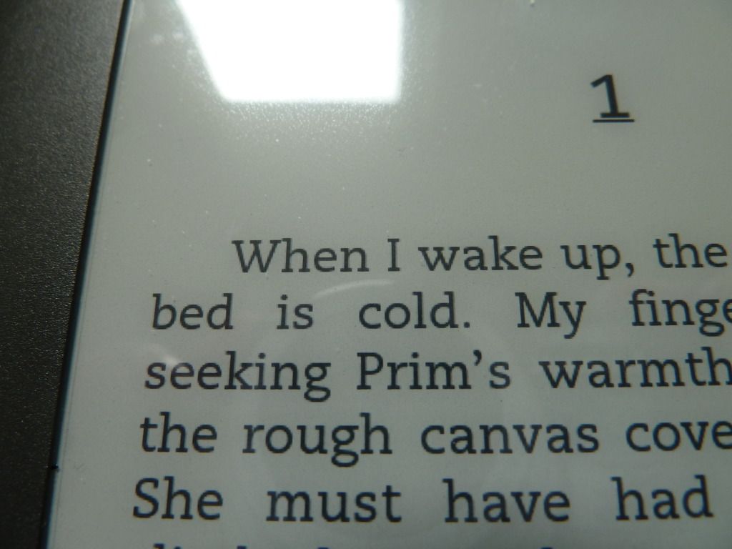
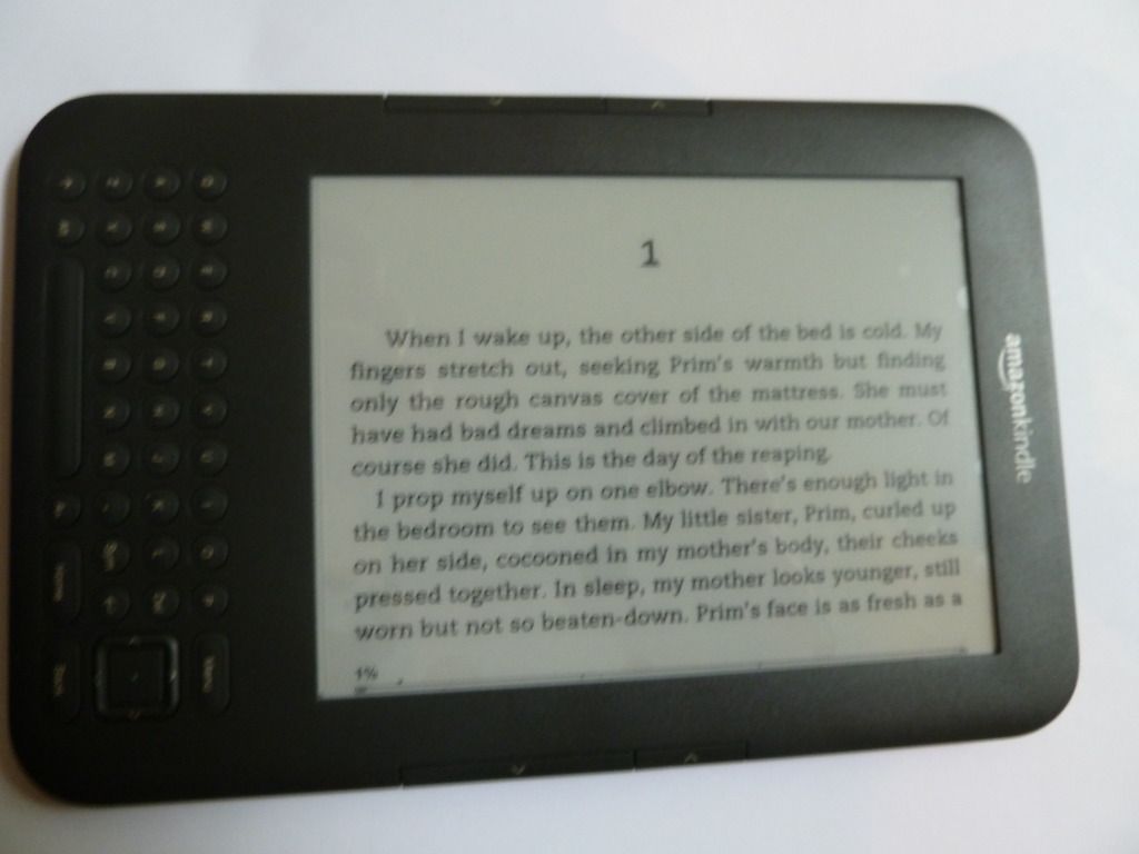
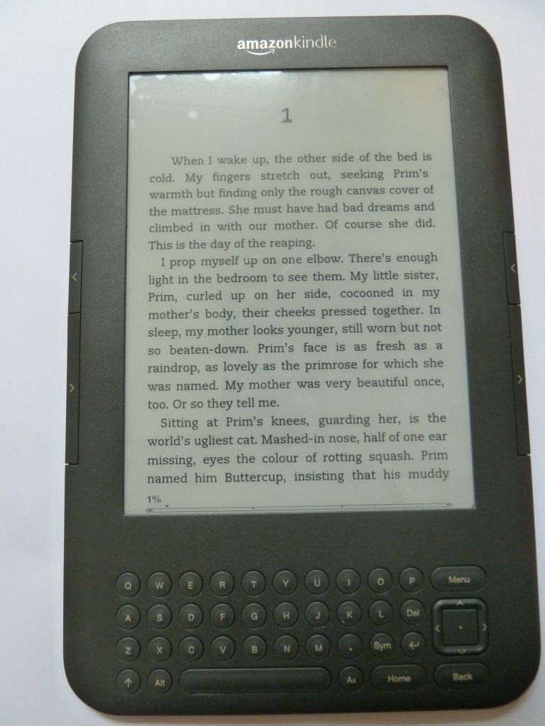
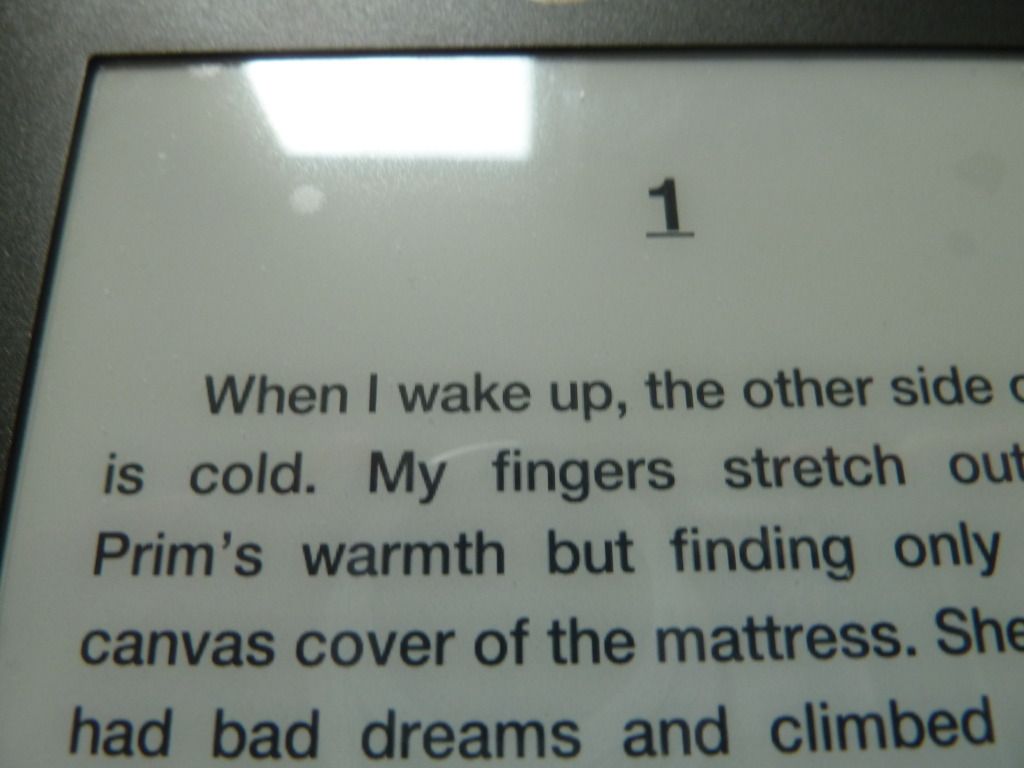
In terms of the page layout, this is pretty much up to the user. I can make the text bigger or smaller, change the typeface from regular to condensed or sans serif, change the line spacing, and even change the page orientation:

smaller text
larger text


sans serif typeface
regular typeface


landscape orientation
When the reader can change how the page looks at will, this defeats the purpose of designing a perfectly balanced page-spread. The downside is that the layout is not as nice as that of a print book. The upside is that it puts power in the reader's hands: they can read it in the format they find easiest. I think the ability to change the size of the text is probably the most useful, as many people suffer from eye problems that make reading smaller text difficult.