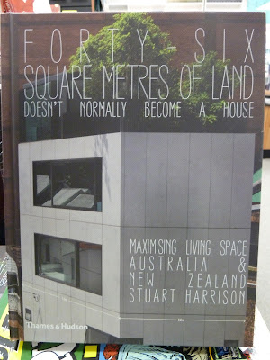
The cover is textured, and the narrow lettering of the title gets somewhat lost because of this. Despite this, I can see what this typeface was trying to achieve - it looks squashed, playing with the book's focus on restricted spaces.
The most shocking thing about this book is that when you open it, here's what the end-paper/first page looks like:
That's right - gasp - the book starts on the endpaper. There's no title page, no imprint page, and no table of contents - it's not at the back of the book either - and the book continues right up onto the last bit of end-paper. Maybe it's to reinforce the impression of 'squashed-ness'? Each page-spread certainly feels very squashed, with extremely narrow margins. The designer also seems to be very keen on showing off their grid, which does allow a great deal of flexibility in layout, but the narrow margins mean every single page feels uncomfortably constrained.
Eventually, I closed the book and spotted this:
Turning to the orange centre of the book, I found the missing imprint page, half-title page, title page, and table of contents. I guess the designer made them orange so they'd be easier to find. But you know what would have made them even easier to find? Yup, putting them at the beginning where everyone expects them to be. I see no reason for breaking this convention in this instance.
Updated 7 July:
The table of contents, although pretty, gives too much weight to the page numbers and not enough to the section headings (the actual information the reader is looking for).
Also, why on earth have a half-title page if it's going to be in the middle of the book and after the title page?


No comments:
Post a Comment