Showing posts with label running heads. Show all posts

Wednesday, 20 June 2012

An odd book

Here is a book which at first glance seems like a standard photography book, but at second glance has a number of odd things going on.

First is the cover colour palette, particularly the colour chosen for the blurb text. Red-on-black is very hard to read, and the colour seems odd given that the rest of the text is either in gold or white.

The text is ragged-right, but some of the alignments are strange, with line-breaks in odd places and variations in measure between pull-quotes and the main text.

There's also a strange variation in the page numbers on page 27. The other page numbers are all aligned to sit closer to the inside margin than the outside one, but on this page, the page number is shifted downwards, centre-aligned, and enlarged. It just seems to be this one page that does this, so I have to assume it's a typo rather than a design choice. If it is a design choice, I have no idea what was behind it.
Another interesting aspect of this book is that it changes from matt to glossy paper half-way through. The photo below shows the mid-point where it changes. On the left is the matt paper, and on the right is the  glossy.
The latter half of the book seems to include less text and more full-page spreads of photos, so it makes sense from a cost perspective to make this half glossy if it wasn't affordable for the whole book.

Saturday, 9 June 2012

Woeful typography

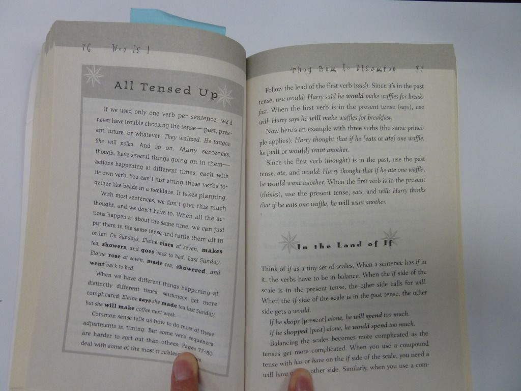
This example of poor typeface choice is from the grammar book Woe is I. Although it's written in 'plain English', it's still a relatively dry book about the rules of grammar. Clearly the intent behind the design was to make grammar fun, but the result was a book full of inappropriate typefaces:

Take the running heads for example - they are in a display typeface which is (1) difficult to read, (2) in a larger size than the narrative text, (3) incredibly distracting, and (4) not reflective of the book's contents.

Wednesday, 6 June 2012

Leading madness

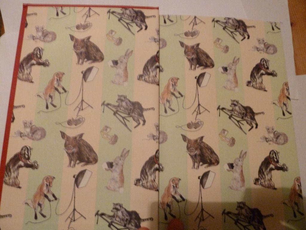
The book I'm examining today is Let's Pretend This Never Happened by Jenny Lawson. On opening the cover, the first thing you notice is the lovely end-paper. The end-paper has been carefully chosen to reflect the book's content (the author's father is a taxidermist, and this is an important part of her childhood).

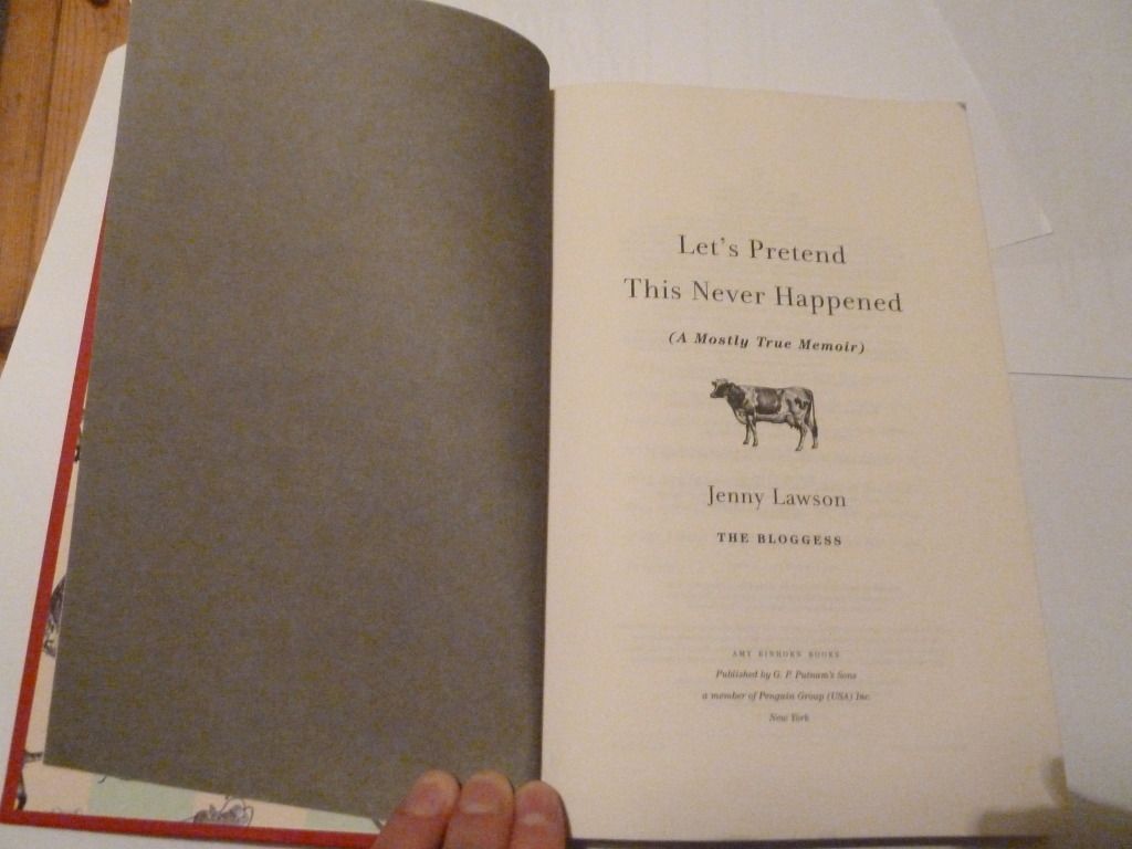
Then comes the front matter, starting with the title page:

I think the dark grey verso page gives more weight to the title page. The cow on the title page also continues the animal theme from the end-paper and cover (the cover features a mouse), without being too repetitive.

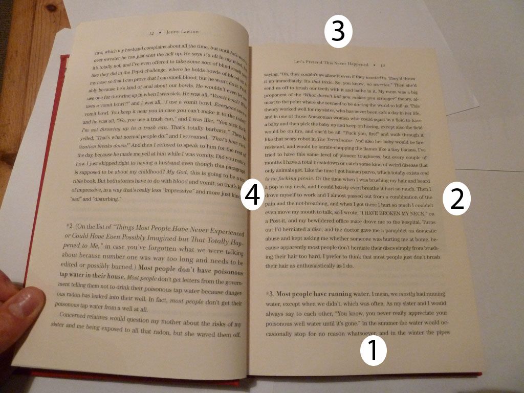
Here's a page spread from the book, with a pretty traditional layout. I've labelled the margins in order from largest to smallest (1 being the largest margin). If you don't include the running head, the top margin is larger than the outside margin.

What's most striking about this page spread is the leading - the space between each line is large enough to be noticeable. It's still readable, but I think it's pushing the maximum leading narrative text can have before each line becomes too separated.

The running heads are also notable for being centre-aligned and not closely anchored to the text panel.

Friday, 18 May 2012

Kermadec

This book, designed by Spencer Levine, caught my eye today.
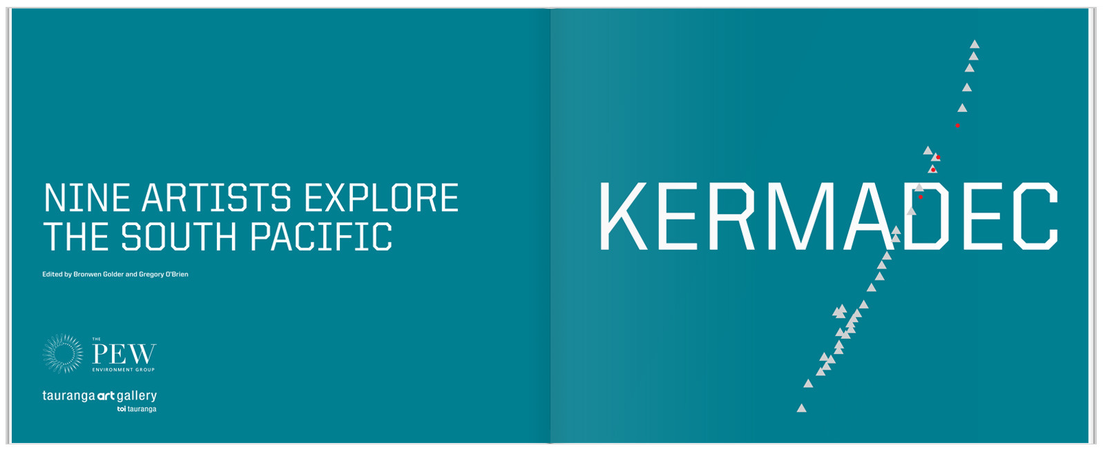
The cover image of a photograph of the sea changing into painted brush strokes is simple but striking. The typeface is a strong, modern font, the only type on the cover. This typeface, with it's very square letters, has practical, scientific associations. Inside, the title page reflects the colours and simplicity of the cover:

The white crest of the waves on the cover is echoed in the pattern of triangles crossing through the title page. I'm pretty sure the triangles are based on the geography of the Kermadec Trench.

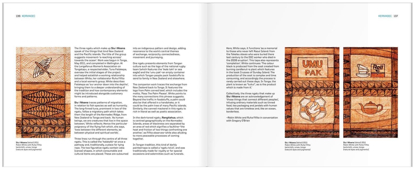
The inside spreads are set in what I initially thought was a three-column grid. Fortunately, the designer was there to correct me and tell me that it is in fact, a six-column grid. You can see this most easily by looking at the placement of the captions.

 I think the detail of the running head is really effective, keeping the design elements present from the cover and title page going throughout the book.