Showing posts with label table of contents. Show all posts

Saturday, 30 June 2012

Some conventions are there for a reason...

I stumbled across this architecture book Forty-Six Square Metres of Land Doesn't Normally Become a House.
The cover is textured, and the narrow lettering of the title gets somewhat lost because of this. Despite this, I can see what this typeface was trying to achieve - it looks squashed, playing with the book's focus on restricted spaces.

The most shocking thing about this book is that when you open it, here's what the end-paper/first page looks like:
That's right - gasp - the book starts on the endpaper. There's no title page, no imprint page, and no table of contents - it's not at the back of the book either - and the book continues right up onto the last bit of end-paper. Maybe it's to reinforce the impression of 'squashed-ness'? Each page-spread certainly feels very squashed, with extremely narrow margins. The designer also seems to be very keen on showing off their grid, which does allow a great deal of flexibility in layout, but the narrow margins mean every single page feels uncomfortably constrained.
Eventually, I closed the book and spotted this:
Turning to the orange centre of the book, I found the missing imprint page, half-title page, title page, and table of contents. I guess the designer made them orange so they'd be easier to find. But you know what would have made them even easier to find? Yup, putting them at the beginning where everyone expects them to be. I see no reason for breaking this convention in this instance.
Updated 7 July:
The table of contents, although pretty, gives too much weight to the page numbers and not enough to the section headings (the actual information the reader is looking for).
Also, why on earth have a half-title page if it's going to be in the middle of the book and after the title page?

Saturday, 23 June 2012

Table of Contents Madness

Today I have two illustrated non-fiction books, both with the imprint page on the verso and the table of contents on the recto of a double-page spread. 


The successful example above is from Trees of New Zealand: Stories of Beauty and Character. A beautiful photograph of leaves has been used for the background of the page-spread, but the overlying text is still perfectly readable. This is a simple left-aligned short contents which uses a serif typeface. The hierarchy of information is clear, with the less important sections at the beginning and end of the book shown in italics. I'm not sure why the heading is in a different typeface - it's already larger than the other text and centre-aligned, so changing the typeface as well seems somewhat redundant.

I also like the placement of the imprint information - it's there if you want to read it, but it's in a smaller font and located lower down the page than the contents, so it doesn't distract from the either the photography or the table of contents.


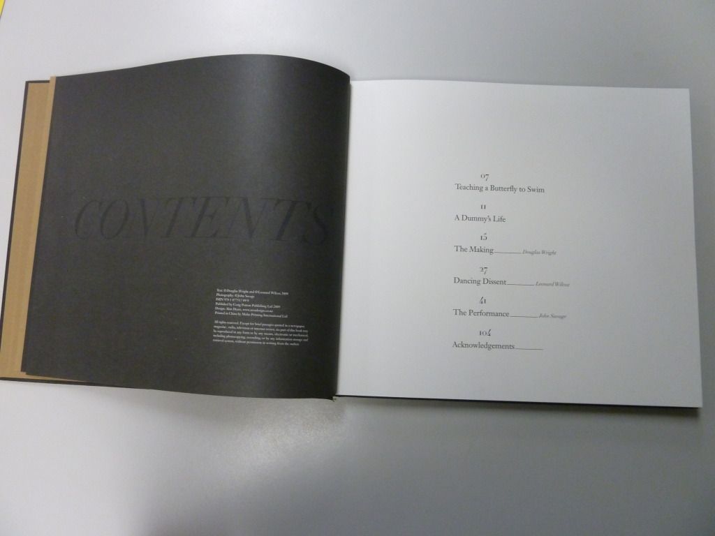
This is an unsuccessful example taken from the book Black Milk. Whilst the black-on-black title is a cool design feature, your eye is drawn to the verso page first, which features the less important imprint information, rather than the recto page featuring the contents. Additionally, the layout of the table of contents is unnecessarily hard to read with page numbers centre-aligned above the chapter titles.

Sunday, 10 June 2012

Frontmatter and Internals

I thought I'd delve more deeply into Brandon Sanderson's The Way of Kings (for a break-down of the cover art, see this post).

Here's the frontmatter (apologies for the shadow of my camera). I think the page-borders (reminiscent of parchment) are a great way to add interest to what can be a relatively boring part of a book. However, I'm not sure that the mixture of typefaces was the best choice for the title-page.

Moving on to the chapter pages, each new chapter has a page of illustrations (from one of the character's journals) and a very decorative chapter title. The text associated with the illustrations is somewhat difficult to read, but feels hand-lettered, like you really are seeing a real page from the character's journal.

The decorative chapter title seems a little too much, particularly for a small paperback. We have an archway with the name of the chapter, an image, then a quote from one of the character's research notes, then a dropcap. Altogether, this page-spread feels very squashed.

Speaking as the target market, however, I have to say I loved these extra design details when I was actually reading the book. I imagine the layout was less squashed in the hardback edition.

Wednesday, 30 May 2012

Display pages - Superfreakonomics


Here we have Superfreakonomics, by Steven D. Levitt and Stephen J. Dubner.

This cover is quite cluttered, but I think it works well because the title of the book is very clear, being at the top of the page in a large, easy-to-read bold typeface. Even though there's a strange break between 'Freak' and 'onomics' I think it works because it breaks up a large, made-up word into two smaller and more easily-digestible chunks.


Moving on to the table of contents:

I love the use of white space in this layout and the clear delineation of  each element. There are large margins on all sides, so nothing feels cluttered (despite the use of text boxes around the chapter numbers). It's very easy to find the chapter number, the chapter title, and the chapter description with only a brief scan and the hierarchy of headings is very clear.

This chapter headings use similar design elements, but less successfully.
As a reader, it's not clear which heading is more important, particularly as both headings are 'floating' in space with no clear relationship to each other or the main text.

Friday, 4 May 2012

Cookbooks part two – the insides

So last post I talked about cookbook covers; now to talk about the bits on the insides. I’ve split this post up into a few parts, which are:
  •  End papers
  • Table of Contents
  • Recipe layout
  • Indexes
Endpapers

From  Free Range in the City by Annabel Langbein
From Treats from Little and Friday by Kim Evans
Endpapers are a structurally important part of hardcovers, but they're also an opportunity to add something aesthetically appealing to the design.
The endpaper for Annabel Langbein's Free Range in the City adds an old-fashioned feel to the book.


The endpaper for Treats from Little and Friday is a fairly standard picture of food, but it adds a layer of luxury to the book, and also included is a bookmark, useful for a recipe book.


Tables of Contents
From  Free Range in the City by Annabel Langbein   
  • the large margins and white space between different subheadings make the layout feel simple, crisp, and easy to read.
  • The coloured subheadings with corresponding coloured page numbers act as navigation tools for the reader and make it easy to find the page number for particular sections.
The next table of contents is from Jaimie's 30 Minute Meals and covers a double page spread.
  
  • the typeface chosen for the meal titles is very 'light' and this combined with the all caps format makes it hard to read.
  • the different colours aren't sufficient to make the different sections distinct - it would work better if there were subheadings.
  • Some of the margins, particularly the left margins, are too small, making the text feel 'crushed' on the page. You can see that I'm having to flatten the left page down quite a lot in order to read the right page.
Recipe Layout
From  Free Range in the City by Annabel Langbein 
  • The information is placed in a logical order so that your eye goes from the title, to the description, to the list of ingredients and then to the instructions.
  • The different elements are kept distinct through the use of three different typefaces: a decorative typeface for the recipe title, a serif typeface for the description, and a sans serif for the recipe itself.
From  Gorgeous Cakes for the ultimate sweet sensation
This has a similar layout to Free Range in the City and is similarly easy to follow. The main difference is the alignment of the different elements. I think the mixture of alignments (particularly the right-alignment of the ingredients) sacrifices a small amount of readability in the name of increasing the attractiveness of the page.

From Jaimie's 30 Minute Meals by Jaimie Oliver
This layout feels too cluttered. Additionally, I'm not sure where I should start reading and what path I should follow - there are a number of subheadings but they've all been given equal weight. 

Indexes
From  Free Range in the City by Annabel Langbein
The  bold subheadings make things relatively easy to find and make the tabbed lists seem crisp rather than messy. However, you have to guess what category the recipe you want is filed under, rather than looking up the dish alphabetically.

From  Gorgeous Cakes for the ultimate sweet sensation
This seems like a fairly average cookbook index to me. One thing I do find is that the different alphabetical sections aren't separated by anything more than a space, which isn't terribly helpful to the reader given the amount of other white space on the page.
From Jaimie's 30 Minute Meals by Jaimie Oliver
This layout is reasonably successful, with recipes under different letters of the alphabet clearly separated by white space and a large letter. However, the typeface chosen for the big letters is a little too light - they don't stand out to me, which makes navigation more difficult than it should be.

Friday, 27 April 2012

Design of a design book


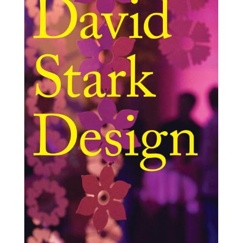
I was at the library today in the cookbooks section when a mis-shelved title metaphorically leapt off the shelf and demanded to be taken home. This visually striking book is a design book published in 2010 called David Stark Design.


The cover is compelling; I couldn’t help picking it up. Why, though? Partly I think it’s the simplicity of the design: only three words on the entire front page and only two basic colours. The serif typeface chosen for the title is also simple, as is the strong left-alignment. The contrast of the cover also hit me forcefully. Yellow and purple are opposites on the colour wheel, and the contrast is further emphasised by the spot glossy surface of the text compared to the matt cover. 

The design elements of the cover (simplicity, bright colours, contrast) are echoed in the design and layout of text elements inside the book. 

For example, in the table of contents the section titles are highlighted with yellow, and the background of the page is pink. The contrast is also echoed in the font choices: the section titles are in a standard sans serif typeface, whilst the sub-headings are in a serif typeface reminiscent of type-writers. The highlighted section titles are very easy to find.

The text pertaining to the artwork on each double-paged spread is also contained in a yellow text-box, repeating the colour theme from the cover. This is also a clever way to put text on top of a photograph.

The section headings overlay the narrative text. I'm uncertain about this design choice - it is striking, but the heading makes reading the underlying text difficult.