
Showing posts with label end papers. Show all posts
Showing posts with label end papers. Show all posts
Saturday, 16 June 2012
Teeny tiny book
I stumbled across this cute little gift book yesterday. Everything about it has been designed to make it more appealing as a gift item.

Wednesday, 6 June 2012
Leading madness

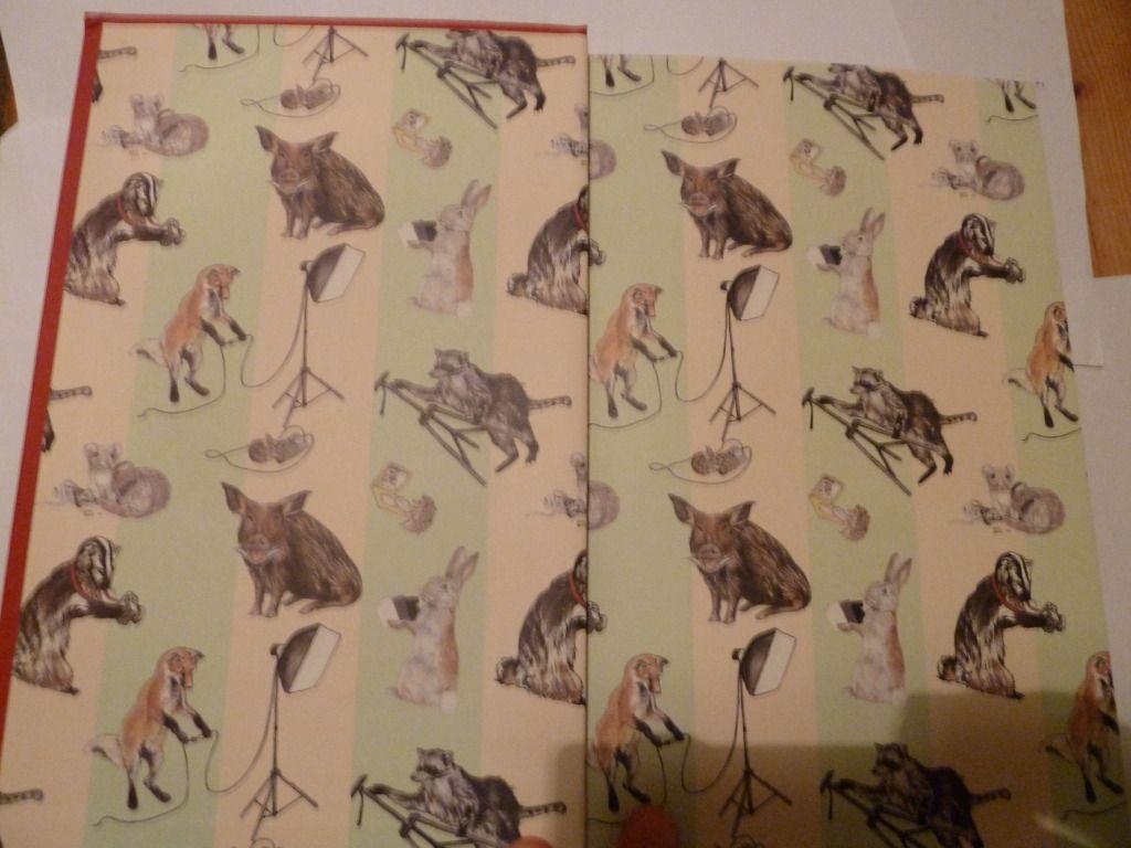
Then comes the front matter, starting with the title page:
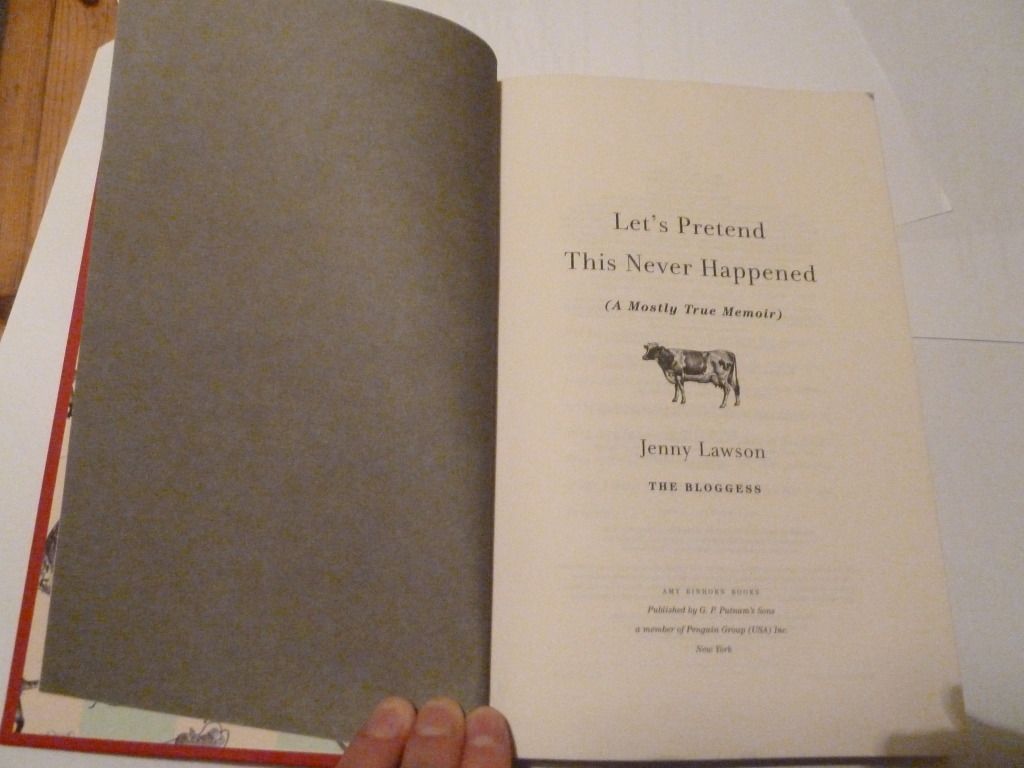
I think the dark grey verso page gives more weight to the title page. The cow on the title page also continues the animal theme from the end-paper and cover (the cover features a mouse), without being too repetitive.
Here's a page spread from the book, with a pretty traditional layout. I've labelled the margins in order from largest to smallest (1 being the largest margin). If you don't include the running head, the top margin is larger than the outside margin.
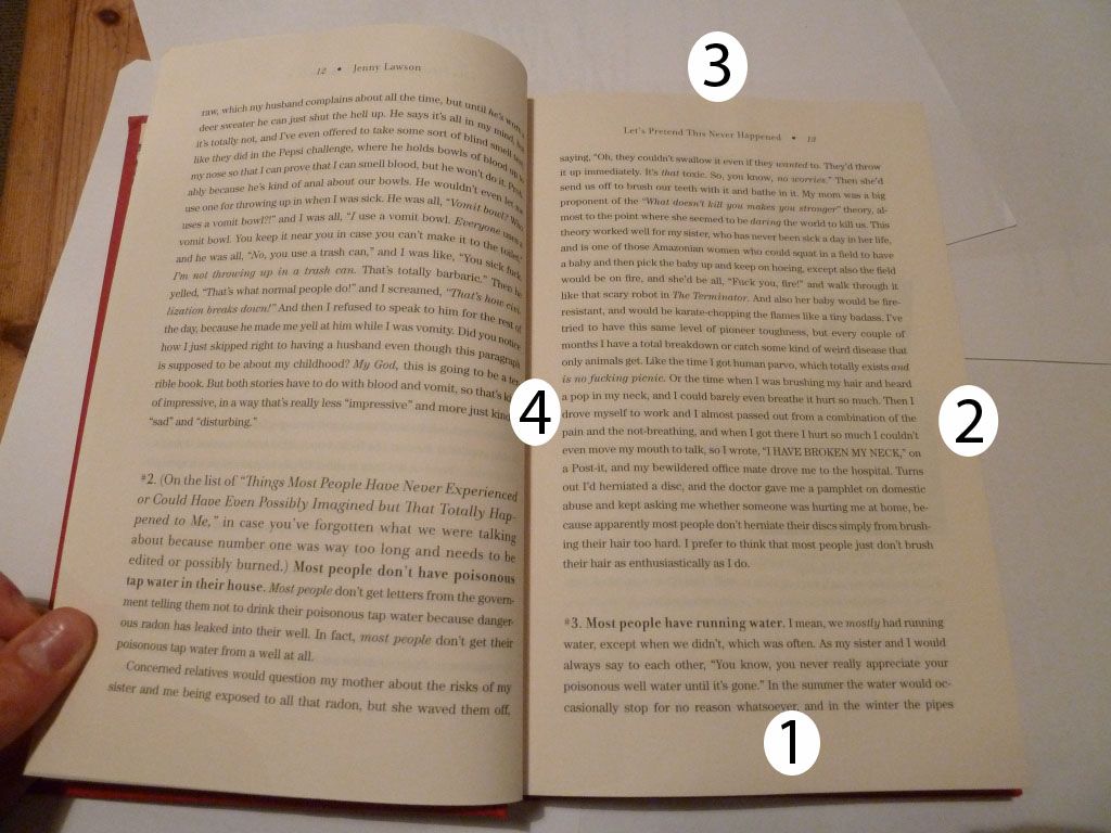 What's most striking about this page spread is the leading - the space between each line is large enough to be noticeable. It's still readable, but I think it's pushing the maximum leading narrative text can have before each line becomes too separated.
The running heads are also notable for being centre-aligned and not closely anchored to the text panel.
Friday, 4 May 2012
Cookbooks part two – the insides
So last post I talked about cookbook covers; now to talk about the bits on the insides. I’ve split this post up into a few parts, which are:
- End papers
- Table of Contents
- Recipe layout
- Indexes
.jpg) |
| From Free Range in the City by Annabel Langbein |
 |
| From Treats from Little and Friday by Kim Evans |
The endpaper for Treats from Little and Friday is a fairly standard picture of food, but it adds a layer of luxury to the book, and also included is a bookmark, useful for a recipe book.
Tables of Contents
.jpg) |
| From Free Range in the City by Annabel Langbein |
- the large margins and white space between different subheadings make the layout feel simple, crisp, and easy to read.
- The coloured subheadings with corresponding coloured page numbers act as navigation tools for the reader and make it easy to find the page number for particular sections.
The next table of contents is from Jaimie's 30 Minute Meals and covers a double page spread.
.JPG)

- the typeface chosen for the meal titles is very 'light' and this combined with the all caps format makes it hard to read.
- the different colours aren't sufficient to make the different sections distinct - it would work better if there were subheadings.
- Some of the margins, particularly the left margins, are too small, making the text feel 'crushed' on the page. You can see that I'm having to flatten the left page down quite a lot in order to read the right page.
.jpg) |
| From Free Range in the City by Annabel Langbein |
- The information is placed in a logical order so that your eye goes from the title, to the description, to the list of ingredients and then to the instructions.
- The different elements are kept distinct through the use of three different typefaces: a decorative typeface for the recipe title, a serif typeface for the description, and a sans serif for the recipe itself.
.jpg) |
| From Gorgeous Cakes for the ultimate sweet sensation |
This has a similar layout to Free Range in the City and is similarly easy to follow. The main difference is the alignment of the different elements. I think the mixture of alignments (particularly the right-alignment of the ingredients) sacrifices a small amount of readability in the name of increasing the attractiveness of the page.
.jpg) |
| From Jaimie's 30 Minute Meals by Jaimie Oliver |
Indexes
The
bold subheadings make things relatively easy to find and make the tabbed lists seem crisp rather than messy. However, you have to guess what category the recipe you want is filed under, rather than looking up the dish alphabetically.
This seems like a fairly average cookbook index to me. One thing I do find is that the different alphabetical sections aren't separated by anything more than a space, which isn't terribly helpful to the reader given the amount of other white space on the page.
 |
| From Free Range in the City by Annabel Langbein |
.jpg) |
From Gorgeous Cakes for the ultimate sweet sensation
|
.jpg) |
| From Jaimie's 30 Minute Meals by Jaimie Oliver |
This layout is reasonably successful, with recipes under different letters of the alphabet clearly separated by white space and a large letter. However, the typeface chosen for the big letters is a little too light - they don't stand out to me, which makes navigation more difficult than it should be.
Subscribe to:
Posts (Atom)