Showing posts with label chapter heading. Show all posts

Tuesday, 19 June 2012

Comparing a paperback and hardback

I'm going to compare the paperback and hardback editions of The Fairy Godmother by Mercedes Lackey.

Besides the obvious size difference, the covers are virtually identical. One minor difference is the formatting of the "A tale of the Five Hundred Kingdoms" tagline. Also, "five" is not capitalised for the paperback version.

Other general cover comments:

  • The author is clearly the most important piece of information on the cover.
  • The decorative typeface chosen for the author's name and the book title conveys the whimsical, romantic tone of this book.
  • To make it clear that this book is targeted at woman, there's a very feminine woman in the foreground with pink flowers in her hair (this does not happen at any point in the actual book).
  • Just to make it extra clear that this book is targeted at women, there's also some random pink sparkles. These also serve the dual purpose of conveying that this is a fantasy novel.
  • Just in case you still hadn't realised that this book is targeted at women, the author's name is foil stamped in metallic gold - a convention often used for romance books.
The paperback version lacks a half-title page, but the title pages for both editions are the same.

One major difference between the two editions is the paper quality. The paperback edition uses lower quality paper, which means the ink has bled slightly, giving the pages darker 'colour'. This is particularly obvious in the photos below.
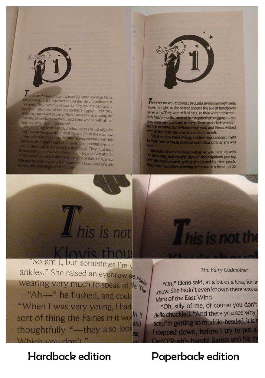
As you can see, the detail on the dropcap is not visible in the paperback edition. The main text also looks much cleaner and is easier to read in the hardback edition, even though the same typeface is used. This typeface is midway between a serif and sans serif typeface, with very small serifs.

One interesting layout choice for the chapter pages is that the image is proportionately larger in the paperback edition. Possibly this is to balance out the smaller page margins of the paperback.
Both editions have quite a lot of show-through; this is particularly evident on the page before the illustrated chapter heading:

Another interesting layout feature of the hardback edition is that the largest margin is the top margin. The hardback has very large margins in general, but normally the bottom margin would be the largest.

Monday, 11 June 2012

Bitterblue - interior design oomph

Look at this lovely book, Bitterblue by Kristin Cashore:
The title is in gold ink (imitation) that really stands out against the blue background. The cover image is very dark, but this makes the white text easy to read.

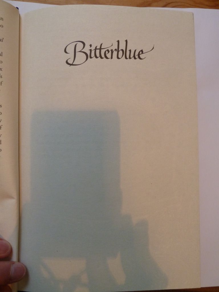
And as well as the extremely attractive cover, this book also has lovely design elements on the inside. First, the half-title page:

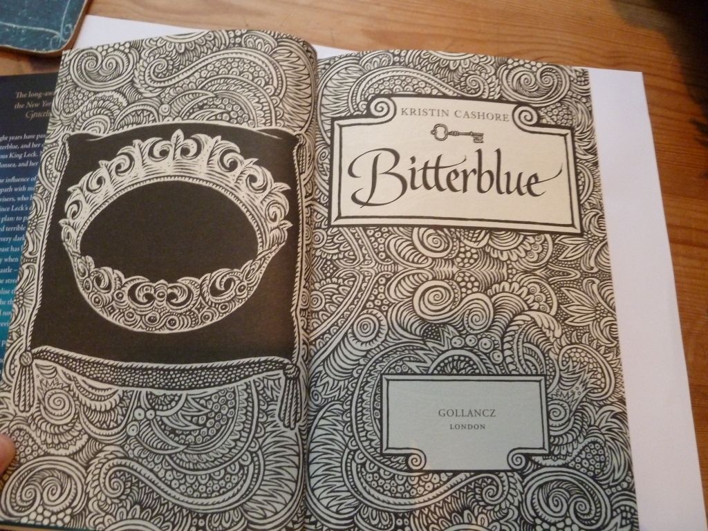
Simple yet effective, it repeats the typeface used on the cover. Then we have the title page:

The title page is given extra emphasis by being given a double-page spread with lovely illustrations with a 'wood-cut' feel to them. This style of illustration is continued throughout the book.

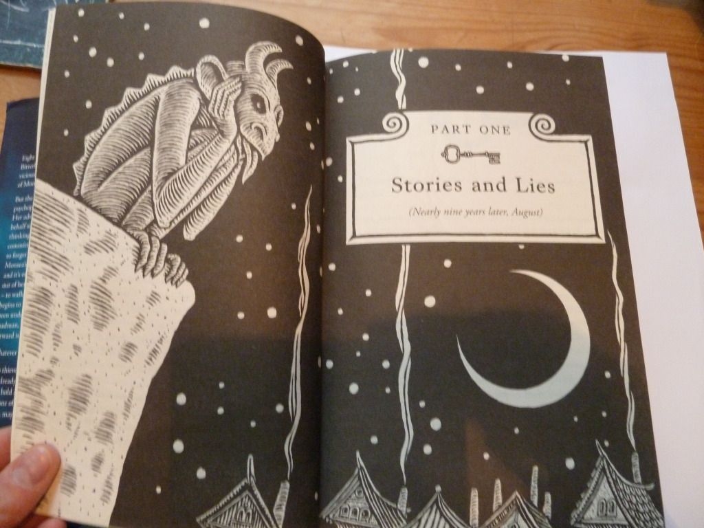
Each part of the book has its own part-title page:

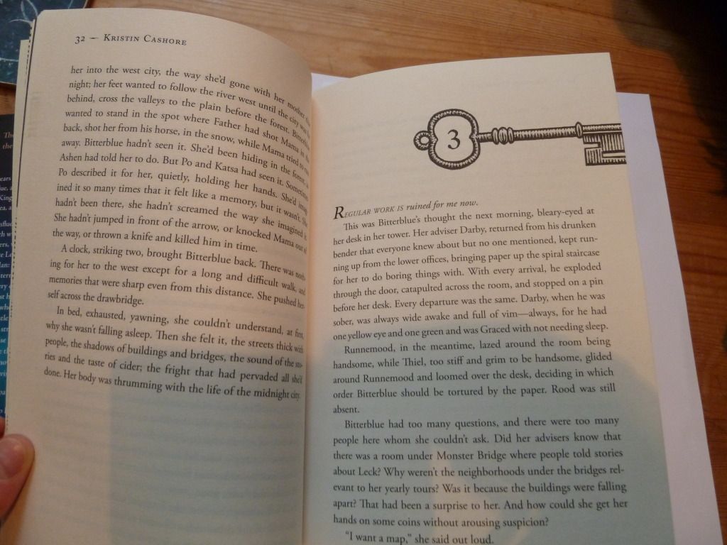
Then each chapter heading has a key motif. This refers to the fact that the book is about unlocking secrets (the US edition features keys as the central image on the cover).

The end result of all this interior designy goodness is that when closed, there is a rather nice pattern formed:

Sunday, 10 June 2012

Frontmatter and Internals

I thought I'd delve more deeply into Brandon Sanderson's The Way of Kings (for a break-down of the cover art, see this post).

Here's the frontmatter (apologies for the shadow of my camera). I think the page-borders (reminiscent of parchment) are a great way to add interest to what can be a relatively boring part of a book. However, I'm not sure that the mixture of typefaces was the best choice for the title-page.

Moving on to the chapter pages, each new chapter has a page of illustrations (from one of the character's journals) and a very decorative chapter title. The text associated with the illustrations is somewhat difficult to read, but feels hand-lettered, like you really are seeing a real page from the character's journal.

The decorative chapter title seems a little too much, particularly for a small paperback. We have an archway with the name of the chapter, an image, then a quote from one of the character's research notes, then a dropcap. Altogether, this page-spread feels very squashed.

Speaking as the target market, however, I have to say I loved these extra design details when I was actually reading the book. I imagine the layout was less squashed in the hardback edition.

Wednesday, 6 June 2012

Leading madness

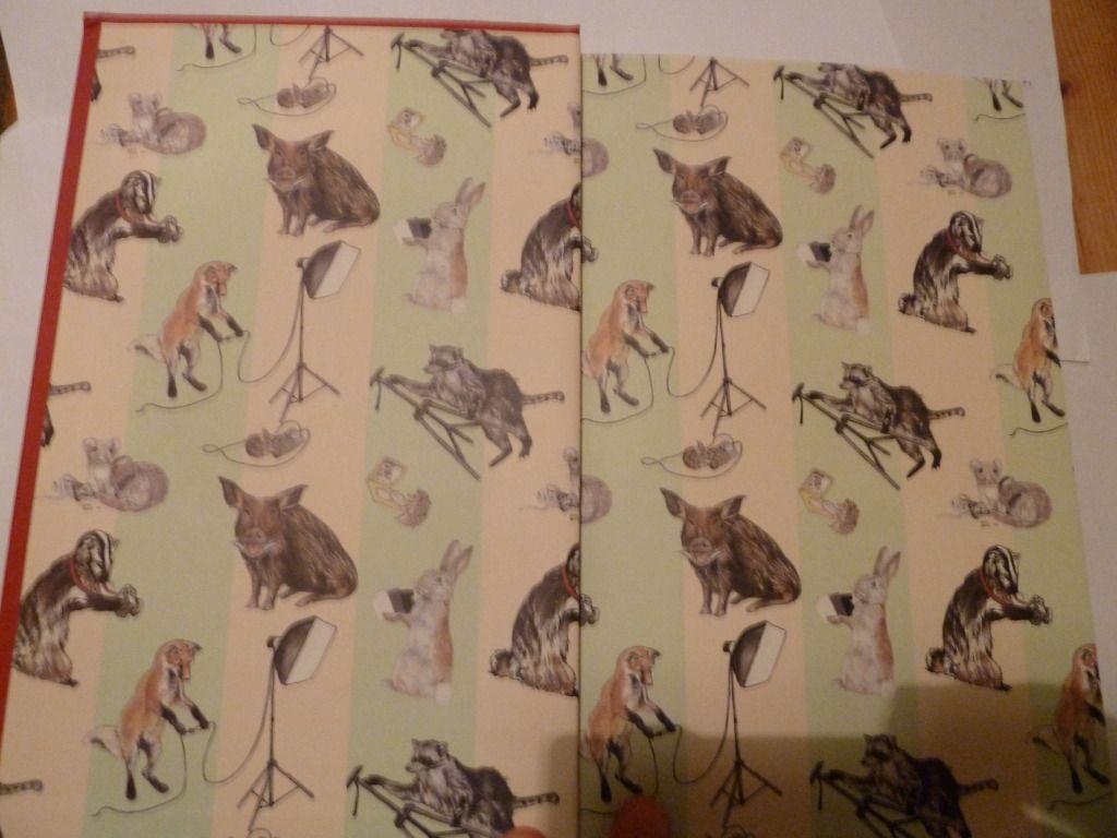
The book I'm examining today is Let's Pretend This Never Happened by Jenny Lawson. On opening the cover, the first thing you notice is the lovely end-paper. The end-paper has been carefully chosen to reflect the book's content (the author's father is a taxidermist, and this is an important part of her childhood).

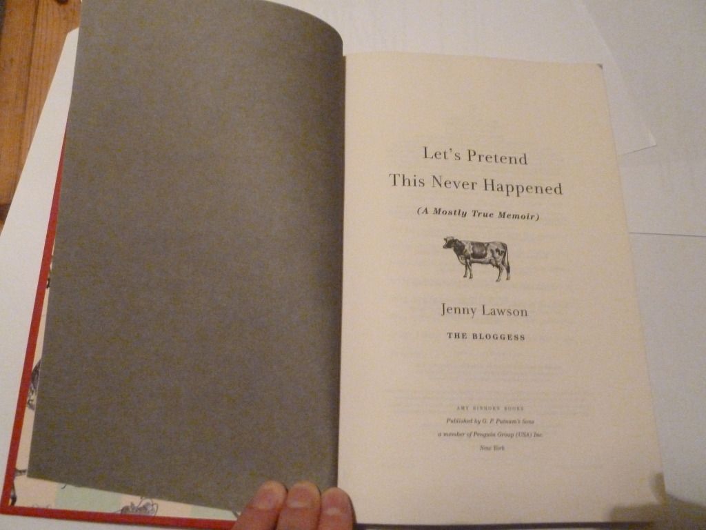
Then comes the front matter, starting with the title page:

I think the dark grey verso page gives more weight to the title page. The cow on the title page also continues the animal theme from the end-paper and cover (the cover features a mouse), without being too repetitive.

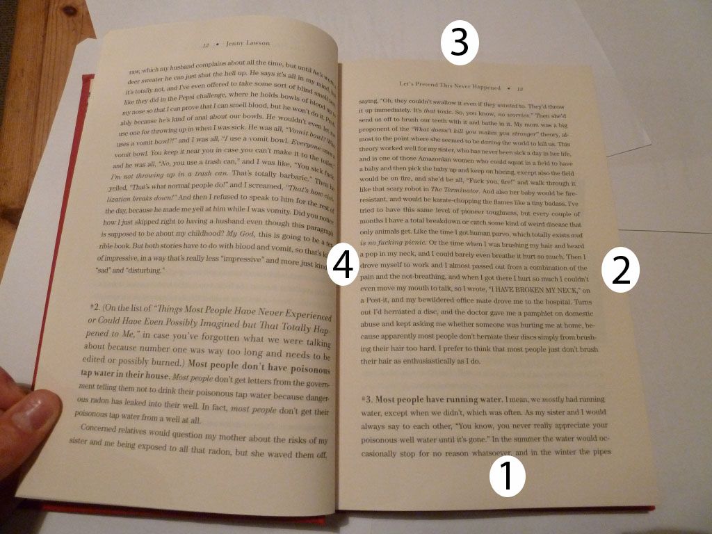
Here's a page spread from the book, with a pretty traditional layout. I've labelled the margins in order from largest to smallest (1 being the largest margin). If you don't include the running head, the top margin is larger than the outside margin.

What's most striking about this page spread is the leading - the space between each line is large enough to be noticeable. It's still readable, but I think it's pushing the maximum leading narrative text can have before each line becomes too separated.

The running heads are also notable for being centre-aligned and not closely anchored to the text panel.

Wednesday, 30 May 2012

Display pages - Superfreakonomics


Here we have Superfreakonomics, by Steven D. Levitt and Stephen J. Dubner.

This cover is quite cluttered, but I think it works well because the title of the book is very clear, being at the top of the page in a large, easy-to-read bold typeface. Even though there's a strange break between 'Freak' and 'onomics' I think it works because it breaks up a large, made-up word into two smaller and more easily-digestible chunks.


Moving on to the table of contents:

I love the use of white space in this layout and the clear delineation of  each element. There are large margins on all sides, so nothing feels cluttered (despite the use of text boxes around the chapter numbers). It's very easy to find the chapter number, the chapter title, and the chapter description with only a brief scan and the hierarchy of headings is very clear.

This chapter headings use similar design elements, but less successfully.
As a reader, it's not clear which heading is more important, particularly as both headings are 'floating' in space with no clear relationship to each other or the main text.