Showing posts with label genre: illustrated non-fiction. Show all posts

Saturday, 30 June 2012

Some conventions are there for a reason...

I stumbled across this architecture book Forty-Six Square Metres of Land Doesn't Normally Become a House.
The cover is textured, and the narrow lettering of the title gets somewhat lost because of this. Despite this, I can see what this typeface was trying to achieve - it looks squashed, playing with the book's focus on restricted spaces.

The most shocking thing about this book is that when you open it, here's what the end-paper/first page looks like:
That's right - gasp - the book starts on the endpaper. There's no title page, no imprint page, and no table of contents - it's not at the back of the book either - and the book continues right up onto the last bit of end-paper. Maybe it's to reinforce the impression of 'squashed-ness'? Each page-spread certainly feels very squashed, with extremely narrow margins. The designer also seems to be very keen on showing off their grid, which does allow a great deal of flexibility in layout, but the narrow margins mean every single page feels uncomfortably constrained.
Eventually, I closed the book and spotted this:
Turning to the orange centre of the book, I found the missing imprint page, half-title page, title page, and table of contents. I guess the designer made them orange so they'd be easier to find. But you know what would have made them even easier to find? Yup, putting them at the beginning where everyone expects them to be. I see no reason for breaking this convention in this instance.
Updated 7 July:
The table of contents, although pretty, gives too much weight to the page numbers and not enough to the section headings (the actual information the reader is looking for).
Also, why on earth have a half-title page if it's going to be in the middle of the book and after the title page?

Saturday, 23 June 2012

Table of Contents Madness

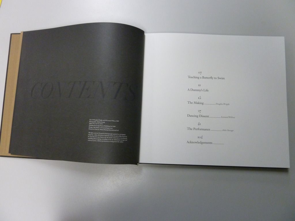
Today I have two illustrated non-fiction books, both with the imprint page on the verso and the table of contents on the recto of a double-page spread. 


The successful example above is from Trees of New Zealand: Stories of Beauty and Character. A beautiful photograph of leaves has been used for the background of the page-spread, but the overlying text is still perfectly readable. This is a simple left-aligned short contents which uses a serif typeface. The hierarchy of information is clear, with the less important sections at the beginning and end of the book shown in italics. I'm not sure why the heading is in a different typeface - it's already larger than the other text and centre-aligned, so changing the typeface as well seems somewhat redundant.

I also like the placement of the imprint information - it's there if you want to read it, but it's in a smaller font and located lower down the page than the contents, so it doesn't distract from the either the photography or the table of contents.


This is an unsuccessful example taken from the book Black Milk. Whilst the black-on-black title is a cool design feature, your eye is drawn to the verso page first, which features the less important imprint information, rather than the recto page featuring the contents. Additionally, the layout of the table of contents is unnecessarily hard to read with page numbers centre-aligned above the chapter titles.

Friday, 22 June 2012

Unconventional cover and binding

I found this book the other day with an unconventional cover.
 It takes you a moment, but eventually you notice that you can lift the paper up directly under the title. And then you keep unfolding, and eventually you unwrap the book entirely and discover this: a poster dust jacket made of luxuriously thick paper.

This is a lovely book, but one thing I noticed about the binding was the distance between stitches. I've circled them in the photo below and you can see that the bottom stitch is significantly farther from the edge of the paper than the top stitch.
What this means is that when you turn the pages, if you're at the beginning of a new signature of pages the bottom right corner catches as you turn. Like so:

An interesting design feature of this book is the location of the barcode. This would usually be located on the outside of the back cover, but in this book it is located inside the back cover, presumably to avoid taking up space on the dust jacket poster.

And yet another interesting design choice is the mixture of paper stocks used in the book. You can see the marked colour variation between the two different paper stocks in the photo below.

Wednesday, 20 June 2012

An odd book

Here is a book which at first glance seems like a standard photography book, but at second glance has a number of odd things going on.

First is the cover colour palette, particularly the colour chosen for the blurb text. Red-on-black is very hard to read, and the colour seems odd given that the rest of the text is either in gold or white.

The text is ragged-right, but some of the alignments are strange, with line-breaks in odd places and variations in measure between pull-quotes and the main text.

There's also a strange variation in the page numbers on page 27. The other page numbers are all aligned to sit closer to the inside margin than the outside one, but on this page, the page number is shifted downwards, centre-aligned, and enlarged. It just seems to be this one page that does this, so I have to assume it's a typo rather than a design choice. If it is a design choice, I have no idea what was behind it.
Another interesting aspect of this book is that it changes from matt to glossy paper half-way through. The photo below shows the mid-point where it changes. On the left is the matt paper, and on the right is the  glossy.
The latter half of the book seems to include less text and more full-page spreads of photos, so it makes sense from a cost perspective to make this half glossy if it wasn't affordable for the whole book.

Tuesday, 19 June 2012

Cool cover texture

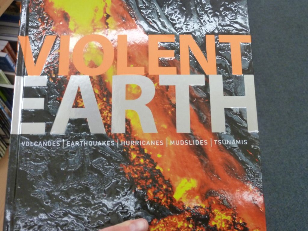
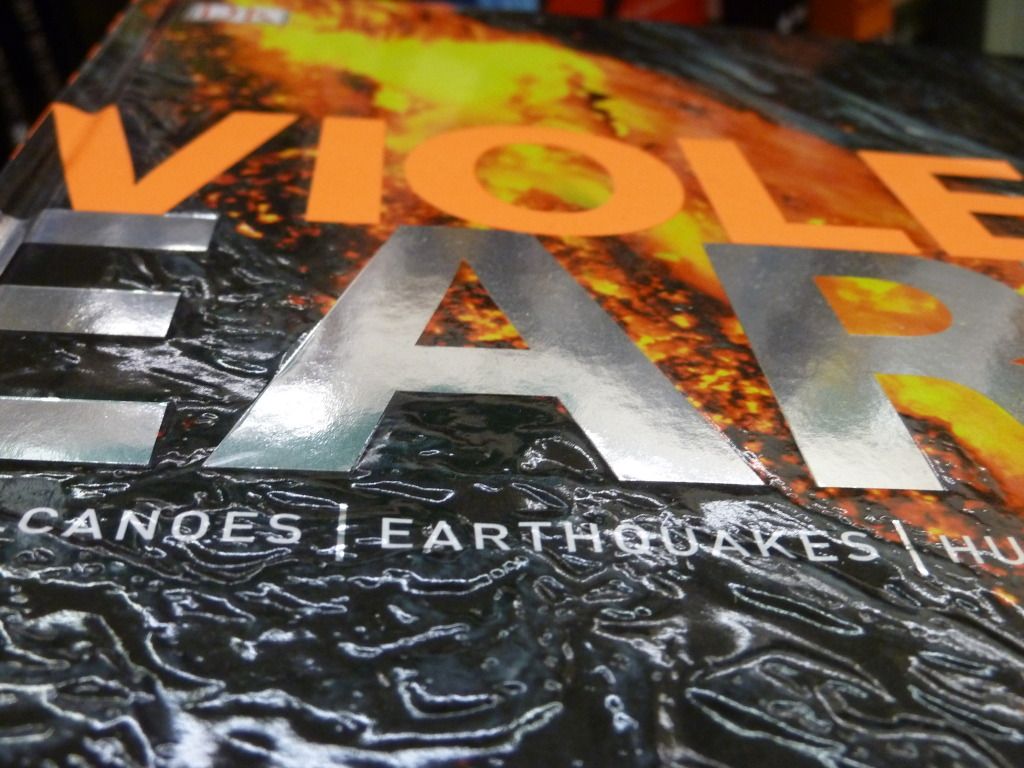
Check out the cover of Violent Earth. It's hard to capture its full awesomeness in photos, but I'll try.

Firstly, there's the crumpled plastic texture of the lava background. This is a very tactile cover that begs to be handled - a good selling point for a coffee table book.


The lettering on the cover hasn't been neglected either, with spot gloss for "Violent" and a metallic gloss for "Earth". This typeface is also well-chosen, as the bold, capitalised sans serif stands out against the busy, textured background.

Friday, 18 May 2012

Kermadec

This book, designed by Spencer Levine, caught my eye today.
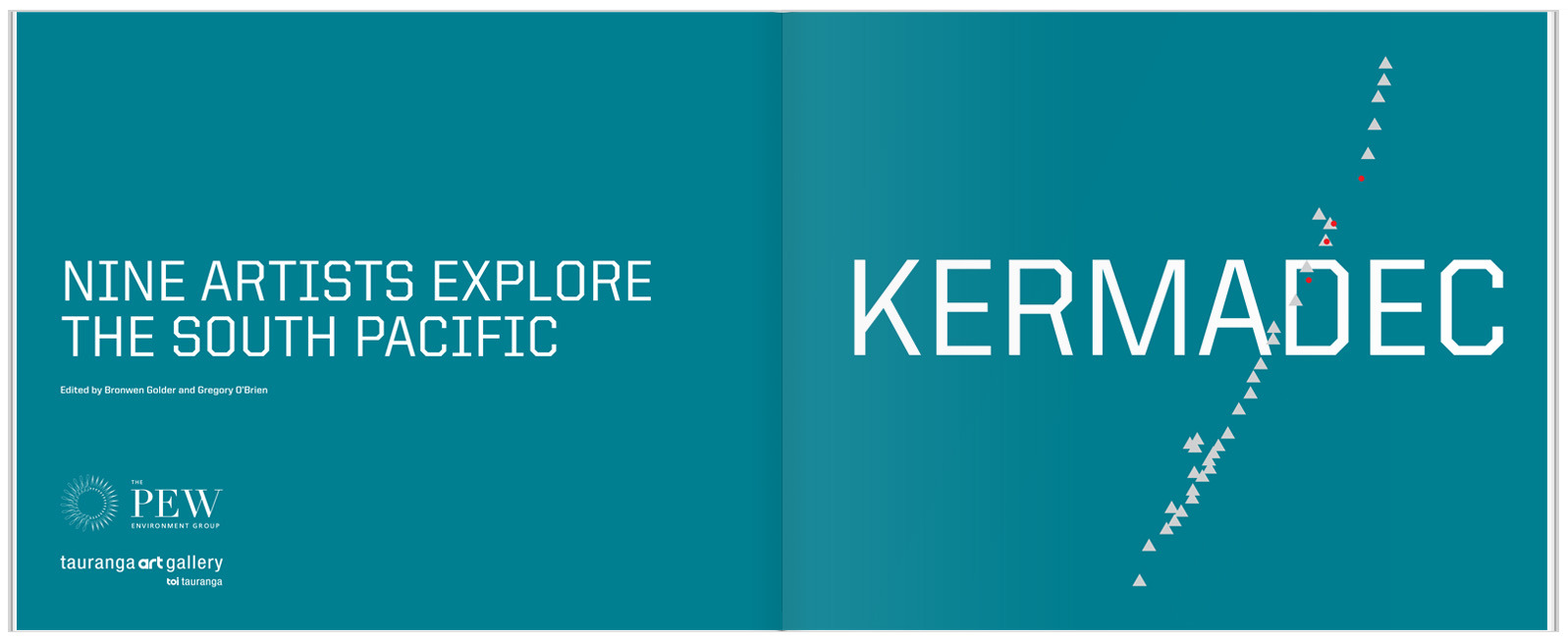
The cover image of a photograph of the sea changing into painted brush strokes is simple but striking. The typeface is a strong, modern font, the only type on the cover. This typeface, with it's very square letters, has practical, scientific associations. Inside, the title page reflects the colours and simplicity of the cover:

The white crest of the waves on the cover is echoed in the pattern of triangles crossing through the title page. I'm pretty sure the triangles are based on the geography of the Kermadec Trench.

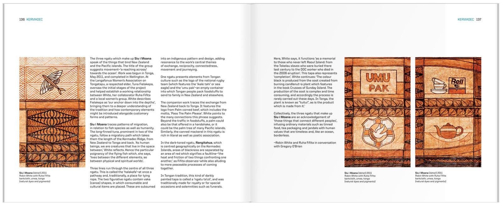
The inside spreads are set in what I initially thought was a three-column grid. Fortunately, the designer was there to correct me and tell me that it is in fact, a six-column grid. You can see this most easily by looking at the placement of the captions.

 I think the detail of the running head is really effective, keeping the design elements present from the cover and title page going throughout the book.