Showing posts with label genre: non-fiction. Show all posts

Saturday, 20 October 2012

I see what you did there


Really? I have to admire the sheer audacity of this cover design. What I find particularly amusing about it is that it's clearly a cash-in on the mega success of Fifty Shades of Grey, but it's invoking Twilight with it's cover art/layout. It seems like both an acknowledgement of Fifty Shades of Grey's fanfiction origins and a dig at the abusive undertones of Twilight.

Wednesday, 4 July 2012

Another oddly sized book

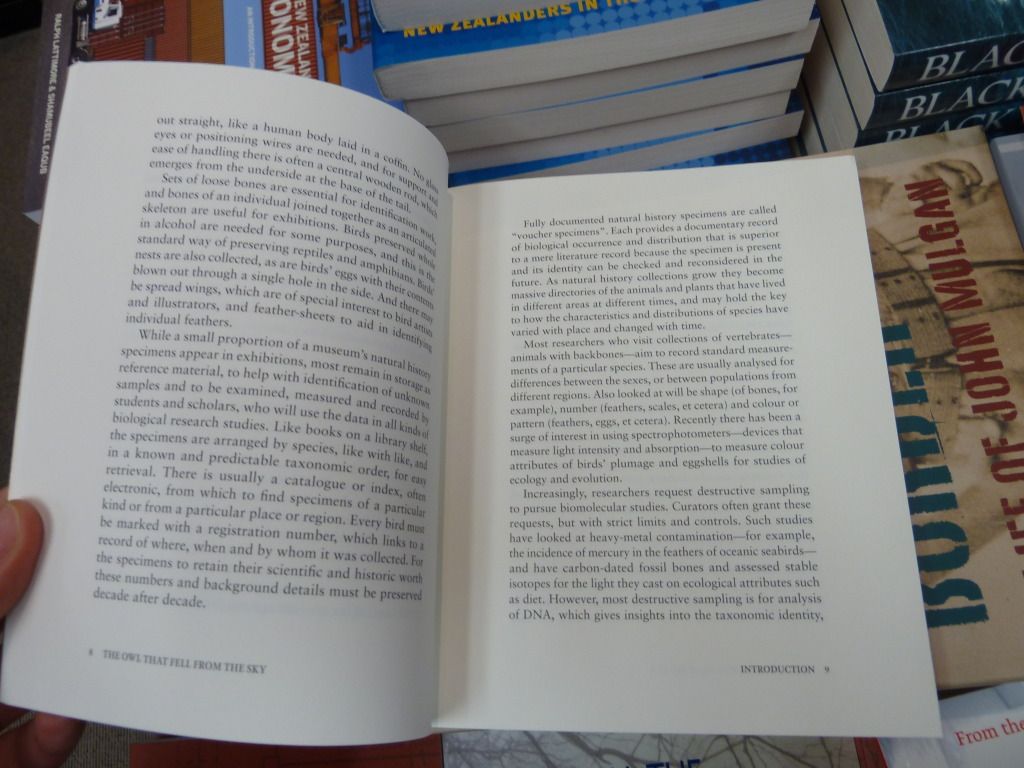
Here's Awa Press' The Owl that Fell from the Sky. The very first thing I noticed about it was its odd size - it's approximately the height of an A-format paperback, but much wider ( 170 x145mm), giving it an almost square appearance.

Aside from the format, the cover design is lovely with a simple black/white/teal colour palette. The only part I question is what appears to be a strange ligature between 's' and 't' - it distracts from the otherwise clean-cut nature of the cover design.


Looking at a page-spread, the margins have been chosen to create a text panel with relatively traditional proportions, rather than the square-ish proportions of the book. This measure works well, without needing too many hyphens (I can't actually see any on this page-spread). I also note the use of the em rather than en dash - this seems appropriate, as the em dash is slightly more old-fashioned, and this book is about museum specimens.

Tuesday, 3 July 2012

Unusual running feet

I found this rather charming example of running feet in this book The Calculus Diaries. The arrow design fits with the maths focus of the book, but it's not obtrusive. It also ties in with the heading designs. The page numbers are probably slightly harder to find when casually flicking through the pages, but the arrows mean they're well-connected to the corner of the page where most people would be used to finding them.

Sunday, 1 July 2012

Hyphenation madness

I'm not even sure how I stumbled across this, but I found an extraordinary example of why paying attention to those hyphenation settings when typesetting is important. I've taken a close-up photo of a page from The Better Angels of Our Nature that is fairly representative of the hyphenation problem present throughout the book. It's particularly strange because it shouldn't be a problem based on the measure (which is perfectly adequate for the size of the text).

Monday, 11 June 2012

Design troubles - putting text on a non-plain background

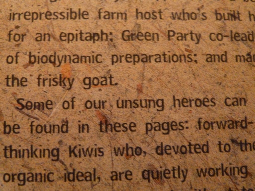
I found this example of unsuccessful blurb design on the back cover of The Wild Green Yonder by Philippa Jamieson.

There are multiple problems here, but the main issue is that the text is incredibly hard to read because of the background colour and texture. This problem is exacerbated by the choice of typeface. The typeface has uneven lettering, which makes it less readable than a more traditional sans serif. The typeface is quirky and is in keeping with the 'homemade' and 'organic' feel of this book, but is a bad choice to go on top of such a busy background. The other problem with this design is that the blurb is way too long and not broken up enough. Who's going to read such a long piece of uneven, hard-to-read text?


Saturday, 9 June 2012

Woeful typography

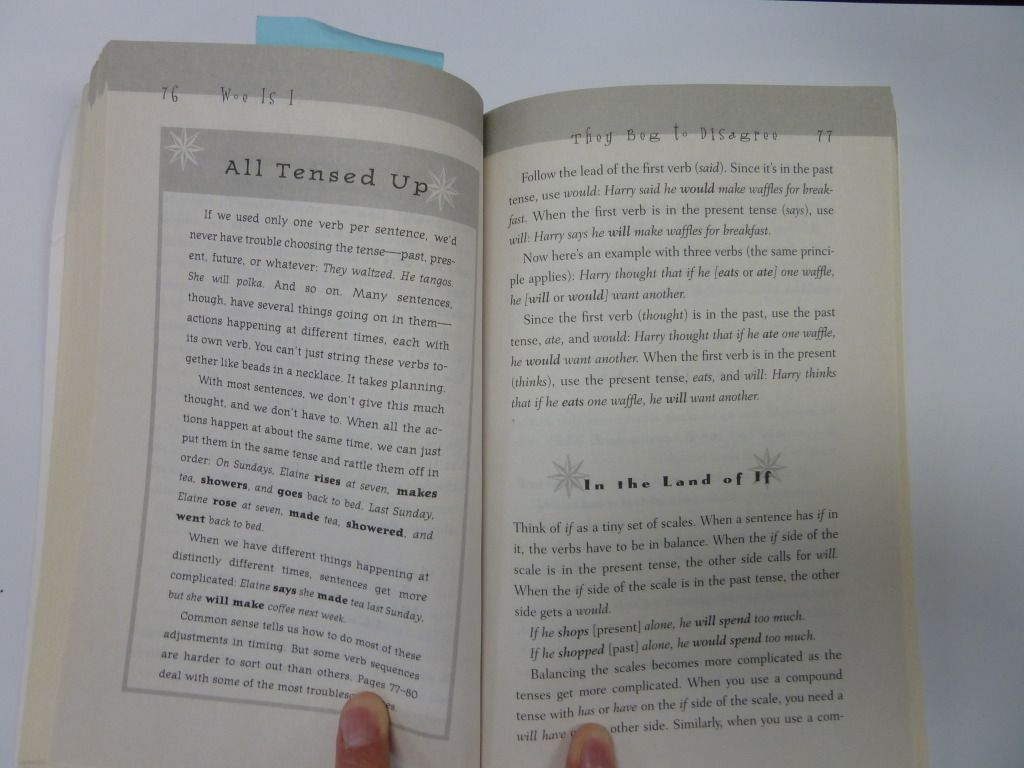
This example of poor typeface choice is from the grammar book Woe is I. Although it's written in 'plain English', it's still a relatively dry book about the rules of grammar. Clearly the intent behind the design was to make grammar fun, but the result was a book full of inappropriate typefaces:

Take the running heads for example - they are in a display typeface which is (1) difficult to read, (2) in a larger size than the narrative text, (3) incredibly distracting, and (4) not reflective of the book's contents.

Wednesday, 30 May 2012

Display pages - Superfreakonomics


Here we have Superfreakonomics, by Steven D. Levitt and Stephen J. Dubner.

This cover is quite cluttered, but I think it works well because the title of the book is very clear, being at the top of the page in a large, easy-to-read bold typeface. Even though there's a strange break between 'Freak' and 'onomics' I think it works because it breaks up a large, made-up word into two smaller and more easily-digestible chunks.


Moving on to the table of contents:

I love the use of white space in this layout and the clear delineation of  each element. There are large margins on all sides, so nothing feels cluttered (despite the use of text boxes around the chapter numbers). It's very easy to find the chapter number, the chapter title, and the chapter description with only a brief scan and the hierarchy of headings is very clear.

This chapter headings use similar design elements, but less successfully.
As a reader, it's not clear which heading is more important, particularly as both headings are 'floating' in space with no clear relationship to each other or the main text.