Showing posts with label different editions. Show all posts

Friday, 22 June 2012

Different Harry Potter covers

In a fit of nostalgia, I thought I'd do a comparison of different covers for the UK editions of one of the bestselling novels of all time: Harry Potter and the Philosopher's Stone.

First, the edition I own, published in 1997 (though sadly not a first edition). This edition is notable for the strange man on the back cover, who in later editions is replaced with Albus Dumbledore (see the cover on the right).
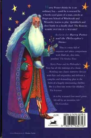


I have mixed feelings about this cover. Looking at it now, it has a sort of quirky, nostalgic charm to it. However, I remember being given this book when I was 11 or 12 and thinking that it was one of the lamest and most childish covers I'd seen. I've read that this book was initially targeted at ages 9-11, so speaking from my memory of being the target market, I can't say I found it appealing.

Comments:

  • It's interesting that the character's name is presented as the most important piece of information on the cover. Since the character's name is the same for the entire series it provides a simple way for readers to quickly identify all of books in the series.
  • The typeface used for "Harry Potter" is a slightly old-fashioned serif, in keeping with the tone of the book. The script-like typeface for "and the Philosopher's Stone" is clearly an attempt to convey the fantastical nature of the book's contents.
  • The bright block colours have clearly been chosen to appeal to children.

Bloomsbury clearly cottoned on to the fact that not just kids liked the books by bringing out the first UK adult edition, published in 1998:

This cover is horribly unappealing on several levels:

  • It looks incredibly dated.
  • Nothing on this cover suggests its a fantasy novel.
  • The dark black and white cover photo implies that this is a serious book with dark themes.
  • The author's name seems to be floating randomly in space, un-anchored to anything around it.

The later adult edition in 2004 is a huge improvement:
  • Interestingly, the "Philosopher's Stone" part of the title has been deemed more important than the main character's name for this edition.
  • Again, this isn't a cover that says "fantasy", although it's better than the earlier adult edition.

Finally, the most recent children's edition the "signature edition" in 2010.


  • This is a very clean look compared to the earlier children's edition.
  • The simple centre alignment of all the text, and the focus of the image, makes a clear path from top to bottom for your eyes to follow.

Tuesday, 19 June 2012

Comparing a paperback and hardback

I'm going to compare the paperback and hardback editions of The Fairy Godmother by Mercedes Lackey.

Besides the obvious size difference, the covers are virtually identical. One minor difference is the formatting of the "A tale of the Five Hundred Kingdoms" tagline. Also, "five" is not capitalised for the paperback version.

Other general cover comments:

  • The author is clearly the most important piece of information on the cover.
  • The decorative typeface chosen for the author's name and the book title conveys the whimsical, romantic tone of this book.
  • To make it clear that this book is targeted at woman, there's a very feminine woman in the foreground with pink flowers in her hair (this does not happen at any point in the actual book).
  • Just to make it extra clear that this book is targeted at women, there's also some random pink sparkles. These also serve the dual purpose of conveying that this is a fantasy novel.
  • Just in case you still hadn't realised that this book is targeted at women, the author's name is foil stamped in metallic gold - a convention often used for romance books.
The paperback version lacks a half-title page, but the title pages for both editions are the same.

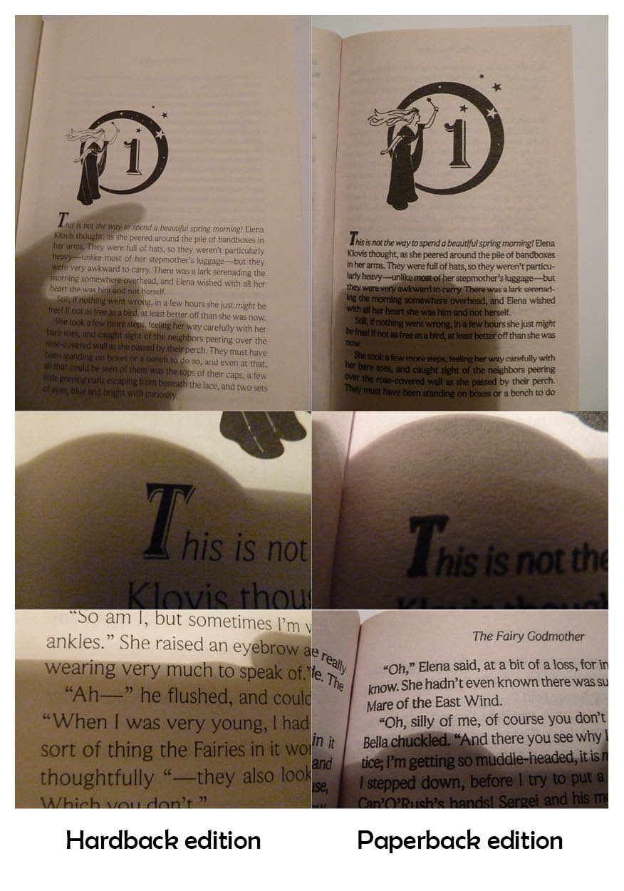
One major difference between the two editions is the paper quality. The paperback edition uses lower quality paper, which means the ink has bled slightly, giving the pages darker 'colour'. This is particularly obvious in the photos below.

As you can see, the detail on the dropcap is not visible in the paperback edition. The main text also looks much cleaner and is easier to read in the hardback edition, even though the same typeface is used. This typeface is midway between a serif and sans serif typeface, with very small serifs.

One interesting layout choice for the chapter pages is that the image is proportionately larger in the paperback edition. Possibly this is to balance out the smaller page margins of the paperback.
Both editions have quite a lot of show-through; this is particularly evident on the page before the illustrated chapter heading:

Another interesting layout feature of the hardback edition is that the largest margin is the top margin. The hardback has very large margins in general, but normally the bottom margin would be the largest.

Tuesday, 29 May 2012

The Heir of Night

This book  by New Zealand fantasy author Helen Lowe recently won the Gemmell Morningstar Award for Best Fantasy Newcomer. I thought I'd include it, in the interest of supporting NZ fantasy.

The black and red combination makes for a striking cover despite the fact that this colour combination is relatively common at the moment. I think it stands out because the current trend is for red/black presented in a romantic way, whereas this cover isn't romantic - it's bold. It also stands out amongst fantasy titles because it doesn't necessarily look like a fantasy novel - it could equally be a horror. The all-caps sans serif typeface is also not typical of the fantasy genre - it's a convention more usually found amongst contemporary fiction.

The black to red gradient on the typeface is a clever way to get around the change in background colour.

I particularly like that the cover figure instantly tells you that there is a strong female main character (and she isn't in a sexy or submissive pose - sadly something of a rarity for a female cover model). This same cover figure is used on the other version of the cover I've seen around.

The other version of the cover I've seen around is more evocative of the fantasy genre than the first one. The typeface chosen for the title is interesting, with unevenly-sized 'T's and 'H's. It gives it almost a hand-lettered feel. The letters are again placed quite cleverly, with light type against dark smoke. The hint of colour on the bottom of 'night' makes it seem like the words are 'in' the picture and are being affected by the flames.

Friday, 20 April 2012

International editions - case study 'Angel's Blood' by Nalini Singh

I find it interesting to compare different editions of the same book, especially foreign language editions. To that end I've collected various editions of Angels' Blood by Nalini Singh. The original version of Angels' Blood was published in the US in 2009. Angels' Blood reached our shores in the form of the UK/Australian edition in 2010.

US Edition
UK/Australian Edition

The title's typeface in the US edition draws heavily on romance genre conventions: decorative, foil stamped, drop shadow. The UK/Australian edition is edgier, and hints at horror/thriller elements with the dripping blood in the title.

Other editions are as follows. 

The Spanish and Portuguese editions are effectively the same as the UK edition, except the typeface for the title has been altered in the Portuguese version. The European versions seem to be more monochromatic than the various Asian editions as a general rule. The UK, Hungarian and French covers seem to be following the trend for predominantly black and white covers, with a single highlighting colour, very reminiscent of the iconic Twilight cover.

I think the Indonesian and Polish versions are the least successful, mainly because of the bad photo-shopping. On the Polish  cover the woman’s breasts have been photo-shopped out, leaving the model with an unnatural appearance. I've made some more detailed comments on the Indonesian cover below.
The Indonesian version also doesn't clearly express that this is a book with strong fantasy elements – this cover could belong to any romance novel. The other editions lacking a strong fantasy element on the cover (such as the US and Japanese editions) still have a fantastical feel because of mystical background lighting.

Another thing I find interesting with the different editions is whether the author’s name or the book’s title is deemed more important. The most important element is the biggest, boldest, and is usually located at the top. The editions seem to rank the importance of the title versus the author’s name as follows:

Title more important
Author more important
UK/Australian
French
German
Hungarian
Italian
Japanese
Polish
Portuguese
Spanish
US
Indonesian
Thai

The logic behind this is probably because Nalini Singh is most well-known in the US market, so her name has strong brand appeal there. Outside that market, the name of the book is more likely to entice potential readers. I’m not sure why the Indonesian and Thai editions deem the author’s name more important.