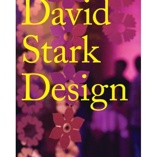
I was at the library today in the cookbooks section when a mis-shelved title metaphorically leapt off the shelf and demanded to be taken home. This visually striking book is a design book published in 2010 called David Stark Design.
.JPG)
The design elements of the cover (simplicity, bright colours, contrast) are echoed in the design and layout of text elements inside the book.
For example, in the table of contents the section titles are highlighted with yellow, and the background of the page is pink. The contrast is also echoed in the font choices: the section titles are in a standard sans serif typeface, whilst the sub-headings are in a serif typeface reminiscent of type-writers. The highlighted section titles are very easy to find.
.JPG)
.JPG)
The text pertaining to the artwork on each double-paged spread is also contained in a yellow text-box, repeating the colour theme from the cover. This is also a clever way to put text on top of a photograph.
.JPG)
The section headings overlay the narrative text. I'm uncertain about this design choice - it is striking, but the heading makes reading the underlying text difficult.
.JPG)
Great designer nice thanks for sharing us.
ReplyDeleteCustom Logo
HEY!!
ReplyDeleteSuch a Best and unique site.
Thanks for sharing with us.
Buy a logo design with 57% off. Custom Logo
Good post thanks for sharing with us.
ReplyDeletebuy social logo
this is really a helpul content thanks for sharing with us
ReplyDeleteif you are really interested in web designing or logo designing then visit us,
Logo Designers