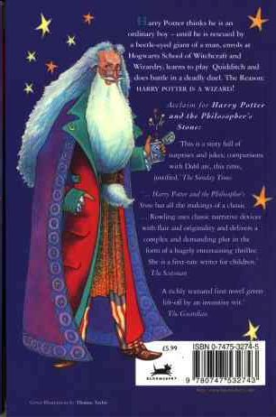
First, the edition I own, published in 1997 (though sadly not a first edition). This edition is notable for the strange man on the back cover, who in later editions is replaced with Albus Dumbledore (see the cover on the right).

I have mixed feelings about this cover. Looking at it now, it has a sort of quirky, nostalgic charm to it. However, I remember being given this book when I was 11 or 12 and thinking that it was one of the lamest and most childish covers I'd seen. I've read that this book was initially targeted at ages 9-11, so speaking from my memory of being the target market, I can't say I found it appealing.
Comments:
- It's interesting that the character's name is presented as the most important piece of information on the cover. Since the character's name is the same for the entire series it provides a simple way for readers to quickly identify all of books in the series.
- The typeface used for "Harry Potter" is a slightly old-fashioned serif, in keeping with the tone of the book. The script-like typeface for "and the Philosopher's Stone" is clearly an attempt to convey the fantastical nature of the book's contents.
- The bright block colours have clearly been chosen to appeal to children.
Bloomsbury clearly cottoned on to the fact that not just kids liked the books by bringing out the first UK adult edition, published in 1998:
This cover is horribly unappealing on several levels:
- It looks incredibly dated.
- Nothing on this cover suggests its a fantasy novel.
- The dark black and white cover photo implies that this is a serious book with dark themes.
- The author's name seems to be floating randomly in space, un-anchored to anything around it.
The later adult edition in 2004 is a huge improvement:

- Interestingly, the "Philosopher's Stone" part of the title has been deemed more important than the main character's name for this edition.
- Again, this isn't a cover that says "fantasy", although it's better than the earlier adult edition.
Finally, the most recent children's edition the "signature edition" in 2010.

- This is a very clean look compared to the earlier children's edition.
- The simple centre alignment of all the text, and the focus of the image, makes a clear path from top to bottom for your eyes to follow.
No comments:
Post a Comment