The cover image of a photograph of the sea changing into painted brush strokes is simple but striking. The typeface is a strong, modern font, the only type on the cover. This typeface, with it's very square letters, has practical, scientific associations. Inside, the title page reflects the colours and simplicity of the cover:
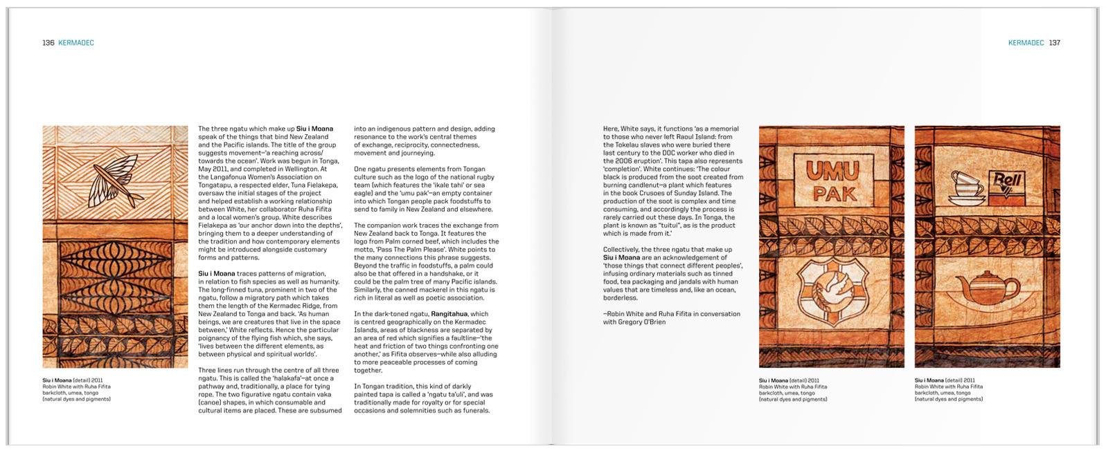
The inside spreads are set in what I initially thought was a three-column grid. Fortunately, the designer was there to correct me and tell me that it is in fact, a six-column grid. You can see this most easily by looking at the placement of the captions.
I think the detail of the running head is really effective, keeping the design elements present from the cover and title page going throughout the book.


No comments:
Post a Comment