There's coffee table books, and then there's this monstrosity:
In Unity Books, The Art Museum has its own stand it's so enormous:
This book is nearly 1000 pages long, 42cm tall, 32cm wide and 7cm thick. And it's heavy - it weighs nearly 8kgs according to the internet. It's so big that its form affects its function - its so unwieldy to flick through that why would anyone bother? It's also a very expensive book, retailing at over $200.
The paper is also really thin, so it's not exactly the kind of book you can easily leaf through - I'd worry about tearing the pages.
An additional note - the designer was clearly keen to show off the grid layout of this book, because even I can see it.
Showing posts with label grid layout. Show all posts
Showing posts with label grid layout. Show all posts
Monday, 2 July 2012
Thursday, 14 June 2012
Comic book layout
I've added arrows to the above page spread to show the order you're meant to read each panel and speech bubble. The speech bubbles follow certain conventions to guide the reader (read top before bottom, and left before right).
Children's book layout - 'The Duckling Gets a Cookie!?'
I've included this sample from the children's book The Duckling Gets a Cookie!? to show how it effectively uses a simple two-column grid system for each page.
This grid here has been used to show the pigeon's thought-process as he gets increasingly upset about the duckling getting a cookie. The different background colours for each square make each thought into a separate mini-scene, adding emphasis. The last thought before the page-turn is given extra emphasis as it covers two squares instead of one.

The typeface for the story has clearly been chosen for its old-fashioned, simple, 'typewriter' feel, which complements the plain backgrounds and uncomplicated line-drawings of the illustrations.
This grid here has been used to show the pigeon's thought-process as he gets increasingly upset about the duckling getting a cookie. The different background colours for each square make each thought into a separate mini-scene, adding emphasis. The last thought before the page-turn is given extra emphasis as it covers two squares instead of one.

The typeface for the story has clearly been chosen for its old-fashioned, simple, 'typewriter' feel, which complements the plain backgrounds and uncomplicated line-drawings of the illustrations.
Friday, 18 May 2012
Kermadec
This book, designed by Spencer Levine, caught my eye today.
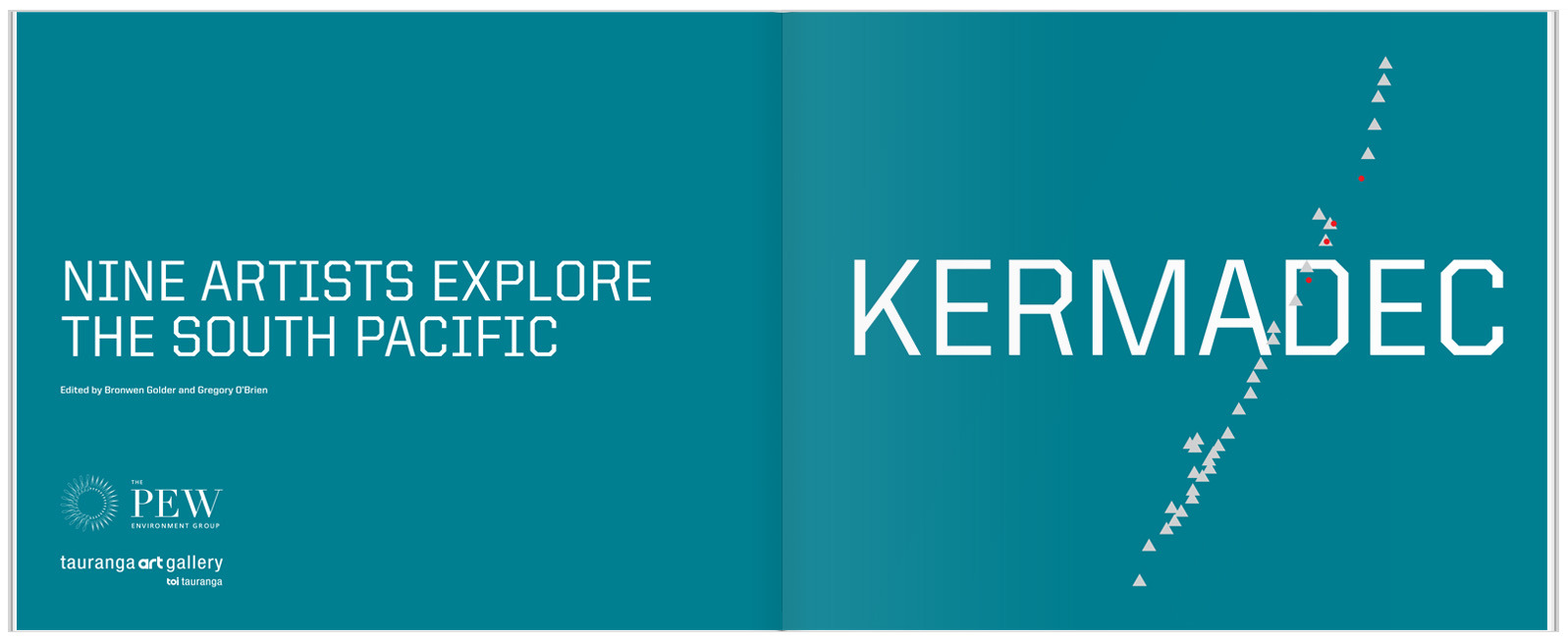
The white crest of the waves on the cover is echoed in the pattern of triangles crossing through the title page. I'm pretty sure the triangles are based on the geography of the Kermadec Trench.
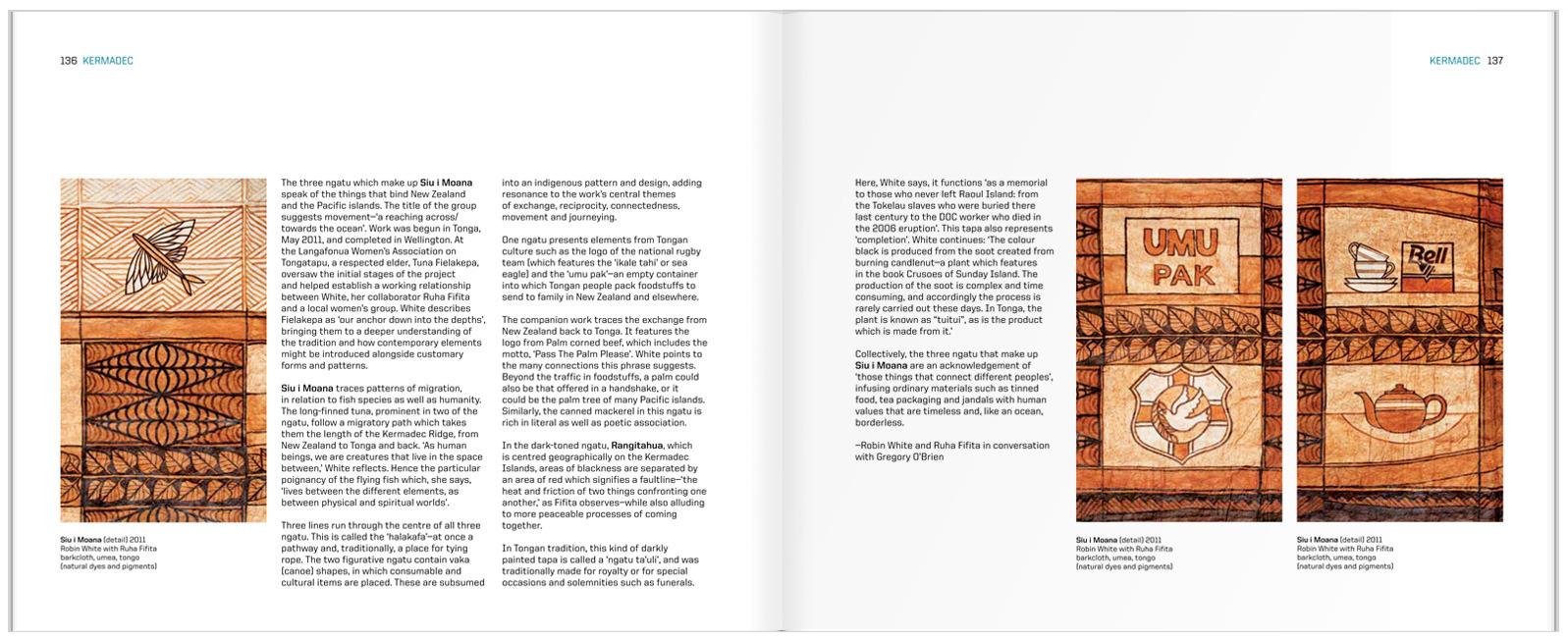
The inside spreads are set in what I initially thought was a three-column grid. Fortunately, the designer was there to correct me and tell me that it is in fact, a six-column grid. You can see this most easily by looking at the placement of the captions.
I think the detail of the running head is really effective, keeping the design elements present from the cover and title page going throughout the book.
The cover image of a photograph of the sea changing into painted brush strokes is simple but striking. The typeface is a strong, modern font, the only type on the cover. This typeface, with it's very square letters, has practical, scientific associations. Inside, the title page reflects the colours and simplicity of the cover:
The inside spreads are set in what I initially thought was a three-column grid. Fortunately, the designer was there to correct me and tell me that it is in fact, a six-column grid. You can see this most easily by looking at the placement of the captions.
I think the detail of the running head is really effective, keeping the design elements present from the cover and title page going throughout the book.
Subscribe to:
Posts (Atom)


