
Showing posts with label genre: fiction. Show all posts
Showing posts with label genre: fiction. Show all posts
Monday, 20 August 2012
Fifty Shades of Grey Cover Trends
So, design scrapbook is officially over, but I couldn't resist making a post about about this. It's insane. Actually insane. Look at this:
 We have books clearly cashing in on the Fifty Shades of Grey craze advertising this through echoing the design of Fifty Shades of Grey, which in turn cashed in on the Twilight craze, blatantly mimicking cover elements from that series. It's like the book cover version of Matryoshka dolls!

Tuesday, 26 June 2012
Pretty cover and ragged edges
Presenting Terry Pratchett's Nation:
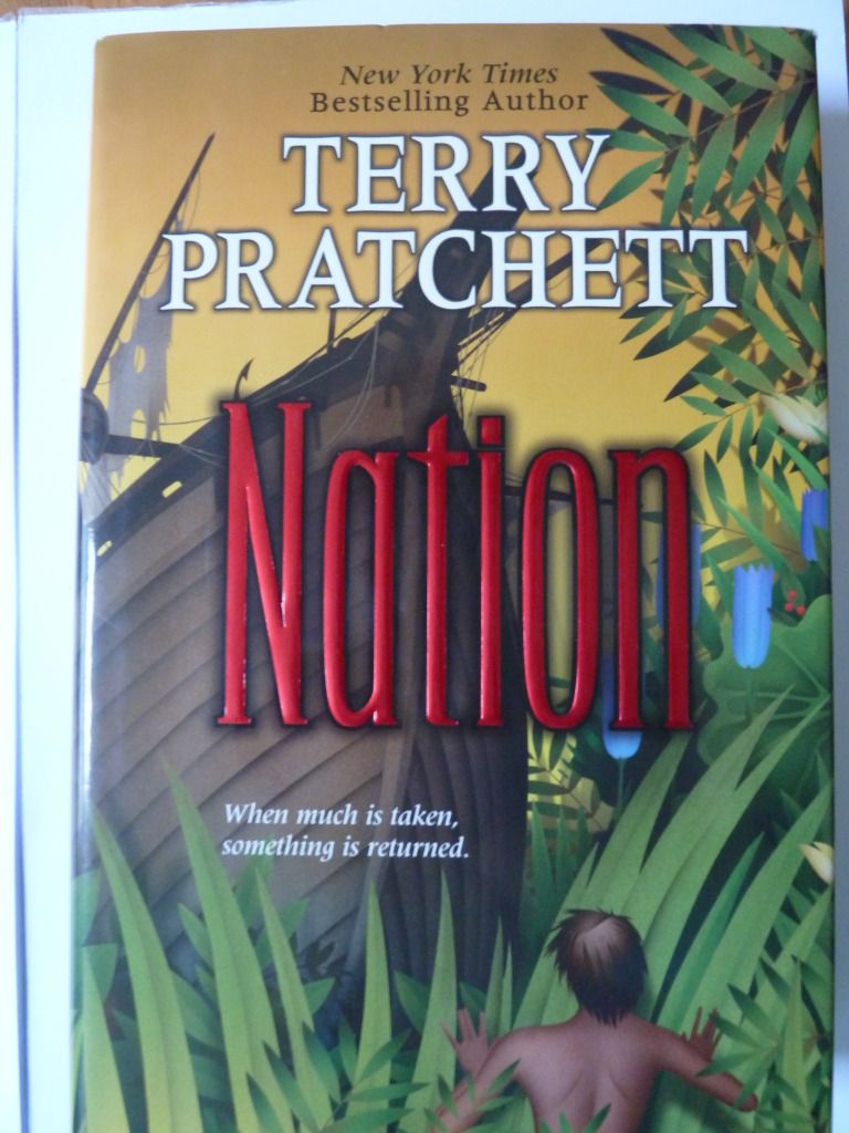 The author's name and title are clearly displayed in the order of importance, and are very easy to read despite the busy background. The title is eye-catching because it is foil-stamped, with a drop shadow for added emphasis.
The dust-cover shows one continuous scene - which I think is always a nice design touch. The transparent text box used for the blurb is a good way to put text on top of a busy background, whilst still allowing the sense of the image to be conveyed.
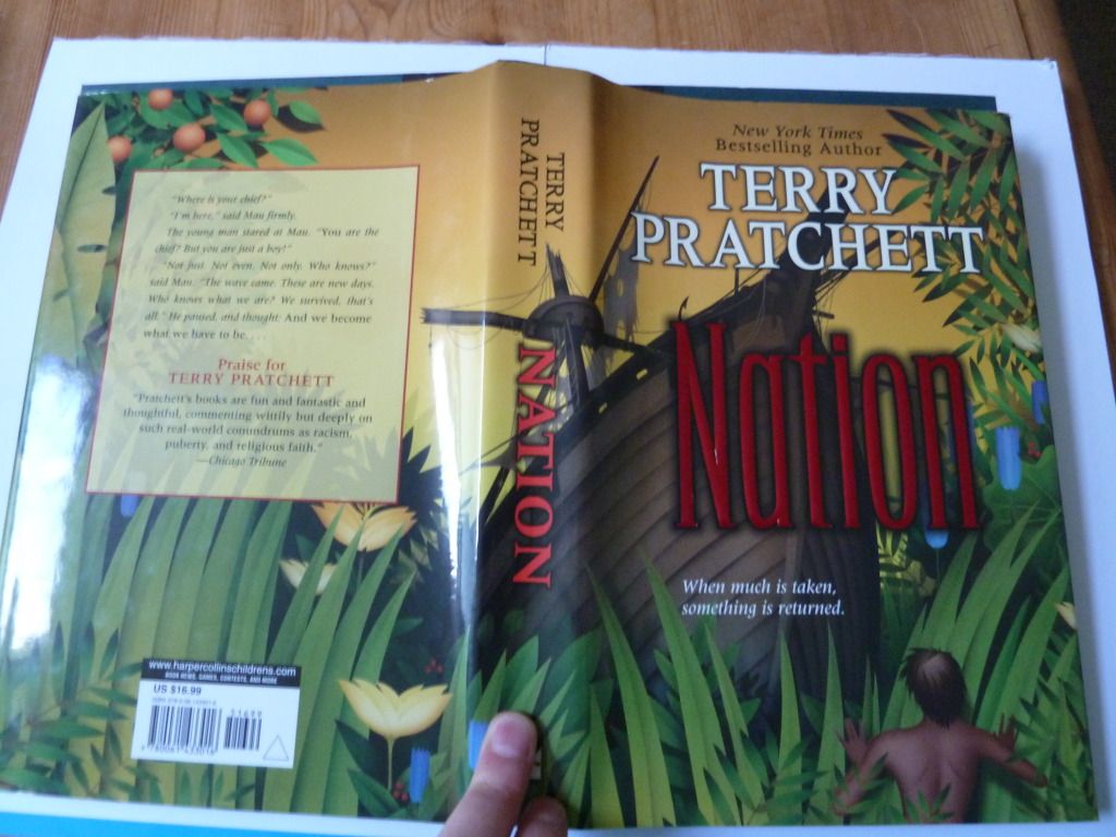
As this is the US hardback, it also has a ragged 'rough cut' edge (something more common in the US). I find it makes it harder to flick through pages, and it makes the book feel less 'perfect', but it also adds an element of interest.

Sunday, 24 June 2012
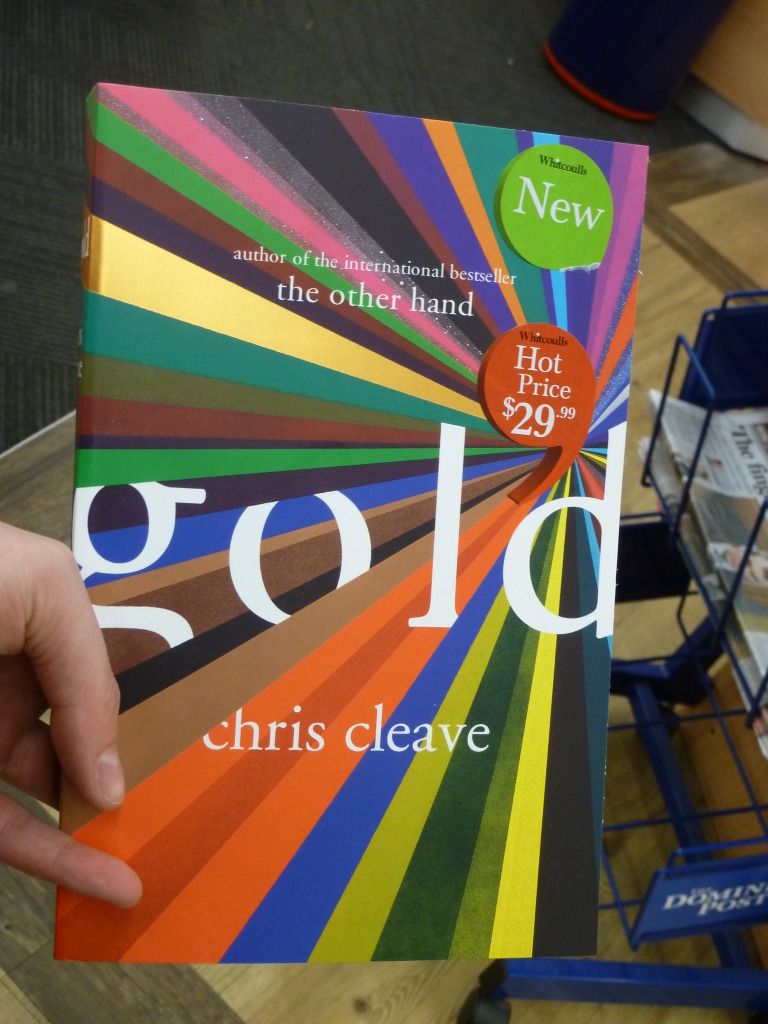
Cool cover - Gold by Chris Cleave
This caught my attention the other day:
 With all those colours and the stripe of gold foil, it's very eye-catching. This is a novel about Olympic cyclists, and I see the multiple colours receding into the distance as representing the blur of cyclists wearing different colours and moving at speed.
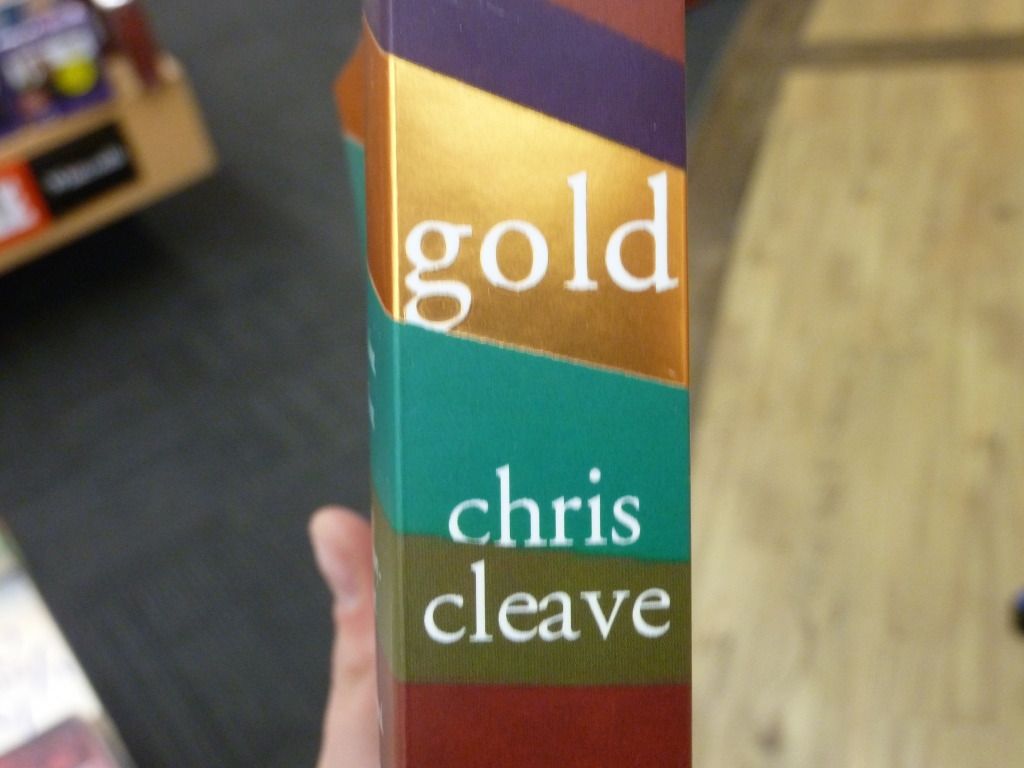
The stripe theme is carried over the whole cover. Here's the spine, with the title located on the stripe of gold foil.
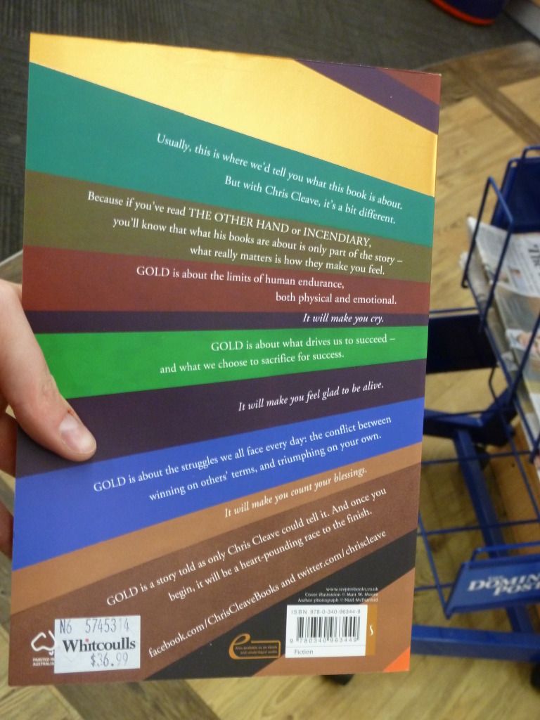
 Then there's the back, with the blurb text aligned so each paragraph sits aligned on a stripe. Overall the text is roughly right-aligned, following the curve of the stripes receding into the distance. This makes the blurb more exciting, but it's still pretty easy to read.

The stripe theme is carried over the whole cover. Here's the spine, with the title located on the stripe of gold foil.
Subscribe to:
Posts (Atom)