I found this rather charming children's book
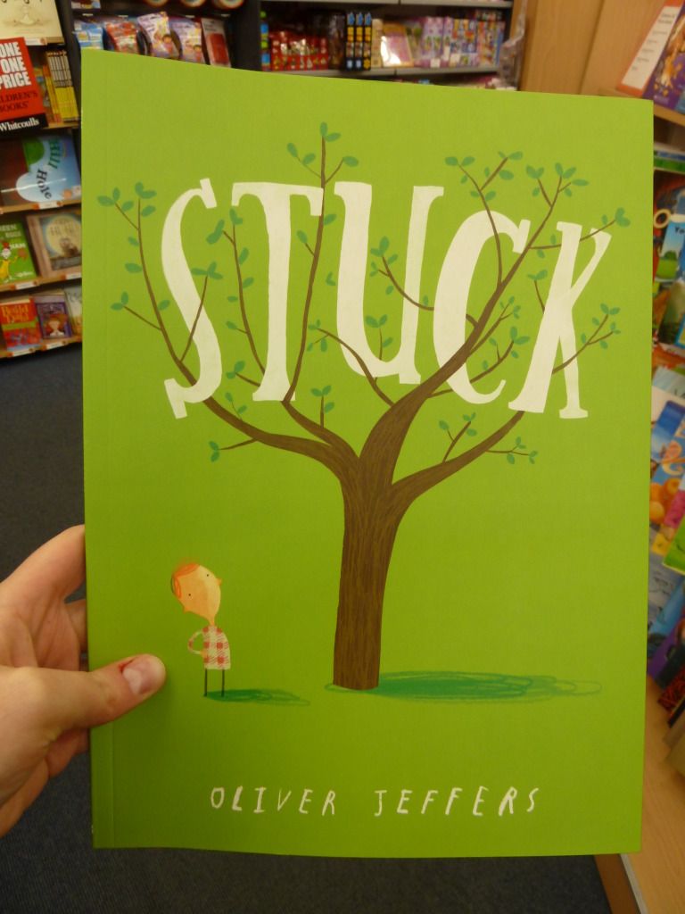
Stuck.
I think this is a really successful cover.
- The title is easy to read because of its size and contrast, even though it is in an uneven typeface with a hand-lettered feel to it.
- The title's typeface also suits the illustration style, and the positioning of the letters between the tree branches anchors the title to the cover image.
- The typeface for the author's name matches the typeface used for the inside lettering (more on this below).
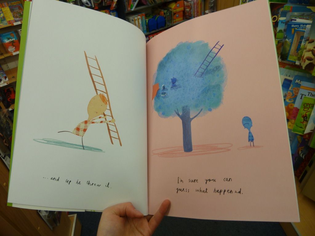
Here is a page spread from the book:
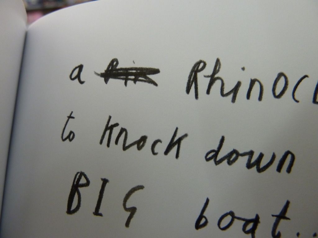
The typeface used for the text is a child's scribbly pencil handwriting (is it still a typeface if it's hand-written?). This suits the scribbly nature of the illustrations, and makes the narrator seem more authentic. I particularly like how in the photo below, the narrator has had two tries at spelling a difficult word (rhinoceros) and crossed out the first attempt.
This book also has cover flaps, and designs on the inside of the cover, a nice additional touch.

 Because of the extra physical material glued into each page, the pages are very thick and board-like, also suitable for young children who may not have the fine motor skills to be gentle with thin pages.